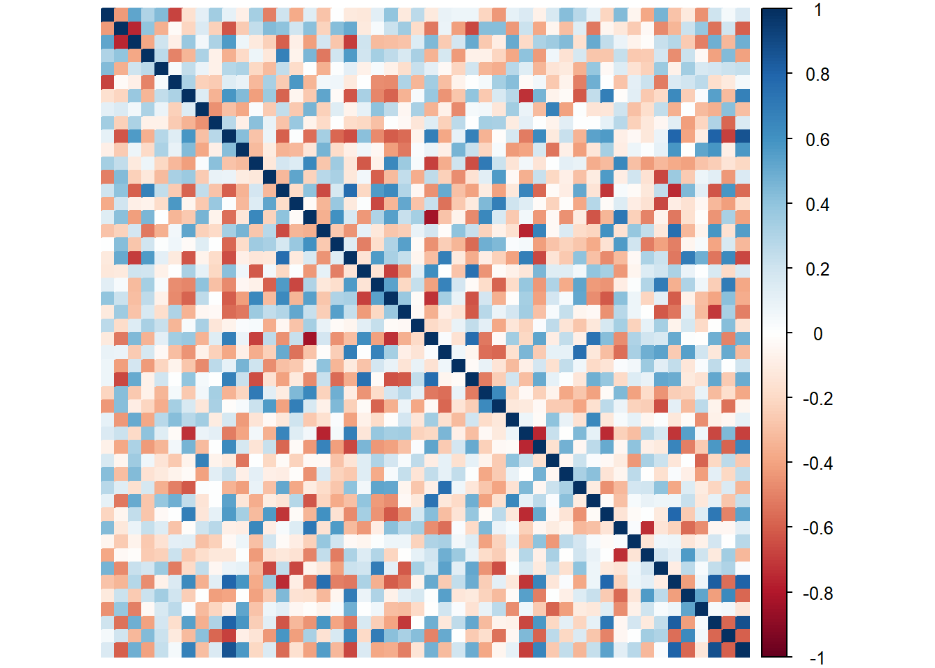
9.3 Correlation Plots
Like in other techniques, we will plot the heatmap of the 2 data tables we get the general feel of the data. We learned that the relationships among items (Judges) in each datasets is a mix of both positive and negative (leaning negative).
9.3.1 of Product Ratings
# Compute the covariance matrix
heat1 <- cor(sort)

# Plot it with corrplot
corrplot(heat1, method = "color",
         #title = "Correlation Plot of Product Ratings",
tl.pos='n') 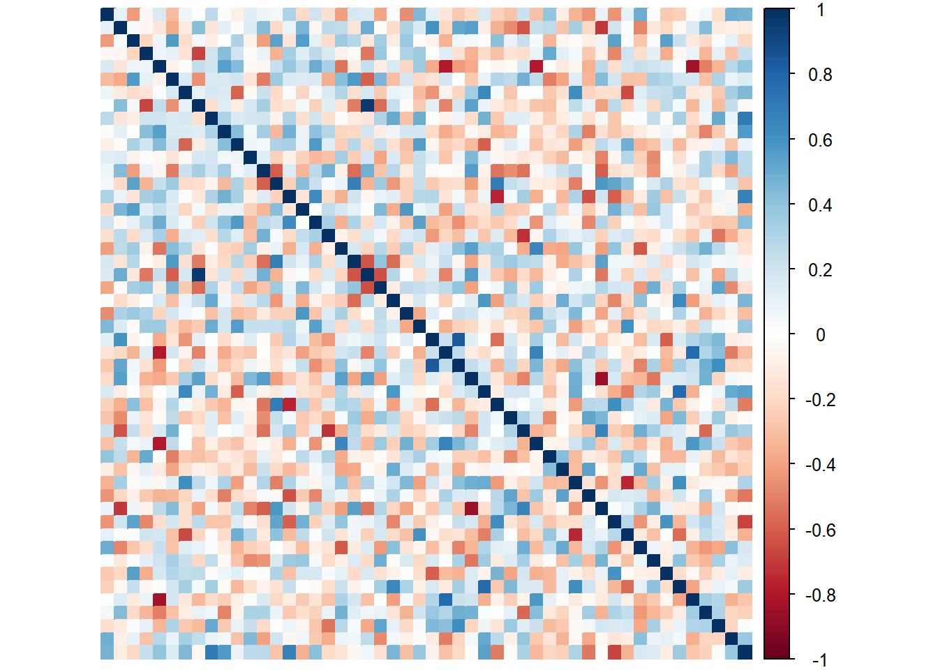
9.3.2 of Vocab