Static Maps are the most common type of visual output from geocomputation. This is therefore the longest and most detailed part of this chapter (Section 9.2).
Scales control how the values are represented on the map and in the legend, and they largely depend on the selected visual variable (Section 9.2.4). We can distinguish between interval (Section 9.2.4.2), continuous
and categorical scales
applying categorical, sequential or diverging palettes (Section 9.2.4.5).
Legends have a certain title, position, orientation to place it on the graphics. But you can also disable legend (Section 9.2.5).
Layouts refer to the combination of all map elements into a cohesive map (Section 9.2.6).
Faceted maps are composed of many maps arranged side-by-side, and sometimes stacked vertically. Facets enable the visualization of how spatial relationships change with respect to another variable, such as time (Section 9.2.7). They can also used with special parameters for animated maps (Section 9.3).
Inset maps are smaller maps rendered within or next to the main map (Section 9.2.8). It is a complex chapter which uses details of the {grid} package like grid::viewport(), grid::grid.newpage() and the sf::bbox() function to return the bounding of a simple feature (set). As I do not need inset maps at the moment for my own research I skipped this section.
Animated maps show how spatial distributions of variables change (e.g., over time) sometimes better than tiny faceted maps (Section 9.3).
Interactive maps is the next level to explore data. Interactivity can take many forms: Starting with interactive labels through pop-ups when you hover over the region or click with the mouse, continuing with the ability to pan around and zoom into any part of a geographic dataset overlaid on a ‘web map’ to show context to the more advanced level of the ability to tilt and rotate maps (Section 9.4).
9.1 Introduction
I am following here Chapter 9 Making Maps with R respectively chapter 8 of the printed book 2nd edition, explaining mainly the use of {tmap}. In addition to the example and code demonstrations I will also use my own WHR dataset.
To facilitate working with the WHR dataset I have joined the ladder score values in a new column “WHR” with the world dataset of {tmap} and stored as world_whr_2024.rds in “data/chapter09”
R Code 9.1 : Join WHR ladder scores with {tmap} World dataset
Static maps are the most common type of visual output from geocomputation. They are usually stored in standard formats including .png and .pdf for graphical raster and vector outputs, respectively. Initially, static maps were the only type of maps that R could produce. Things have advanced very much in the last decade, and many map-making techniques, functions, and packages have been developed since then. However, despite the innovation of interactive mapping, static plotting was still the emphasis of geographic data visualization in R.
The generic base::plot() function is often the fastest way to create static maps from vector and raster spatial objects. Sometimes, simplicity and speed are priorities, especially during the development phase of a project, and this is where base::plot() excels. The base R approach is also extensible, with base::plot() offering dozens of arguments. Another approach is the {grid} package which allows low-level control of static maps. But these notes focus on {tmap} and emphasizes the essential aesthetic and layout options.
# get nz datanz<-spData::nz# Add fill layer to nz shapenz1<-tmap::tm_shape(nz)+tmap::tm_fill()# Add border layer to nz shapenz2<-tmap::tm_shape(nz)+tmap::tm_borders()# Add fill and border layers to nz shapenz3<-tmap::tm_shape(nz)+tmap::tm_fill()+tmap::tm_borders()tmap::tmap_arrange(nz1, nz2, nz3)
Figure 9.1: New Zealand’s shape plotted with fill (left), border (middle) and fill and border (right) layers added using tmap functions.
R Code 9.3 : World countries layers
Code
```{r}#| label: fig-whr-world-with-layers#| fig-asp: 0.5#| fig-cap: "Shape of world countries plotted with fill and border layers added using tmap functions."world_whr_2024 <- base::readRDS("data/chapter09/world_whr_2024.rds")world_whr_2024 |> tmap::tm_shape() + tmap::tm_fill() + tmap::tm_borders() + tmap::tm_crs("+proj=robin")```
#> [tip] Consider a suitable map projection, e.g. by adding `+ tm_crs("auto")`.
#> This message is displayed once per session.
Figure 9.2: Shape of world countries plotted with fill and border layers added using tmap functions.
R Code 9.4 : Numbered R Code Title
Code
```{r}#| label: fig-whr-ladder-scores#| fig-asp: 0.4#| fig-cap: "World Happiness Report Ladder scores"# works better with Antarctica and earth_boundary = TRUEtmap::tm_shape(world_whr_2024) +tmap::tm_polygons("WHR") +tmap::tm_crs("+proj=robin") +# tmap::tm_title("World Happiness") +tmap::tm_layout(earth_boundary =FALSE, frame =FALSE )```
Figure 9.3: World Happiness Report Ladder scores
9.2.2 Map objects
Map objects can be stored as class tmap into the R memory. You can add new shapes later with + tm_shape(new_obj)
(The book example are not useful for my applications as it add raster objects and uses geometry operations.)
9.2.3 Visual variables
The plots in the previous section demonstrate tmap’s default aesthetic settings. Gray shades are used for tmap::tm_fill() layers and a continuous black line is used to represent lines created with tmap::tm_borders(). Of course, these default values and other aesthetics can be overridden.
fill: fill color of a polygon
col: color of a polygon border, line, point, or raster
lwd: line width
lty: line type
size: size of a symbol
shape: shape of a symbol
Additionally, you may customize the fill and border color transparency using fill_alpha and col_alpha.
9.2.3.1 Fixed values
Code Collection 9.2 : Visualize fixed aesthetic arguments on different layer types
Figure 9.5: Impact of changing commonly used fill and border aesthetics to fixed values.
9.2.3.2 Variable values
Using variable values, e.g. values from a column of the dataset, is the essential technique to show colored country differences on a map. Other issues (choosing an appropriate color palette, adapting text and position of the legend etc.) are — seen from a general perspective — only details.
Code Collection 9.3 : Visualize variable aesthetic arguments on different layer types
Figure 9.7: Fill countries of the world with well-being values of HPI and WHR
If you compare the well-being index from the Happiness Planet Index (HPI) and from the World Happiness Reports (WHR) you can see that the results are very similar. But there are some differences: For instance in countries with missing values, or Mexico, Colombia and Argentina have higher values in the WHR index. To understand these differences I would have to dive deeper in the different construction of the indexes.
Each visual variable has three related additional arguments, with suffixes of .scale, .legend, and .free. For example, the tmap::tm_fill() function has arguments such as fill, fill.scale, fill.legend, and fill.free.
The .scale argument determines how the provided values are represented on the map and in the legend (Section 9.2.4),
The .legend argument is used to customize the legend settings, such as its title, orientation, or position (Section 9.2.5)
The .free argument is relevant only for maps with many facets to determine if each facet has the same or different scale and legend.
9.2.4 Scales
9.2.4.1 Setting breaks
Scales control how the values are represented on the map and in the legend, and they largely depend on the selected visual variable. For example, when our visual variable is fill, then fill.scale controls how the colors of spatial objects are related to the provided values; and when our visual variable is size, then size.scale controls how the sizes represent the provided values.
By default, the used scale is tmap::tm_scale(), which selects the visual settings automatically given by the input data type (factor, numeric, and integer). There are also specific functions that depend on the data type and visual variable, such as
The tm_scale function applies different scale functions depending on the data type and visual variable, such as tm_scale_ordinal, tm_scale_categorical, tm_scale_intervals, tm_scale_continuous, etc
Let’s see how the scales work by customizing polygons’ fill colors. Color settings are an important part of map design – they can have a major impact on how spatial variability is portrayed.
Code Collection 9.4 : Different color settings and scales for income variable
Figure 9.8: Break settings. The results show (from top left to bottom right): default settings (= ‘pretty’ breaks), manual breaks, n breaks, and the impact of changing the palette.
This figure shows four ways of splitting the input data values into a set of intervals.
Top left: The default setting uses ‘pretty’ breaks, e.g., rounds breaks into whole numbers where possible and spaces them evenly.
Top right: breaks allows you to manually set the breaks
Bottom right: n sets the number of bins into which numeric variables are categorized
Bottom left: values defines the color scheme, for example, brewer.bu_gn
{tmap} version 4 has new names for color palettes
The value for the example color scheme is in the book BuGn. But this value results into a warning:
[cols4all] color palettes: use palettes from the R package {cols4all}. Run cols4all::c4a_gui() to explore them. The old palette name “BuGn” is named “brewer.bu_gn”.
Multiple palettes called “bu_gn” found: “brewer.bu_gn”, “matplotlib.bu_gn”. The first one, “brewer.bu_gn”, is returned.
{cols4all} is a new R package for selecting color palettes, with a special orientation to include palettes for people with color vision deficiency.
R Code 9.10 : GDP per capita with standard ‘pretty’ breaks
Code
world_no_ata<-world_whr_2024|>dplyr::filter(name!="Antarctica")tmap::tm_shape(world_no_ata)+tmap::tm_polygons( fill ="gdp_cap_est", fill.legend =tmap::tm_legend( position =tmap::tm_pos_in("left", "bottom")))
Figure 9.9: GDP per capita with standard (‘pretty’) breaks
Because of it extraordinary GDP per capita value (200,000 US $) I have removed the uninhabited Antarctica from the map. It has a population of only 4490 people, supposedly researchers working in this huge area.
To differentiate better the lower end of the distribution I have chosen small interval breaks until 20,000 US$ and put together all those countries that GDP per capita is higher than 20,000 US$.
I contrast to the previous example I have additionally I have set the aspect ratio of the figure. (See the code chunk option fig-asp: 0.5.) This removes the white space above and below the figure.
R Code 9.12 : GDP per capita with number of breaks specified (n = 10)
Code
tmap::tm_shape(world_whr_2024)+tmap::tm_polygons( fill ="gdp_cap_est", fill.scale =tmap::tm_scale(n =10), fill.legend =tmap::tm_legend( title ="Estimated GDP per capita", orientation ="landscape"))
#> [plot mode] fit legend/component: Some legend items or map compoments do not
#> fit well, and are therefore rescaled.
#> ℹ Set the tmap option `component.autoscale = FALSE` to disable rescaling.
Figure 9.11: GDP per capita with a specified number of breaks (n = 10)
If the data would have missing values I had to choose another color palette or tho change the default color for NAs. Otherwise the standard gray color for missing values (NAs) would be difficult to distinguish from the color of the lowest break (0-20,000).
In this example I haven chosen a color palette with different colors instead of just the same color with different saturation. The matplotlib.rainbow palette is very helpful to visually distinguish differences in the countries. It is much better suited than the standard “blues” or other gradient scale versions.
In this example you can’t see the only red country Luxembourg with over 100,000 $ GDP per capita, because it is too small. But you will see a tiny orange spot in Europe. This is Switzerland the only country slightly over 80,000 $ GDP per capita. You will get a sightly better view if you click on this last figure to get a larger image.
Choose the desired color palette with the interactive {shiny} website calling cols4all::ca4_gui() from the console.
Arguments work for other types of visual variables too
All of the above arguments (breaks, n, and values) also work for other types of visual variables. For example, values expects a vector of colors or a palette name for fill.scale or col.scale, a vector of sizes for size.scale, or a vector of symbols for shape.scale.
9.2.4.2 Interval scales
The tmap::tm_scale_intervals() function splits the input data values into a set of intervals. In addition to setting breaks manually, {tmap} allows users to specify algorithms to create breaks with the style argument automatically. The default is tmap::tm_scale_intervals(style = "pretty"), which rounds breaks into whole numbers where possible and spaces them evenly.
style = “pretty”: default value, rounds breaks into whole numbers where possible and spaces them evenly.
style = “equal”: divides input values into bins of equal range and is appropriate for variables with a uniform distribution (not recommended for variables with a skewed distribution as the resulting map may end up having little color diversity).
style = “quantile”: ensures the same number of observations fall into each category (with the potential downside that bin ranges can vary widely).
style = “jenks”: identifies groups of similar values in the data and maximizes the differences between categories.
style = “log10_pretty”: a common logarithmic (the logarithm to base 10) version of the regular pretty style used for variables with a right-skewed distribution.
Origin of class interval computation
Although style is an argument of {tmap} functions, in fact it originates as an argument in classInt::classIntervals(). See the help pages for {classInt) especially the article on head/tail breaks (Pareto 80/20 rule).
Code Collection 9.5 : Setting intervals with algorithms via “styles”
Figure 9.13: Different interval scale methods using the style argument
Here I have added the interval style for each example as annotation. I couldn’t find an annotation function, so I had used tmap::tm_credits().
Note also the different color palette in the last example style = "log10_pretty". I have called cols4all::c4a_gui() from the console, set the number of colors to 3 and looked for a palette with blue and this reddish color at the high end (brewer.bu_pu).
R Code 9.15 : Set interval scale using style = "pretty"
Code
tmap::tm_shape(world_whr_2024)+tmap::tm_polygons( fill ="WHR", fill.scale =tmap::tm_scale_intervals( style ="pretty", values ="matplotlib.rainbow"), fill.legend =tmap::tm_legend( position =tmap::tm_pos_in("left", "center")))
Figure 9.14: Set interval scale for WHR ladder scores using the standard style = 'pretty'.
These are the standard intervals. The code line fill.scale = tmap::tm_scale_intervals(style = "pretty") wouldn’t be necessary. It results in nice intervals from 1 to 8.
Choosing the “matplotlib.rainbow” color palette helps to distinguish the different categories. So you can see that the only two countries with a blueish color in Asia (Afghanistan) and in Africa (Sierra Leone). It is easy to see that Afghanistan is the most unhappiness country falling the worst category between 1 and 2 (value = 1.368), whereas Sierra Leone belongs to the somewhat better next category. Sierra Leone actually has a value of almost 3 (value = 2.998). This is the disadvantage of interval categories: Each country belongs to one category, but you can’t see where they are positioned inside their categories.
R Code 9.16 : Set interval scale using style = "equal"
Code
tmap::tm_shape(world_whr_2024)+tmap::tm_polygons( fill ="WHR", fill.scale =tmap::tm_scale_intervals( style ="equal", values ="matplotlib.rainbow"), fill.legend =tmap::tm_legend( position =tmap::tm_pos_in("left", "center")))
Figure 9.15: Set interval scale for WHR ladder scores using style = 'equal'.
Here we get categories with ugly boundaries. It does not have an advantage to the better to interpret “pretty” solution.
R Code 9.17 : Set interval scale using style = "equal" with 12 breaks
Code
tmap::tm_shape(world_whr_2024)+tmap::tm_polygons( fill ="WHR", fill.scale =tmap::tm_scale_intervals( style ="equal", n =12, values ="cols4all.friendly13"), fill.legend =tmap::tm_legend( position =tmap::tm_pos_in("left", "center")))
Figure 9.16: Set interval scale for WHR ladder scores using the style = 'equal' with 12 breaks.
Again we have ugly boundaries for each category. But this time there is an advantage: The 12 categories give a more detailed picture, especially in the higher end of the cantril ladder scores.
But the set of interval is still not ideal: For instance the second worst category has no element in it and at the high end we have not enough differentiation.
The “cols4all.friendly13” scale has 13 different colors, but for me there are two colors a that hare difficult to distinguish. So I decided to go with just 12 colors.
R Code 9.18 : Set interval scale using style = "quantile"
Code
tmap::tm_shape(world_whr_2024)+tmap::tm_polygons( fill ="WHR", fill.scale =tmap::tm_scale_intervals( style ="quantile", values ="cols4all.friendly13"), fill.legend =tmap::tm_legend( position =tmap::tm_pos_in("left", "center")))
Figure 9.17: Set interval scale for WHR ladder scores using style = 'quantile'.
This set of intervals gives a good rough picture of the WHR results: We have just 5 categories for 140 countries with ladder scores. In each category are placed 28 countries. So can we for instance decide the relative position of each country:
Label
Color
worst
red colored countries
bad
ochre / dark yellow colored countries
middle
blue colored countries
good
dark green colored countries
excellent
violet / purple colored countries
Sure this is a very coarse classification but it gives an idea about the distribution of the happiness index in the world.
: Set interval scale using style = "quantile" with 12 breaks
Code
tmap::tm_shape(world_whr_2024)+tmap::tm_polygons( fill ="WHR", fill.scale =tmap::tm_scale_intervals( style ="quantile", values ="cols4all.friendly13", n =12), fill.legend =tmap::tm_legend( position =tmap::tm_pos_in("left", "center")))
Figure 9.18: Set interval scale for WHR ladder scores using style = 'quantile'.
Because of the many colors the interpretation is not easy. But you get a good idea in which value regions are a concentration of countries. The two broad categories at both ends are necessary to get the same amount of countries as in the much thinner inner categories.
R Code 9.19 : Set interval scale using style = "log10_pretty" for country populations
Code
tmap::tm_shape(world_whr_2024)+tmap::tm_polygons( fill ="pop_est", fill.scale =tmap::tm_scale_intervals( style ="log10_pretty", values ="cols4all.friendly13"), fill.legend =tmap::tm_legend( position =tmap::tm_pos_in("left", "center")))
Figure 9.19: Set interval scale for WHR ladder scores using style = 'log10_pretty' for country populations
This is not a sensible map. I think style = 'log10_pretty' is better suited for instance to show an individual income distribution where 1% of the people owns the overwhelming part of the wealth. Or other content with a similar very skewed distribution.
Generally there are two main groups of continuous color palettes:
Sequential palettes. These color palettes follow a gradient, for example from light to dark colors (light colors often tend to represent lower values), and are appropriate for continuous (numeric) variables. Sequential continuous palettes can be single (“brewer.blues” for example goes from light to dark blue, see Figure 9.20 left) or multi-color/hue (“yl_gn_bu” for example is a gradient from light yellow to blue via green, see Figure 9.20 middle). The difference in the legend is that there are no lower and upper limits of bins as can be seen in Figure 9.20 right. The right example uses the same color palette as the middle graph but this time segmented by bins.
Diverging palettes, typically range between three distinct colors (purple-white-green in Figure 9.20) and are usually created by joining two single-color sequential palettes with the darker colors at each end. Their main purpose is to visualize the difference from an important reference point, e.g., a certain temperature, the median household income or the mean probability for a drought event. By default the midpoint values is set to 0 if negative and positive values are present. But the reference point’s value can be adjusted in {tmap} using the midpoint argument.
Figure 9.20: Using a continuous map (left) instead of bins (middle, right) for displaying median income in New Zealand
The standard scale tmap::tm_scale() sets breaks automatically to create bins with a lower and upper limit (middle and right). In contrast tmap::tm_scale_continuous() (left) provides a continuum scale without bins and borders.
R Code 9.21 : Cantril ladder values for countries mapped onto a continuous scale
Code
tmap::tm_shape(world_no_ata)+tmap::tm_polygons( fill ="WHR", fill.scale =tmap::tm_scale_continuous( values ="brewer.blues"), fill.legend =tmap::tm_legend( orientation ="landscape", position =tmap::tm_pos_out("center", "bottom"), width =50))
Figure 9.21: Using a continuous scale instead of setting breaks for bins to display the Happiness ladder scores in the countries of the world
Without width = 50 the scale would be auto scaled. The width is calculated from the font size. With standard values width = 50 is the maximum width without where no auto scaling is necessary.
9.2.4.4 Categorical scales
Categorical palettes tmap::tm_scale_categorical() consist of easily distinguishable colors and are most appropriate for categorical data without any particular order such as state names or land cover classes.
Ordinal scales tmap::tm_scale_ordinal() are also categorical scales but assume ordered categories used for instance for land use or habitat suitability. Ordered classes can represent levels of suitability from least to most suitable.
For categorical or ordered scales are different default color palettes used (see the tmap::tmap_options("values.var")).
Colors should be intuitive: rivers should be blue, for example, and pastures green. Avoid too many categories: maps with large legends and many colors can be difficult to interpret.
Figure 9.22: Using categorical scales to distinguish north/south parts of New Zealand
Figure 9.23: Using categorical scales to distinguish regions of New Zealand
The regions in the lower graphics are difficult to distinguish because there are too many colors. I have used col = "MAP_COLORS" to create unique fill colors for adjacent regions. (A slightly improvement of the lower graphics would maybe if I ordered the items of the legend manually according to the position of the colored part.)
R Code 9.24 : Income group categorization of world’s countries
Code
tmap::tm_shape(world_no_ata)+tmap::tm_polygons( fill ="income_grp", fill.scale =tmap::tm_scale_categorical( values ="brewer.accent"), fill.legend =tmap::tm_legend( orientation ="landscape", position =tmap::tm_pos_out("center", "bottom"), width =50))
#> [plot mode] fit legend/component: Some legend items or map compoments do not
#> fit well, and are therefore rescaled.
#> ℹ Set the tmap option `component.autoscale = FALSE` to disable rescaling.
Figure 9.25: Income group categorization of world’s countries”
9.2.4.5 Scale summary
Figure 9.26: Examples of categorical, sequential and diverging palettes.
There are two important principles for consideration when working with colors: perceptibility and accessibility. Firstly, colors on maps should match our perception. This means that certain colors are viewed through our experience and also cultural lenses. For example, green colors usually represent vegetation or lowlands, and blue is connected with water or coolness. Color palettes should also be easy to understand to effectively convey information. It should be clear which values are lower and which are higher, and colors should change gradually. Secondly, changes in colors should be accessible to the largest number of people. Therefore, it is important to use colorblind friendly palettes as often as possible.
9.2.5 Legends
After we decided on our visual variable and its properties, we should move our attention toward the related map legend style. Using the tmap::tm_legend() function, we may change its title, position, orientation, or even disable it. The most important argument in this function is title, which sets the title of the associated legend. In general, a map legend title should provide two pieces of information: what the legend represents and what the units are of the presented variable. The following code chunk demonstrates this functionality by providing a more attractive name than the variable name “Land_area” (note the use of base::expression() to create superscript text).
legend_title=base::expression("Area (km"^2*")")tmap::tm_shape(nz)+tmap::tm_polygons( fill ="Land_area", fill.legend =tmap::tm_legend( title =legend_title, orientation ="portrait", position =tmap::tm_pos_in("left", "top")))
R Code 9.26 : Customizing of the legend orientation and position
Code
tmap::tm_shape(nz)+tmap::tm_polygons(fill ="Land_area", fill.legend =tmap::tm_legend( title =legend_title, orientation ="portrait", position =tmap::tm_pos_in( pos.h ="left", pos.v ="top")))
The default legend orientation in {tmap} is “portrait”, however, an alternative legend orientation, “landscape”, is also possible. Other than that, we can also customize the location of the legend using the position argument.
The legend position (and also the position of several other map elements in tmap) can be customized using one of a few functions. (I have the relevant functions for oeintation and position already used in Section 9.2.4.)
The two most important functions for the positions are:
tmap::tm_pos_out(): the default, adds the legend outside of the map frame area. We can customize its location with two values that represent the horizontal position (“left”, “center”, or “right”), and the vertical position (“bottom”, “center”, or “top”)
tmap::tm_pos_in(): puts the legend inside of the map frame area. We may decide on its position using two arguments, where the first one can be “left”, “center”, or “right”, and the second one can be “bottom”, “center”, or “top”.
Alternatively, we may just provide a vector of two values (or two numbers between 0 and 1) here – and in such case, the legend will be put inside the map frame.
9.2.6 Layouts
The map layout refers to the combination of all map elements into a cohesive map. Map elements include among others
The color settings covered in the previous section relate to the palette and breakpoints used to affect how the map looks. Both may result in subtle changes that can have an equally large impact on the impression left by your maps.
9.2.6.1 Graticules and grid
Graticules versus Grid
tmap::tm_grid() is used to draw grid lines based on the projection of the input data, e.g. its role is to represent the input data’s coordinates.
tm_graticules() is used to draw lines of latitude (parallels) and longitude (meridians) in degrees, providing a geographic reference regardless of the data’s projection.
Figure 9.28: New Zealand map with additonal layout components: title, compass, scale bar, credits and logo
9.2.6.3 Layout settings
{tmap} also allows a wide variety of layout settings to be changed. To delve into the meaning of all this parameters call the appropriate help file with ?tmap::tm_layout. The following huge list gives you a first impression of the many possible settings.
Figure 9.29: Examples for different arguments for layout settings. Changing the overall scale of the map to scale = 4 (left), setting the background color bg.color = 'lightblue' (center) and removing the border around the graph with frame = FALSE
A helpful function for designing a specific layout is tmap::tmap_design_mode(). When the so-called “design mode” is enabled, inner and outer margins, legend position, and aspect ratio are shown explicitly in plot mode. Also, information about aspect ratios is printed in the console. This function sets the global option tmap.design.mode. It can be used as toggle function without arguments.
R Code 9.30 : Turning design mode on/off to check and change specific layout options
Faceted maps are composed of many maps arranged side-by-side, and sometimes stacked vertically. Facets enable the visualization of how spatial relationships change with respect to another variable, such as time. The changing populations of settlements, for example, can be represented in a faceted map with each panel representing the population at a particular moment in time.
R Code 9.31 : Faceted maps
Code
urb_1950_2035<-spData::urban_agglomerationsworld<-tmap::Worldurb_1970_2030<-urb_1950_2035|>dplyr::filter(year%in%c(1970, 1990, 2010, 2030))tmap::tm_shape(world)+tmap::tm_polygons(fill ="white")+tmap::tm_shape(urb_1970_2030)+tmap::tm_symbols( fill ="red", col ="black", size ="population_millions", size.legend =tmap::tm_legend( title ="Urban populations in million"))+tmap::tm_facets_wrap(by ="year", nrow =2)+tmap::tm_layout( legend.orientation ="landscape", legend.position =tmap::tm_pos_out( cell.h ="center", cell.v ="bottom"))
Figure 9.31: Faceted map showing the top 30 largest urban agglomerations from 1970 to 2030 based on population projections by the United Nations.
How to change the legend title?
I just learned that the legend title has to be changed with the argument that calls the database column. In this case it is size = "population_millions", therefore I had to use size.legend = tmap::tm_legend() (and not size.legend = tmap::tm_legend() as I tried all the time!)
Revising my notes I learned that the first paragraph in (Section 9.2.4) stated exactly this procedure: But fill.scale, size.scale does not only control how the selected visual variable is presented but also the legend title.
The preceding code chunk demonstrates key features of faceted maps created using the tmap::tm_facets_wrap() function:
Shapes that do not have a facet variable are repeated (countries in world in this case)
The by argument which varies depending on a variable (“year” in this case)
The nrow/ncol setting specifying the number of rows and columns that facets should be arranged into
Alternatively, it is possible to use the tmap::tm_facets_grid() function that allows to have facets based on up to three different variables: one for rows, one for columns, and possibly one for pages.
In addition to their utility for showing changing spatial relationships, faceted maps are also useful as the foundation for animated maps (see Section 9.3).
9.2.8 Inset maps (empty)
An inset map is a smaller map rendered within or next to the main map. It could serve many different purposes, including providing a context or bringing some non-contiguous regions closer to ease their comparison. They could be also used to focus on a smaller area in more detail or to cover the same area as the map, but representing a different topic.
9.3 Animated maps
9.3.1 Introduction
Faceted maps, described in Section (Section 9.2.7), can show how spatial distributions of variables change (e.g., over time), but the approach has disadvantages. Facets become tiny when there are many of them. Furthermore, the fact that each facet is physically separated on the screen or page means that subtle differences between facets can be hard to detect.
Animated maps solve these issues. Although they depend on digital publication, this is becoming less of an issue as more and more content moves online. Animated maps can still enhance paper reports: you can always link readers to a webpage containing an animated (or interactive) version of a printed map to help make it come alive.
9.3.2 Comparing downloads
There are several animation packages, including {tmap} which includes with tmap::tmap_animation() a specialized function for geospatial animations.
R Code 9.32 : Comparing downloads of several animation packages
Code
my_pkgs_dl( pkgs =c("tmap", "gganimate", "plotly", "animation", "animint2", "loon", "tweenR"), period ="last-month", days =30)
I have no much experience with animations packages. But it is evident for me that the first three are very important:
{plotly): I have already started to learn {plotly} and produced some personal notes. I think I will use it to get more information out of map graphics via interactivity, for instance moving the cursor over the map and showing the name of the country and/or some vital statistics.
{gganimate} is important because it is fully compatible with {ggplot2} and it can be used for specifying transitions and animations in a flexible and extensible way. But at the moment (2025-05-22) I do not have any experience with this package.
Here I will concentrate on {tmap}.
9.3.3 Ladder score
Instead of reproducing the book’s example, I will try to use the WHR dataset. I want to see the changes over time for the cantril ladder score of the countries. My main question is: What does an animation of the well-being scores looks like and is it valuable graphical representation to understand the data better?
Figure 9.32: Show well-being country scores over the years 2011-2024 (2013 is missing). Higher values are higher happiness.
Wait some time for seeing the first change. I have set delay = 800 to provide time for inspecting each year. But even with this long time the result is not very satisfying: It is difficult to get a better understanding about the trends. What I would need is to choose when to change to get which year and this option combined with the interactive inspection of data by hovering the mouse pointer over the map.
9.4 Interactive maps
9.4.1 Introduction
We will explore how to make slippy maps with {tmap} (the syntax of which we have already learned), {mapview}, {mapdeck} and finally with the very popular {leaflet} (which provides low-level control over interactive maps and has many supporting packages).
Resource 9.2 : Leaflet and packages extending its function (Leaflet ecosphere)
I just learned that there are many packages that extend the functionality of {leafelet}. In alphabetical order:
{leafem}: {leaflet} extension for {mapview}
{leafgl}: High-performance ‘WebGL’ rendering for {leaflet}
{leaflegend}: Add custom legends to {leaflet} maps
{leaflet}: Create interactive web maps with the JavaScript ‘leaflet’ library
{leaflet.extras}: Extra functionality for {leaflet}
{leaflet.providers}: Leaflet providers
{leafpop}: Include tables, images and graphs in {leaflet} pop-ups
{leafsync}: Small multiples (facets) for {leaflet} web maps
9.4.2 Comparing downloads
There are several animation packages, including {tmap} which includes with tmap::tmap_animation() a specialized function for geospatial animations.
R Code 9.35 : Comparing downloads of several interactive map packages
Code
my_pkgs_dl( pkgs =c("tmap", "plotly", "mapview","mapdeck","googleway","mapsf","mapmisc","leaflet","Rgooglemaps","ggmap","mapedit"), period ="last-month", days =30)
R Code 9.36 : Prepare data for calling leaflet WHR 2024 data
Run this code chunk manually if the file still needs to be downloaded.
Code
whr_2024<-base::readRDS("data/chapter09/whr_final.rds")|>dplyr::filter(wb_group_name=="World"&year==2024)|>dplyr::select(1:3, 6)world_map_countries<-base::readRDS("data/chapter09/world_map_countries.rds")world_whr_2024<-dplyr::left_join(whr_2024,world_map_countries,dplyr::join_by(iso3==iso3))|>sf::st_as_sf()leaflet_whr_2024<-tmap::tm_shape(world_whr_2024)+tmap::tm_polygons( fill ="ladder_score", id ="name", hover =TRUE, fill.scale =tmap::tm_scale( values ="matplotlib.rainbow", value.na ="yellow"))my_save_data_file("chapter09", leaflet_whr_2024, "leaflet_whr_2024.rds")
(For this R code chunk is no output available)
Hovering about the menu “paper pile” you can choose the kind of background map. The background labels appear whenever there are no data for countries and the map is resized to greater details. But my specific yellow color does not work for NA’s countries as they all appear with a gray background.
9.4.4 Applying {leaflet} via {tmap}
A unique feature of {tmap} is its ability to create static and interactive maps using the same code. Maps can be viewed interactively at any point by switching to view mode, using the command tmap::tmap_mode("view"). This should be the same as tmap::tmap_leaflet(data, show = TRUE) with the advantage that you can specify to show or hide the map and that you don’t need to place the code to return to plot mode with tmap::tmap_mode("plot").
The function tmap::tmap_leaflet(leaflet_whr_2024, show = TRUE) did not work for me.
Figure 9.33: Interactive map of the well-being data in 2024 with standard providers
Hovering the mouse cursor over the paper pile symbol (top left) opens a menu where you can choose different map styles. But you can also pick one of very many map server provider as it is shown in the next tab.
R Code 9.39 : Map of well-being scores in 2024 with specific map provider
Figure 9.34: Interactive map with specified base map ‘Esri.WorldTopoMap’
There are many options to choose a provider for the server parameter. Choose one from the leaflet provider preview.
tmap::tm_basemap() draws the tile layer as basemap, i.e. as bottom layer. In contrast, there is also tmap::tm_tiles() that draws the tile layer as overlay layer, where the stacking order corresponds with the order in which this layer is called, just like other map layers.
There are two parameters groupand group.control to manage the map layers:
group: Name of the group to which this layer belongs. This is only relevant in view mode, where layer groups can be switched.
group.control: In view mode, the group control determines how layer groups can be switched on and off. Options are:
“radio” for radio buttons (meaning only one group can be shown),
“check” for check boxes (so multiple groups can be shown), and
“none” for no control (the group cannot be (de)selected).
9.4.4.3 Facets: “pretty” breaks
R Code 9.40 : Compare 2011 with 2024 WHR data with pretty breaks
Figure 9.35: Compare 2011 with 2024 WHR data of world’s countries (pretty breaks)
The breaks aren’t optimal. For instance Russia has improved considerable from 5.284 in 2011 to 5.945, but you can’t see this progress because both values are between 5 to 6. Here I should consider more sensible breaks as I have tried in the next code chunk.
Adding {sf} class to {tibble} class
Without sf::st_as_sf() rendering the whole file would not work (but knitting just this code chunk would work). The reason is that I need to be aware the {tibble} classes "tbl_df" "tbl" "data.frame" needed to convert to (sf) classes with the result "sf" "tbl_df" "tbl" "data.frame".
9.4.4.4 Facets: quantile breaks
R Code 9.41 : Compare 2011 with 2024 WHR data with quantile breaks
Code
tmap::tm_shape(world_whr_2011.2024)+tmap::tm_polygons(c("2011", "2024"), fill.scale =tmap::tm_scale_intervals( values ="cols4all.friendly13" , n =7, style ="quantile"), fill.legend =tmap::tm_legend( title ="Score"), fill.free =FALSE)+tmap::tm_facets_vstack(ncol =1, sync =TRUE)
Figure 9.36: Compare 2011 with 2024 WHR data of world’s countries (quantile breaks)
If you are not proficient with {tmap}, the quickest way to create interactive maps in R may be with {mapview.} The following ‘one liner’ is a reliable way to interactively explore a wide range of geographic data formats.
{mapview} has a concise syntax, yet, it is powerful. By default, it has some standard GIS functionality such as mouse position information, attribute queries (via pop-ups), scale bar, and zoom-to-layer buttons. It also offers advanced controls including the ability to ‘burst’ datasets into multiple layers and the addition of multiple layers with + followed by the name of a geographic object. Additionally, it provides automatic coloring of attributes via the zcol argument. In essence, it can be considered a data-driven {leaflet} API (see below for more information about {leaflet}).
Given that {mapview} always expects a spatial object (including sf and SpatRaster) as its first argument, it works well at the end of piped expressions.
Consider the following example where {sf} is used to intersect lines and polygons and then is visualized with {mapview}. It uses some advanced {sf} function I had never used before.
R Code 9.46 : Example that intersects lines and polygons with {sf} visualized with {viewmap}
#> Warning: attribute variables are assumed to be spatially constant throughout
#> all geometries
One important thing to keep in mind is that {mapview} layers are added via the + operator (similar to {ggplot2} or {tmap}). By default, {mapview} uses the leaflet JavaScript library to render the output maps, which is user-friendly and has a lot of features.
However, some alternative rendering libraries could be more performant (work more smoothly on larger datasets). {mapview} allows to set alternative rendering (graphics) libraries ({leafgl} and {mapdeck}) in the mapview::mapviewOptions()1. For further information on {mapview}, see the package’s website at: r-spatial.github.io/mapview/: Beside the standard reference part of available functions there are also seven articles explaining different aspects of {mapview}.
9.4.5.2 {googleway}
There are other ways to create interactive maps with R. The {googleway} package, for example, provides an interactive mapping interface that is flexible and extensible.
Googleway provides access to Google Maps APIs, and the ability to plot an interactive Google Map overlayed with various layers and shapes, including markers, circles, rectangles, polygons, lines (polylines) and heatmaps. You can also overlay traffic information, transit and cycling routes. (From the (new) googleway-vignette, which is more uptodate than the reference at the documentation website.)
As I can see there are an awful lot of functions covered in this package. But surprisingly it is not downloaded many times (somewhat under 100 downloads/month)
9.4.5.3 {mapdeck}
Another approach by the same author that developed {googleway} is {mapdeck}, a combination of Mapbox and Deck.gl framework2. Its use of WebGL enables it to interactively visualize large datasets up to millions of points. The package uses Mapbox access tokens, which you must register for before using the package.
The above code chunk worked in RStudio but didn’t show up in my Brave browser. At first I thought that it is a problem of WebGL compatibility. But as I can see the spinning cube my browser should support WebGL. But there are other options why it might fail referenced by the {mapdeck} package developer David Cooley or on the Mapbox website itself.
As I couldn’t find a solution and as I am not convinced to use {mpadeck} on a daily basis I bypassed this problem by using the RStudio result below as an iframe. But I had also to cancel the evaluation of the code because otherwise all the other code after this code chunk doesn’t appear in the browser.
R Code 9.48 : Presenting the results of the demo code in R Code 9.47 as HTML iframe
You can zoom into England and drag the map in the browser to see the crash statistics. In addition you can also rotate and tilt the map when pressing Cmd/Ctrl. Multiple layers can be added with the pipe operator, as demonstrated in the {mapdeck} vignettes. {mapdeck} also supports sf objects, as can be seen by replacing the mapdeck::add_grid() function call in the preceding code chunk with mapdeck::add_polygon(data = lnd, layer_id = "polygon_layer"), to add polygons representing London to an interactive tilted map.
9.4.5.4 {leaflet}
The last example is {leaflet} which is the most mature and widely used interactive mapping package in R. {leaflet} provides a relatively low-level interface to the Leaflet JavaScript library and many of its arguments can be understood by reading the documentation of the original JavaScript library.
Leaflet maps are created with leaflet::leaflet(), the result of which is a leaflet map object which can be piped to other leaflet functions. This allows multiple map layers and control settings to be added interactively, as demonstrated in the code below. (See the {leaflet} R documentation for details.)
R Code 9.49 : Multiple map layers demonstration of {leaflet}
See my section to learn how to use {leaflet} in Appendix B
9.5 Mapping Applications
9.5.1 Limatation of interactivity
The interactive web maps demonstrated in Section 9.4 can go far. Careful selection of layers to display, basemaps and pop-ups can be used to communicate the main results of many projects involving geocomputation. But the web mapping approach to interactivity has also some limitations:
Although the map is interactive in terms of panning, zooming and clicking, the code is static, meaning the user interface is fixed.
All map content is generally static in a web map, meaning that web maps cannot scale to handle large datasets easily.
Additional layers of interactivity, such a graphs showing relationships between variables and ‘dashboards’, are difficult to create using the web mapping-approach.
9.5.2 Geospatial framework & map servers
Overcoming these limitations involves going beyond static web mapping and toward geospatial frameworks and map servers. Products in this field include
GeoDjango which extends the Django web framework and is written in Python,
MapServer (a framework for developing web applications, largely written in C and C++) and
GeoServer (a mature and powerful map server written in Java). Each of these is scalable, enabling maps to be served to thousands of people daily, assuming there is sufficient public interest in your maps!
The bad news is that such server-side solutions require much skilled developer time to set up and maintain, often involving teams of people with roles such as a dedicated geospatial database administrator (DBA).
9.5.3 {shiny}
Fortunately for R programmers, web mapping applications can now be rapidly created with {shiny} (Chang et al. 2024). As described in the open source book Mastering Shiny(Wickham 2021) and in the shiny documentation, {shiny} is an R package and framework for converting R code into interactive web applications. You can embed interactive maps in {shiny} apps thanks to functions such as leaflet::renderLeaflet().
R Code 9.50 : Demo of a {Shiny} driven interactive map
This minimum example does not work. Rendering just the code chunk inside RStudio I got the warning message “Warning: Error in FUN: x must be a vector, not a object.” and a separate page/tab in the browser with the ‘Life expectancy’ slider but nothing else.
Knitting the whole Quarto file I got no warning but the message on which port shiny is listening with an empty grey rectangle.
Note 9.1: Deploying a serverless Shiny application for R within Quarto
Later I learned that there is a {shinylive} package. See the docs and the GitHub repo.
Exporting ‘shiny’ applications with ‘shinylive’ allows you to run them entirely in a web browser, without the need for a separate R server. The traditional way of deploying ‘shiny’ applications involves i a separate server and client: the server runs R and ‘shiny’, and clients connect via the web browser. When an application is deployed with ‘shinylive’, R and ‘shiny’ run in the web browser (via ‘webR’): the browser is effectively both the client and server for the application. This allows for your ‘shiny’ application exported by ‘shinylive’ to be hosted by a static web server.
I think it pays the effort to study this possibility because it would a huge advantage if I could provide my result as an interactive shiny dashboard!
Learning {leaflet} combined with {shiny}
There are several hints about the details of the demonstration in R Code 9.50 in the Geocomputing book which could helpful to learn how to integrate interactive maps with {leaflet} into {shiny}. I will skip these parts here at the moment. Perhaps I will come back to it later in another trial or occasion to interpret my datasets.
9.6 Other mapping packages
9.6.1 Generic map packages
We have learned that there are many geocpomputing packages around. You will get an overview about the functionality of these packages skimming two task views:
Spatial: CRAN Task View: Analysis of Spatial Data(Bivand and Nowosad 2025). Base R includes many functions that can be used for reading, visualising, and analysing spatial data. The focus in this view is on “geographical” spatial data, where observations can be identified with geographical locations, and where additional information about these locations may be retrieved if the location is recorded with care. This is the more updated task view, but I noticed that {googleway} was not mentioned.
SpatioTemporal: CRAN Task View: Handling and Analyzing Spatio-Temporal Data(Pebesma and Bivand 2022). This task view aims at presenting R packages that are useful for the analysis of spatio-temporal data. (This task view seems a little bit outdated because the last update was 2022-10-01.)
The chapter on mapping application features especially {ggplot2} which supports the {sf} package with the ggplot2::geom_sf() function but is also part of an ecosphere that includes map-drawing relevant packages as for instance {ggspatial}, {ggmap}, and {mapsf}
{ggmap}(Kahle and Wickham 2013) contains a collection of functions to visualize spatial data and models on top of static maps from various online sources (e.g Google Maps and Stamen Maps). It includes tools common to those tasks, including functions for geolocation and routing.
{mapsf}(Giraud 2024) create and integrates thematic maps in your workflow. This package helps to design various cartographic representations such as proportional symbols, choropleth or typology maps. It also offers several functions to display layout elements that improve the graphic presentation of maps (e.g. scale bar, north arrow, title, labels). {mapsf} maps {sf} objects on {base} graphics.
Another benefit of maps based on {ggplot2} is that they can easily be given a level of interactivity when printed using the function plotly::ggplotly() from the {plotly} package.
{rasterVis} is another geocomputing package facilitating visualization methods for raster data. As I am mostly interested in visualizing vector data I am not going into the detail of this package.
9.6.1.1 Summary table
Selected general-purpose mapping packages.
Package
Title
ggplot2
Create Elegant Data Visualisations Using the Grammar of Graphics
googleway
Accesses Google Maps APIs to Retrieve Data and Plot Maps
ggspatial
Spatial Data Framework for ggplot2
leaflet
Create Interactive Web Maps with Leaflet
mapview
Interactive Viewing of Spatial Data in R
plotly
Create Interactive Web Graphics via 'plotly.js'
rasterVis
Visualization Methods for Raster Data
tmap
Thematic Maps
9.6.2 Specific map packages
Several packages focus on specific map types. Such packages create cartograms that distort geographical space, create line maps, transform polygons into regular or hexagonal grids, visualize complex data on grids representing geographic topologies, and create 3D visualizations.
9.6.2.1 Specific map packages
Selected specific-purpose mapping packages, with associated metrics.
Package
Title
cartogram
Create Cartograms with R
geogrid
Turn Geospatial Polygons into Regular or Hexagonal Grids
geofacet
‘ggplot2’ Faceting Utilities for Geographical Data
linemap
Line Maps
tanaka
Design Shaded Contour Lines (or Tanaka) Maps
rayshader
Create Maps and Visualize Data in 2D and 3D
Of special interest is the {cartogram} package (Jeworutzki 2023). A cartogram is a type of thematic map in which geographic areas are resized or distorted based on a quantitative variable, such as population. The goal is to make the area sizes proportional to the selected variable while preserving geographic positions as much as possible. There is also a {tmap.cartogram} package as an extension to the {*+tmap} packages providing new layer functions to {tmap**} for creating various types of cartograms.
But I have to look much more into the details of all these packages mentioned here. I will do this step by step whenever I feel the need born from my research process working on my different dataset about well-beeing and inequality data.
Chang, Winston, Joe Cheng, JJ Allaire, Carson Sievert, Barret Schloerke, Yihui Xie, Jeff Allen, Jonathan McPherson, Alan Dipert, and Barbara Borges. 2024. “Shiny: Web Application Framework for r.”https://doi.org/10.32614/CRAN.package.shiny.
Wickham, Hadley. 2021. Mastering Shiny: Build Interactive Apps, Reports, and Dashboards Powered by R. O’Reilly UK Ltd.
gl — often used for some packages at the end of their names, like {lefgl} — is the abbreviation for “graphics library”.↩︎
Deck.gl has been developed under the stewardship of Uber’s Engineering organization but has now moved to an open governance model hosted by the OpenJS Foundation and accessible in a GitHub repository.↩︎
Source Code
---execute: cache: false echo: true---# Making Maps with R {#sec-chap09}```{r}#| label: setup#| results: hold#| include: falsebase::source(file ="R/helper.R")ggplot2::theme_set(ggplot2::theme_bw())```## Table of content for chapter 09 {.unnumbered}:::::: {#obj-chap03}::::: my-objectives::: my-objectives-headerChapter section list:::::: my-objectives-container1. **Introduction** (@sec-09-introduction)2. **Static Maps** are the most common type of visual output from geocomputation. This is therefore the longest and most detailed part of this chapter (@sec-09-static-maps). - **Scales** control how the values are represented on the map and in the legend, and they largely depend on the selected visual variable (@sec-09-scales). We can distinguish between interval (@sec-09-interval-scales), continuous (@sec-09-continuous-scales) and categorical scales (@sec-09-categorical-scales) applying categorical, sequential or diverging palettes (@sec-09-scale-summary). - **Legends** have a certain title, position, orientation to place it on the graphics. But you can also disable legend (@sec-09-legends). - **Layouts** refer to the combination of all map elements into a cohesive map (@sec-09-layouts). - **Faceted maps** are composed of many maps arranged side-by-side, and sometimes stacked vertically. Facets enable the visualization of how spatial relationships change with respect to another variable, such as time (@sec-09-faceted-maps). They can also used with special parameters for animated maps (@sec-09-animated-maps). - **Inset maps** are smaller maps rendered within or next to the main map (@sec-09-inset-maps). It is a complex chapter which uses details of the {**grid**} package like `grid::viewport()`,`grid::grid.newpage()` and the `sf::bbox()` function to return the bounding of a simple feature (set). As I do not need inset maps at the moment for my own research I skipped this section.3. **Animated maps** show how spatial distributions of variables change (e.g., over time) sometimes better than tiny faceted maps (@sec-09-animated-maps).4. **Interactive maps** is the next level to explore data. Interactivity can take many forms: Starting with interactive labels through pop-ups when you hover over the region or click with the mouse, continuing with the ability to pan around and zoom into any part of a geographic dataset overlaid on a ‘web map’ to show context to the more advanced level of the ability to tilt and rotate maps (@sec-09-interactive-maps).::::::::::::::## Introduction {#sec-09-introduction}I am following here Chapter 9 [Making Maps withR](https://r.geocompx.org/adv-map) respectively chapter 8 of the printedbook 2nd edition, explaining mainly the use of {**tmap**}. In additionto the example and code demonstrations I will also use my own`r glossary("WHR")` dataset.To facilitate working with the WHR dataset I have joined the ladderscore values in a new column "WHR" with the `world` dataset of{**tmap**} and stored as `world_whr_2024.rds` in "data/chapter09":::::: my-r-code:::: my-r-code-header::: {#cnj-09-join-world-whr-dataset}: Join WHR ladder scores with {**tmap**} World dataset:::::::::: my-r-code-container```{r}#| label: join-world-whr-datasetmy_create_folder("data/chapter09")whr_2024 <- base::readRDS("data/chapter09/whr_final_2024.rds") |> dplyr::select(iso3, ladder_score) |> dplyr::rename(WHR = ladder_score)World <- tmap::Worldworld_whr_2024 <- dplyr::left_join( World, whr_2024, dplyr::join_by(iso_a3 == iso3))my_save_data_file("chapter09", world_whr_2024, "world_whr_2024.rds")dplyr::glimpse(world_whr_2024)```:::::::::## Static maps {#sec-09-static-maps}Static maps are the most common type of visual output fromgeocomputation. They are usually stored in standard formats including`.png` and `.pdf` for graphical raster and vector outputs, respectively.Initially, static maps were the only type of maps that R could produce.Things have advanced very much in the last decade, and many map-makingtechniques, functions, and packages have been developed since then.However, despite the innovation of interactive mapping, static plottingwas still the emphasis of geographic data visualization in R.The generic `base::plot()` function is often the fastest way to createstatic maps from vector and raster spatial objects. Sometimes,simplicity and speed are priorities, especially during the developmentphase of a project, and this is where `base::plot()` excels. The base Rapproach is also extensible, with `base::plot()` offering dozens ofarguments. Another approach is the {**grid**} package which allowslow-level control of static maps. But these notes focus on {**tmap**}and emphasizes the essential aesthetic and layout options.### {tmap} basics:::::::::::::::::::: my-code-collection::::: my-code-collection-header::: my-code-collection-icon:::::: {#exm-09-tmap-basics}: {**tmap**} basics:::::::::::::::::::::::: my-code-collection-container::::::::::::::: panel-tabset###### nz layers:::::: my-r-code:::: my-r-code-header::: {#cnj-09-nz-layers}: New Zealand Layers:::::::::: my-r-code-container```{r}#| label: fig-nz-layers#| fig-cap: "New Zealand’s shape plotted with fill (left), border (middle) and fill and border (right) layers added using tmap functions."# get nz datanz <- spData::nz# Add fill layer to nz shapenz1 <- tmap::tm_shape(nz) + tmap::tm_fill() # Add border layer to nz shapenz2 <- tmap::tm_shape(nz) + tmap::tm_borders() # Add fill and border layers to nz shapenz3 <- tmap::tm_shape(nz) + tmap::tm_fill() + tmap::tm_borders()tmap::tmap_arrange(nz1, nz2, nz3)```:::::::::###### whr world:::::: my-r-code:::: my-r-code-header::: {#cnj-09-world-with-layers}: World countries layers:::::::::: my-r-code-container```{r}#| label: fig-whr-world-with-layers#| fig-asp: 0.5#| echo: fenced #| fig-cap: "Shape of world countries plotted with fill and border layers added using tmap functions."world_whr_2024 <- base::readRDS("data/chapter09/world_whr_2024.rds")world_whr_2024 |> tmap::tm_shape() + tmap::tm_fill() + tmap::tm_borders() + tmap::tm_crs("+proj=robin")```:::::::::###### Ladder scores:::::: my-r-code:::: my-r-code-header::: {#cnj-09-whr-ladder-scores}: Numbered R Code Title:::::::::: my-r-code-container```{r}#| label: fig-whr-ladder-scores#| fig-asp: 0.4#| echo: fenced #| fig-cap: "World Happiness Report Ladder scores"# works better with Antarctica and earth_boundary = TRUEtmap::tm_shape(world_whr_2024) +tmap::tm_polygons("WHR") +tmap::tm_crs("+proj=robin") +# tmap::tm_title("World Happiness") +tmap::tm_layout(earth_boundary =FALSE, frame =FALSE )```::::::::::::::::::::::::::::::::::::::::::::::::::::::::::::### Map objectsMap objects can be stored as class `tmap` into the R memory. You can addnew shapes later with `+ tm_shape(new_obj)`(The book example are not useful for my applications as it add rasterobjects and uses geometry operations.)### Visual variablesThe plots in the previous section demonstrate tmap’s default aestheticsettings. Gray shades are used for `tmap::tm_fill()` layers and acontinuous black line is used to represent lines created with`tmap::tm_borders()`. Of course, these default values and otheraesthetics can be overridden.- `fill`: fill color of a polygon- `col`: color of a polygon border, line, point, or raster- `lwd`: line width- `lty`: line type- `size`: size of a symbol- `shape`: shape of a symbolAdditionally, you may customize the fill and border color transparencyusing `fill_alpha` and `col_alpha`.#### Fixed values:::::::::::::::: my-code-collection::::: my-code-collection-header::: my-code-collection-icon:::::: {#exm-09-visualize-fixed-values}: Visualize fixed aesthetic arguments on different layer types:::::::::::::::::::: my-code-collection-container::::::::::: panel-tabset###### New Zealand:::::: my-r-code:::: my-r-code-header::: {#cnj-09-visualize-fixed-nz-values}: NZ: Visualize aesthetic arguments with fixed values:::::::::: my-r-code-container```{r}#| label: fig-nz-visualize-values#| fig-cap: "Impact of changing commonly used fill and border aesthetics to fixed values."ma1 = tmap::tm_shape(nz) + tmap::tm_polygons(fill ="red")ma2 = tmap::tm_shape(nz) + tmap::tm_polygons(fill ="red", fill_alpha =0.3)ma3 = tmap::tm_shape(nz) + tmap::tm_polygons(col ="blue")ma4 = tmap::tm_shape(nz) + tmap::tm_polygons(lwd =3)ma5 = tmap::tm_shape(nz) + tmap::tm_polygons(lty =2)ma6 = tmap::tm_shape(nz) + tmap::tm_polygons(fill ="red", fill_alpha =0.3,col ="blue", lwd =3, lty =2)tmap::tmap_arrange(ma1, ma2, ma3, ma4, ma5, ma6)```:::::::::###### WHR:::::: my-r-code:::: my-r-code-header::: {#cnj-09-visualize-fixed-whr-values}: WHR: Visualize aesthetic arguments with fixed values:::::::::: my-r-code-container```{r}#| label: fig-whr-visualize-values#| fig-cap: "Impact of changing commonly used fill and border aesthetics to fixed values."wrld1 = tmap::tm_shape(world_whr_2024) + tmap::tm_polygons(fill ="red")wrld2 = tmap::tm_shape(world_whr_2024) + tmap::tm_polygons(fill ="red", fill_alpha =0.3)wrld3 = tmap::tm_shape(world_whr_2024) + tmap::tm_polygons(col ="blue")wrld4 = tmap::tm_shape(world_whr_2024) + tmap::tm_polygons(lwd =3)wrld5 = tmap::tm_shape(world_whr_2024) + tmap::tm_polygons(lty =2)wrld6 = tmap::tm_shape(world_whr_2024) + tmap::tm_polygons(fill ="red", fill_alpha =0.3,col ="blue", lwd =3, lty =2)tmap::tmap_arrange(wrld1, wrld2, wrld3, wrld4, wrld5, wrld6)```::::::::::::::::::::::::::::::::::::::::::::::::#### Variable valuesUsing variable values, e.g. values from a column of the dataset, is theessential technique to show colored country differences on a map. Otherissues (choosing an appropriate color palette, adapting text andposition of the legend etc.) are — seen from a general perspective —only details.:::::::::::::::: my-code-collection::::: my-code-collection-header::: my-code-collection-icon:::::: {#exm-09-visualize-variable-values}: Visualize variable aesthetic arguments on different layer types:::::::::::::::::::: my-code-collection-container::::::::::: panel-tabset###### New Zealand:::::: my-r-code:::: my-r-code-header::: {#cnj-09-visualize-nz-variables}: NZ: Visualize aesthetic arguments with NZ variables:::::::::: my-r-code-container```{r}#| label: fig-visualize-nz-variables#| fig-cap: "Fill regions of New Zealand with values of column 'Land_area'"tmap::tm_shape(nz) + tmap::tm_fill(fill ="Land_area")```:::::::::###### WHR:::::: my-r-code:::: my-r-code-header::: {#cnj-09-visualize-whr-variables}: WHR: Visualize aesthetic arguments with WHR variables:::::::::: my-r-code-container```{r}#| label: fig-visualize-whr-variables#| fig-cap: "Fill countries of the world with well-being values of HPI and WHR"well_being_HPI <- tmap::tm_shape(world_whr_2024) + tmap::tm_fill(fill ="well_being")well_being_WHR <- tmap::tm_shape(world_whr_2024) + tmap::tm_fill(fill ="WHR")tmap::tmap_arrange(well_being_HPI, well_being_WHR)```------------------------------------------------------------------------If you compare the well-being index from the Happiness Planet Index(`r glossary("HPI")`) and from the World Happiness Reports(`r glossary("WHR")`) you can see that the results are very similar. Butthere are some differences: For instance in countries with missingvalues, or Mexico, Colombia and Argentina have higher values in the WHRindex. To understand these differences I would have to dive deeper inthe different construction of the indexes.::::::::::::::::::::::::::::::::::::::::::::::::Each visual variable has three related additional arguments, withsuffixes of `.scale`, `.legend`, and `.free`. For example, the`tmap::tm_fill()` function has arguments such as `fill`, `fill.scale`,`fill.legend`, and `fill.free`.- The `.scale` argument determines how the provided values are represented on the map and in the legend (@sec-09-scales),- The `.legend` argument is used to customize the legend settings, such as its title, orientation, or position (@sec-09-legends)- The `.free` argument is relevant only for maps with many facets to determine if each facet has the same or different scale and legend.### Scales {#sec-09-scales}#### Setting breaksScales control how the values are represented on the map and in thelegend, and they largely depend on the selected visual variable. Forexample, when our visual variable is `fill`, then `fill.scale` controlshow the colors of spatial objects are related to the provided values;and when our visual variable is `size`, then `size.scale` controls howthe sizes represent the provided values.By default, the used scale is `tmap::tm_scale()`, which selects thevisual settings automatically given by the input data type (factor,numeric, and integer). There are also specific functions that depend onthe data type and visual variable, such as- `tmap::tm_scale_intervals()`,- `tmap::tm_scale_continuous()` and- `tmap::tm_scale_ordinal()` resp. `tmap::tm_scale_categorical()`.The tm_scale function applies different scale functions depending on thedata type and visual variable, such as tm_scale_ordinal,tm_scale_categorical, tm_scale_intervals, tm_scale_continuous, etcLet’s see how the scales work by customizing polygons’ fill colors.Color settings are an important part of map design – they can have amajor impact on how spatial variability is portrayed.:::::::::::::::::::::::::::::: my-code-collection::::: my-code-collection-header::: my-code-collection-icon:::::: {#exm-ID}: Different color settings and scales for income variable:::::::::::::::::::::::::::::::::: my-code-collection-container::::::::::::::::::::::::: panel-tabset###### NZ::::::: my-r-code:::: my-r-code-header::: {#cnj-09-color-nz-settings}: Different break settings and color palettes for NZ medium income::::::::::: my-r-code-container```{r}#| label: fig-nz-breaks#| fig-cap: "Break settings. The results show (from top left to bottom right): default settings (= 'pretty' breaks), manual breaks, n breaks, and the impact of changing the palette."nz_scale1 <- tmap::tm_shape(nz) + tmap::tm_polygons(fill ="Median_income")nz_scale2 <- tmap::tm_shape(nz) + tmap::tm_polygons(fill ="Median_income",fill.scale = tmap::tm_scale(breaks =c(0, 30000, 40000, 50000)))nz_scale3 <- tmap::tm_shape(nz) + tmap::tm_polygons(fill ="Median_income",fill.scale = tmap::tm_scale(n =10))nz_scale4 <- tmap::tm_shape(nz) + tmap::tm_polygons(fill ="Median_income",fill.scale = tmap::tm_scale(values ="brewer.bu_gn"))tmap::tmap_arrange( nz_scale1, nz_scale2, nz_scale3, nz_scale4)```------------------------------------------------------------------------This figure shows four ways of splitting the input data values into aset of intervals.- **Top left**: The default setting uses ‘pretty’ breaks, e.g., rounds breaks into whole numbers where possible and spaces them evenly.- **Top right**: `breaks` allows you to manually set the breaks- **Bottom right**: `n` sets the number of bins into which numeric variables are categorized- **Bottom left**: `values` defines the color scheme, for example,`brewer.bu_gn`::: callout-warning###### {tmap} version 4 has new names for color palettesThe value for the example color scheme is in the book `BuGn`. But thisvalue results into a warning:> \[cols4all\] color palettes: use palettes from the R package> {**cols4all**}. Run `cols4all::c4a_gui()` to explore them. The old> palette name "BuGn" is named "brewer.bu_gn".>> Multiple palettes called "bu_gn" found: "brewer.bu_gn",> "matplotlib.bu_gn". The first one, "brewer.bu_gn", is returned.{**cols4all**} is a new R package for selecting color palettes, with aspecial orientation to include palettes for people with color visiondeficiency.::::::::::::::###### Standard breaks:::::: my-r-code:::: my-r-code-header::: {#cnj-09-whr-settings-pretty-breaks}: GDP per capita with standard ‘pretty’ breaks:::::::::: my-r-code-container```{r}#| label: fig-settings-pretty-breaks#| fig-cap: "GDP per capita with standard ('pretty') breaks" world_no_ata <- world_whr_2024 |> dplyr::filter(name !="Antarctica")tmap::tm_shape(world_no_ata) + tmap::tm_polygons(fill ="gdp_cap_est",fill.legend = tmap::tm_legend(position = tmap::tm_pos_in("left", "bottom") ) )```------------------------------------------------------------------------Because of it extraordinary GDP per capita value (200,000 US \$) I haveremoved the uninhabited Antarctica from the map. It has a population ofonly 4490 people, supposedly researchers working in this huge area.:::::::::###### Manual breaks:::::: my-r-code:::: my-r-code-header::: {#cnj-09-whr-settings-manual-breaks}: GDP per capita with breaks defined:::::::::: my-r-code-container```{r}#| label: fig-settings-manual-breaks#| echo: fenced#| fig-asp: 0.5#| fig-cap: "GDP per capita with breaks defined" tmap::tm_shape(world_whr_2024) + tmap::tm_polygons(fill ="gdp_cap_est",fill.legend = tmap::tm_legend(position = tmap::tm_pos_in("left", "center") ), fill.scale = tmap::tm_scale(breaks =c(0, 5000, 10000, 15000, 20000, 200000) ) )```------------------------------------------------------------------------To differentiate better the lower end of the distribution I have chosensmall interval breaks until 20,000 US\$ and put together all thosecountries that GDP per capita is higher than 20,000 US\$.I contrast to the previous example I have additionally I have set theaspect ratio of the figure. (See the code chunk option `fig-asp: 0.5`.)This removes the white space above and below the figure.:::::::::###### n breaks:::::: my-r-code:::: my-r-code-header::: {#cnj-09-whr-settings-n-breaks}: GDP per capita with number of breaks specified (n = 10):::::::::: my-r-code-container```{r}#| label: fig-whr-settings-n-breaks#| fig-asp: 0.7#| fig-cap: "GDP per capita with a specified number of breaks (n = 10)" tmap::tm_shape(world_whr_2024) + tmap::tm_polygons(fill ="gdp_cap_est",fill.scale = tmap::tm_scale(n =10),fill.legend = tmap::tm_legend(title ="Estimated GDP per capita", orientation ="landscape") )```------------------------------------------------------------------------If the data would have missing values I had to choose another colorpalette or tho change the default color for `NA`s. Otherwise thestandard gray color for missing values (`NA`s) would be difficult todistinguish from the color of the lowest break (0-20,000).:::::::::###### Color palette::::::: my-r-code:::: my-r-code-header::: {#cnj-09-choose-color-palette}: Choosing another color palette::::::::::: my-r-code-container```{r}#| label: fig-color-palette#| fig-cap: "Different color palette" #| fig-asp: 0.5world_no_ata <- world_whr_2024 |> dplyr::filter(name !="Antarctica")tmap::tm_shape(world_no_ata) + tmap::tm_polygons(fill ="gdp_cap_est",fill.scale = tmap::tm_scale(values ="matplotlib.rainbow" ),fill.legend = tmap::tm_legend(position = tmap::tm_pos_in("left", "bottom") ) )```------------------------------------------------------------------------In this example I haven chosen a color palette with different colorsinstead of just the same color with different saturation. The`matplotlib.rainbow` palette is very helpful to visually distinguishdifferences in the countries. It is much better suited than the standard"blues" or other gradient scale versions.In this example you can't see the only red country Luxembourg with over100,000 \$ GDP per capita, because it is too small. But you will see atiny orange spot in Europe. This is Switzerland the only countryslightly over 80,000 \$ GDP per capita. You will get a sightly betterview if you click on this last figure to get a larger image.::: callout-important###### Choose the desired color palette with the interactive {**shiny**} website calling `cols4all::ca4_gui()` from the console.:::::::::::::::::::::::::::::::::::::::::::::::::::::::::::::::::::::::::::::::::::::::::::::::::: callout-tip###### Arguments work for other types of visual variables tooAll of the above arguments (`breaks`, `n`, and `values`) also work forother types of visual variables. For example, `values` expects a vectorof colors or a palette name for `fill.scale` or `col.scale`, a vector ofsizes for `size.scale`, or a vector of symbols for `shape.scale`.:::#### Interval scales {#sec-09-interval-scales}The `tmap::tm_scale_intervals()` function splits the input data valuesinto a set of intervals. In addition to setting breaks manually,{**tmap**} allows users to specify algorithms to create breaks with thestyle argument automatically. The default is`tmap::tm_scale_intervals(style = "pretty")`, which rounds breaks intowhole numbers where possible and spaces them evenly.- **style = "pretty"**: default value, rounds breaks into whole numbers where possible and spaces them evenly.- **style = "equal"**: divides input values into bins of equal range and is appropriate for variables with a uniform distribution (not recommended for variables with a skewed distribution as the resulting map may end up having little color diversity).- **style = "quantile"**: ensures the same number of observations fall into each category (with the potential downside that bin ranges can vary widely).- **style = "jenks"**: identifies groups of similar values in the data and maximizes the differences between categories.- **style = "log10_pretty"**: a common logarithmic (the logarithm to base 10) version of the regular pretty style used for variables with a right-skewed distribution.::: callout-note###### Origin of class interval computationAlthough `style` is an argument of {**tmap**} functions, in fact itoriginates as an argument in `classInt::classIntervals()`. See the [helppages](https://r-spatial.github.io/classInt/reference/classIntervals.html)for {**classInt**) especially the article on [head/tailbreaks](https://r-spatial.github.io/classInt/articles/headtailsR.html)(Pareto 80/20 rule).::::::::::::::::::::::::::::::::::::::: my-code-collection::::: my-code-collection-header::: my-code-collection-icon:::::: {#exm-09-setting-intervals}: Setting intervals with algorithms via "styles":::::::::::::::::::::::::::::::::::::::: my-code-collection-container::::::::::::::::::::::::::::::: panel-tabset###### NZ:::::: my-r-code:::: my-r-code-header::: {#cnj-09-nz-setting-intervals}: Different interval scale methods using the `style` argument:::::::::: my-r-code-container```{r}#| label: fig-nz-setting-intervals#| fig-cap: "Different interval scale methods using the `style` argument"tmap::tmap_options(legend.position = tmap::tm_pos_in(pos.h ="left", pos.v ="top"))nz_int1 <- tmap::tm_shape(nz) + tmap::tm_polygons(fill ="Median_income",fill.scale = tmap::tm_scale_intervals(style ="pretty")) + tmap::tm_credits('style = "pretty"', size =1)nz_int2 <- tmap::tm_shape(nz) + tmap::tm_polygons(fill ="Median_income",fill.scale = tmap::tm_scale_intervals(style ="equal")) + tmap::tm_credits('style = "equal"', size =1)nz_int3 <- tmap::tm_shape(nz) + tmap::tm_polygons(fill ="Median_income",fill.scale = tmap::tm_scale_intervals(style ="quantile")) + tmap::tm_credits('style = "quantile"', size =1)nz_int4 <- tmap::tm_shape(nz) + tmap::tm_polygons(fill ="Median_income",fill.scale = tmap::tm_scale_intervals(style ="jenks")) + tmap::tm_credits('style = "jenks"', size =1)nz_int5 <- tmap::tm_shape(nz) + tmap::tm_polygons(fill ="Population",fill.scale = ( tmap::tm_scale_intervals(style ="log10_pretty",values ="brewer.bu_pu" ) ) ) + tmap::tm_credits('style = \n"log10_pretty"', size =1)tmap::tmap_arrange(nz_int1, nz_int2, nz_int3, nz_int4, nz_int5)```------------------------------------------------------------------------Here I have added the interval style for each example as annotation. Icouldn't find an annotation function, so I had used`tmap::tm_credits()`.Note also the different color palette in the last example`style = "log10_pretty"`. I have called `cols4all::c4a_gui()` from theconsole, set the number of colors to 3 and looked for a palette withblue and this reddish color at the high end (`brewer.bu_pu`).:::::::::###### pretty:::::: my-r-code:::: my-r-code-header::: {#cnj-09-whr-interval-scale-pretty}: Set interval scale using `style = "pretty"`:::::::::: my-r-code-container```{r}#| label: fig-whr-interval-scale-pretty#| fig-cap: "Set interval scale for WHR ladder scores using the standard `style = 'pretty'`."#| fig-asp: 0.5tmap::tm_shape(world_whr_2024) + tmap::tm_polygons(fill ="WHR",fill.scale = tmap::tm_scale_intervals(style ="pretty",values ="matplotlib.rainbow" ),fill.legend = tmap::tm_legend(position = tmap::tm_pos_in("left", "center") ) )```------------------------------------------------------------------------These are the standard intervals. The code line`fill.scale = tmap::tm_scale_intervals(style = "pretty")` wouldn't benecessary. It results in nice intervals from 1 to 8.Choosing the "matplotlib.rainbow" color palette helps to distinguish thedifferent categories. So you can see that the only two countries with ablueish color in Asia (Afghanistan) and in Africa (Sierra Leone). It iseasy to see that Afghanistan is the most unhappiness country falling theworst category between 1 and 2 (value = 1.368), whereas Sierra Leonebelongs to the somewhat better next category. Sierra Leone actually hasa value of almost 3 (value = 2.998). This is the disadvantage ofinterval categories: Each country belongs to one category, but you can'tsee where they are positioned inside their categories.:::::::::###### equal1:::::: my-r-code:::: my-r-code-header::: {#cnj-09-whr-interval-scale-equal}: Set interval scale using `style = "equal"`:::::::::: my-r-code-container```{r}#| label: fig-whr-interval-scale-equal#| fig-cap: "Set interval scale for WHR ladder scores using `style = 'equal'`."#| fig-asp: 0.5tmap::tm_shape(world_whr_2024) + tmap::tm_polygons(fill ="WHR",fill.scale = tmap::tm_scale_intervals(style ="equal",values ="matplotlib.rainbow" ),fill.legend = tmap::tm_legend(position = tmap::tm_pos_in("left", "center") ) )```------------------------------------------------------------------------Here we get categories with ugly boundaries. It does not have anadvantage to the better to interpret "pretty" solution.:::::::::###### equal12:::::: my-r-code:::: my-r-code-header::: {#cnj-09-whr-interval-scale-equal-12-breaks}: Set interval scale using `style = "equal"` with 12 breaks:::::::::: my-r-code-container```{r}#| label: fig-whr-interval-scale-12-breaks#| fig-cap: "Set interval scale for WHR ladder scores using the `style = 'equal'` with 12 breaks."#| fig-asp: 0.5tmap::tm_shape(world_whr_2024) + tmap::tm_polygons(fill ="WHR",fill.scale = tmap::tm_scale_intervals(style ="equal",n =12,values ="cols4all.friendly13" ),fill.legend = tmap::tm_legend(position = tmap::tm_pos_in("left", "center") ) )```------------------------------------------------------------------------Again we have ugly boundaries for each category. But this time there isan advantage: The 12 categories give a more detailed picture, especiallyin the higher end of the `r glossary("cantril ladder")` scores.But the set of interval is still not ideal: For instance the secondworst category has no element in it and at the high end we have notenough differentiation.The "cols4all.friendly13" scale has 13 different colors, but for methere are two colors a that hare difficult to distinguish. So I decidedto go with just 12 colors.:::::::::###### quantile:::::: my-r-code:::: my-r-code-header::: {#cnj-09-whr-interval-scale-quantile}: Set interval scale using `style = "quantile"`:::::::::: my-r-code-container```{r}#| label: fig-whr-interval-scale-quantile#| fig-cap: "Set interval scale for WHR ladder scores using `style = 'quantile'`."#| fig-asp: 0.5tmap::tm_shape(world_whr_2024) + tmap::tm_polygons(fill ="WHR",fill.scale = tmap::tm_scale_intervals(style ="quantile",values ="cols4all.friendly13" ),fill.legend = tmap::tm_legend(position = tmap::tm_pos_in("left", "center") ) )```------------------------------------------------------------------------This set of intervals gives a good rough picture of the WHR results: Wehave just 5 categories for 140 countries with ladder scores. In eachcategory are placed 28 countries. So can we for instance decide therelative position of each country:| Label | Color ||-----------|---------------------------------------|| worst | red colored countries || bad | ochre / dark yellow colored countries || middle | blue colored countries || good | dark green colored countries || excellent | violet / purple colored countries |Sure this is a very coarse classification but it gives an idea about thedistribution of the happiness index in the world.:::::::::###### quantile12:::::: my-r-code:::: my-r-code-header<div>: Set interval scale using `style = "quantile"` with 12 breaks</div>::::::: my-r-code-container```{r}#| label: fig-whr-interval-scale-quantile12#| fig-cap: "Set interval scale for WHR ladder scores using `style = 'quantile'`."#| fig-asp: 0.5tmap::tm_shape(world_whr_2024) + tmap::tm_polygons(fill ="WHR",fill.scale = tmap::tm_scale_intervals(style ="quantile",values ="cols4all.friendly13",n =12 ),fill.legend = tmap::tm_legend(position = tmap::tm_pos_in("left", "center") ) )```------------------------------------------------------------------------Because of the many colors the interpretation is not easy. But you get agood idea in which value regions are a concentration of countries. Thetwo broad categories at both ends are necessary to get the same amountof countries as in the much thinner inner categories.:::::::::###### log10 (pop):::::: my-r-code:::: my-r-code-header::: {#cnj-09-whr-interval-scale-log10}: Set interval scale using `style = "log10_pretty"` for countrypopulations:::::::::: my-r-code-container```{r}#| label: fig-whr-interval-scale-log10#| fig-cap: "Set interval scale for WHR ladder scores using `style = 'log10_pretty'` for country populations"#| fig-asp: 0.5tmap::tm_shape(world_whr_2024) + tmap::tm_polygons(fill ="pop_est",fill.scale = tmap::tm_scale_intervals(style ="log10_pretty",values ="cols4all.friendly13" ),fill.legend = tmap::tm_legend(position = tmap::tm_pos_in("left", "center") ) )```------------------------------------------------------------------------This is not a sensible map. I think `style = 'log10_pretty'` is bettersuited for instance to show an individual income distribution where 1%of the people owns the overwhelming part of the wealth. Or other contentwith a similar very skewed distribution.::::::::::::::::::::::::::::::::::::::::::::::::::::::::::::::::::::::::::::::::::::::::::::::::::::::::::::#### Continuous scales {#sec-09-continuous-scales}The `tmap::tm_scale_continuous()` function is used for continuous data.In case of variables with a skewed distribution, you can also use itsvariants – `tmap::tm_scale_continuous_log()` and`tm_scale_continuous_log1p()`.Generally there are two main groups of continuous color palettes:- **Sequential palettes**. These color palettes follow a gradient, for example from light to dark colors (light colors often tend to represent lower values), and are appropriate for continuous (numeric) variables. Sequential continuous palettes can be single ("brewer.blues" for example goes from light to dark blue, see @fig-cont-scale-nz left) or multi-color/hue ("yl_gn_bu" for example is a gradient from light yellow to blue via green, see @fig-cont-scale-nz middle). The difference in the legend is that there are no lower and upper limits of bins as can be seen in @fig-cont-scale-nz right. The right example uses the same color palette as the middle graph but this time segmented by bins.- **Diverging palettes**, typically range between three distinct colors (purple-white-green in @fig-cont-scale-nz) and are usually created by joining two single-color sequential palettes with the darker colors at each end. Their main purpose is to visualize the difference from an important reference point, e.g., a certain temperature, the median household income or the mean probability for a drought event. By default the midpoint values is set to 0 if negative and positive values are present. But the reference point’s value can be adjusted in {**tmap**} using the `midpoint` argument.:::::::::::::::: my-code-collection::::: my-code-collection-header::: my-code-collection-icon:::::: {#exm-09-continious-scale}: Using a continuous scale:::::::::::::::::::: my-code-collection-container::::::::::: panel-tabset###### NZ:::::: my-r-code:::: my-r-code-header::: {#cnj-09-cont-scale-nz}: Continuous scale of median income in New Zealand:::::::::: my-r-code-container```{r}#| label: fig-cont-scale-nz#| fig-cap: "Using a continuous map (left) instead of bins (middle, right) for displaying median income in New Zealand"#| message: false # turn off resacle messagenz_1 <- tmap::tm_shape(nz) + tmap::tm_polygons(fill ="Median_income",fill.scale = tmap::tm_scale_continuous(values ="brewer.blues" ) ) nz_2 <- tmap::tm_shape(nz) + tmap::tm_polygons(fill ="Median_income", fill.scale = tmap::tm_scale_continuous(values ="brewer.yl_gn_bu" ) ) nz_3 <- tmap::tm_shape(nz) + tmap::tm_polygons(fill ="Median_income", fill.scale = tmap::tm_scale(values ="brewer.yl_gn_bu" ) ) nz_4 <- tmap::tm_shape(nz) + tmap::tm_polygons(fill ="Median_income", fill.scale = tmap::tm_scale_continuous(midpoint =28000,values ="pu_gn_div" ) ) + tmap::tm_credits("midpoint = 28,000", size =0.7)nz_5 <- tmap::tm_shape(nz) + tmap::tm_polygons(fill ="Sex_ratio", fill.scale = tmap::tm_scale_continuous(midpoint =1.0000000,values ="pu_gn_div") ) + tmap::tm_credits("midpoint = 1.000000", size =0.7)tmap::tmap_arrange(nz_1, nz_2, nz_3, nz_4, nz_5)```------------------------------------------------------------------------The standard scale `tmap::tm_scale()` sets breaks automatically tocreate bins with a lower and upper limit (middle and right). In contrast`tmap::tm_scale_continuous()` (left) provides a continuum scale withoutbins and borders.:::::::::###### WHR:::::: my-r-code:::: my-r-code-header::: {#cnj-09-cont-scale-whr}: Cantril ladder values for countries mapped onto a continuous scale:::::::::: my-r-code-container```{r}#| label: fig-cont-scale-whr#| fig-asp: 0.6#| fig-cap: "Using a continuous scale instead of setting breaks for bins to display the Happiness ladder scores in the countries of the world"#| tmap::tm_shape(world_no_ata) + tmap::tm_polygons(fill ="WHR",fill.scale = tmap::tm_scale_continuous(values ="brewer.blues" ),fill.legend = tmap::tm_legend(orientation ="landscape",position = tmap::tm_pos_out("center", "bottom"),width =50 ) )```------------------------------------------------------------------------Without `width = 50` the scale would be auto scaled. The width iscalculated from the font size. With standard values `width = 50` is themaximum width without where no auto scaling is necessary.::::::::::::::::::::::::::::::::::::::::::::::::#### Categorical scales {#sec-09-categorical-scales}Categorical palettes `tmap::tm_scale_categorical()` consist of easilydistinguishable colors and are most appropriate for categorical datawithout any particular order such as state names or land cover classes.Ordinal scales `tmap::tm_scale_ordinal()` are also categorical scalesbut assume ordered categories used for instance for land use or habitatsuitability. Ordered classes can represent levels of suitability fromleast to most suitable.For categorical or ordered scales are different default color palettesused (see the `tmap::tmap_options("values.var")`).Colors should be intuitive: rivers should be blue, for example, andpastures green. Avoid too many categories: maps with large legends andmany colors can be difficult to interpret.:::::::::::::::::::: my-code-collection::::: my-code-collection-header::: my-code-collection-icon:::<div>: Title for code collection</div>::::::::::::::::::::: my-code-collection-container::::::::::::::: panel-tabset###### NZ:::::: my-r-code:::: my-r-code-header::: {#cnj-09-nz-cat}: Using categorical scale for NZ parts:::::::::: my-r-code-container```{r}#| label: fig-nz-cat#| layout-ncol: 1#| fig-cap: #| - "Using categorical scales to distinguish north/south parts of New Zealand"#| - "Using categorical scales to distinguish regions of New Zealand"tmap::tm_shape(nz) + tmap::tm_polygons(fill ="Island",fill.scale = tmap::tm_scale_categorical(values ="brewer.accent" ) ) tmap::tm_shape(nz) + tmap::tm_polygons(fill ="Name",col ="MAP_COLORS",fill.scale = tmap::tm_scale_categorical(values ="poly.palette36" ) ) + tmap::tm_place_legends_right()```------------------------------------------------------------------------The regions in the lower graphics are difficult to distinguish becausethere are too many colors. I have used `col = "MAP_COLORS"` to createunique fill colors for adjacent regions. (A slightly improvement of thelower graphics would maybe if I ordered the items of the legend manuallyaccording to the position of the colored part.):::::::::###### Economy groups:::::: my-r-code:::: my-r-code-header::: {#cnj-world-economy-cat}: Categorization of world economies:::::::::: my-r-code-container```{r}#| label: fig-world-economy-cat#| fig-cap: "Categorization of world economies"tmap::tm_shape(world_no_ata) + tmap::tm_polygons(fill ="economy",fill.scale = tmap::tm_scale_categorical(values ="brewer.accent" ),fill.legend = tmap::tm_legend(position = tmap::tm_pos_out("center", "bottom") ) ) ```:::::::::###### Income groups:::::: my-r-code:::: my-r-code-header::: {#cnj-world-income-grp-cat}: Income group categorization of world's countries:::::::::: my-r-code-container```{r}#| label: fig-world-income-grp-cat#| fig-cap: Income group categorization of world's countries"#| fig-asp: 0.5tmap::tm_shape(world_no_ata) + tmap::tm_polygons(fill ="income_grp",fill.scale = tmap::tm_scale_categorical(values ="brewer.accent" ),fill.legend = tmap::tm_legend(orientation ="landscape",position = tmap::tm_pos_out("center", "bottom"),width =50 ) ) ```::::::::::::::::::::::::::::::::::::::::::::::::::::::::::::#### Scale summary {#sec-09-scale-summary}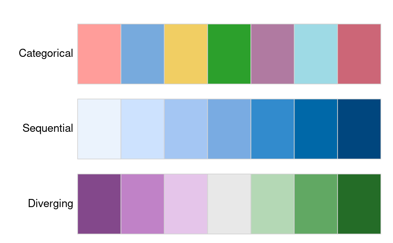{#fig-09-colpal-examplesfig-alt="Examples of categorical, sequential and diverging palettes."fig-align="center" width="80%"}There are two important principles for consideration when working withcolors: perceptibility and accessibility. Firstly, colors on maps shouldmatch our perception. This means that certain colors are viewed throughour experience and also cultural lenses. For example, green colorsusually represent vegetation or lowlands, and blue is connected withwater or coolness. Color palettes should also be easy to understand toeffectively convey information. It should be clear which values arelower and which are higher, and colors should change gradually.Secondly, changes in colors should be accessible to the largest numberof people. Therefore, it is important to use colorblind friendlypalettes as often as possible.### Legends {#sec-09-legends}After we decided on our visual variable and its properties, we shouldmove our attention toward the related map legend style. Using the`tmap::tm_legend()` function, we may change its title, position,orientation, or even disable it. The most important argument in thisfunction is title, which sets the title of the associated legend. Ingeneral, a map legend title should provide two pieces of information:what the legend represents and what the units are of the presentedvariable. The following code chunk demonstrates this functionality byproviding a more attractive name than the variable name "Land_area"(note the use of `base::expression()` to create superscript text).:::::::::::::::: my-code-collection::::: my-code-collection-header::: my-code-collection-icon:::::: {#exm-09-customize-legends}: Customizing legends:::::::::::::::::::: my-code-collection-container::::::::::: panel-tabset###### Title:::::: my-r-code:::: my-r-code-header::: {#cnj-09-legend-title}: Changing the legend title:::::::::: my-r-code-container```{r}#| label: legend-titlelegend_title = base::expression("Area (km"^2*")")tmap::tm_shape(nz) + tmap::tm_polygons(fill ="Land_area", fill.legend = tmap::tm_legend(title = legend_title,orientation ="portrait",position = tmap::tm_pos_in("left", "top") ) )```:::::::::###### Orientation / Position:::::: my-r-code:::: my-r-code-header::: {#cnj-09-legend-orientation-position}: Customizing of the legend orientation and position:::::::::: my-r-code-container```{r}#| label: legend-orientation-positiontmap::tm_shape(nz) + tmap::tm_polygons(fill ="Land_area",fill.legend = tmap::tm_legend(title = legend_title,orientation ="portrait",position = tmap::tm_pos_in(pos.h ="left", pos.v ="top" ) ) )```::::::::::::::::::::::::::::::::::::::::::::::::The default legend orientation in {**tmap**} is "portrait", however, analternative legend orientation, "landscape", is also possible. Otherthan that, we can also customize the location of the legend using theposition argument.The legend position (and also the position of several other map elementsin tmap) can be customized using one of a few functions. (I have therelevant functions for oeintation and position already used in@sec-09-scales.)The two most important functions for the positions are:- `tmap::tm_pos_out()`: the default, adds the legend outside of the map frame area. We can customize its location with two values that represent the horizontal position ("left", "center", or "right"), and the vertical position ("bottom", "center", or "top")- `tmap::tm_pos_in()`: puts the legend inside of the map frame area. We may decide on its position using two arguments, where the first one can be "left", "center", or "right", and the second one can be "bottom", "center", or "top".Alternatively, we may just provide a vector of two values (or twonumbers between 0 and 1) here – and in such case, the legend will be putinside the map frame.------------------------------------------------------------------------### Layouts {#sec-09-layouts}The map layout refers to the combination of all map elements into acohesive map. Map elements include among others- the objects to be mapped,- the map grid (`tmap::tm_graticules()`, `tmap::tm_grid()`),- the north arrow or compass (`tmap::tm_compass()`),- the scale bar (`tmap::tm_scalebar()`),- the title (`tmap::tm_title()`),- the logo (`tmap::tm_logo()`),- credits (`tmap::tm_credits()`), could also used for annotations, and- margins.The color settings covered in the previous section relate to the paletteand breakpoints used to affect how the map looks. Both may result insubtle changes that can have an equally large impact on the impressionleft by your maps.#### Graticules and grid::: callout-note###### Graticules versus Grid- `tmap::tm_grid()` is used to draw grid lines based on the projection of the input data, e.g. its role is to represent the input data’s coordinates.- `tm_graticules()` is used to draw lines of latitude (parallels) and longitude (meridians) in degrees, providing a geographic reference regardless of the data's projection.See for details: [Grids and graticules in the tmappackage](https://geocompx.org/post/2019/tmap-grid/)::::::::: my-r-code:::: my-r-code-header::: {#cnj-09-graticules-versus-grid}: Difference between graticules and grid:::::::::: my-r-code-container```{r}#| label: fig-graticules-versus-grid#| fig-cap: "Using `tmap::tm_grid()` (left) and using `tmap::tm_graticules() with the degree sign (right)"nz01 <- tmap::tm_shape(nz) + tmap::tm_polygons() + tmap::tm_grid()nz02 <- tmap::tm_shape(nz) + tmap::tm_polygons() + tmap::tm_graticules()tmap::tmap_arrange(nz01, nz02)```:::::::::#### ComponentsComponents are non-spatial parts of the plots:- the north arrow or compass (`tmap::tm_compass()`),- the scale bar (`tmap::tm_scalebar()`),- the title (`tmap::tm_title()`),- the logo (`tmap::tm_logo()`),- credits (`tmap::tm_credits()`), could also used for annotations, andSee also: [tmap basics:components](https://r-tmap.github.io/tmap/articles/basics_components).:::::: my-r-code:::: my-r-code-header::: {#cnj-09-layout-components}: Showing layout components:::::::::: my-r-code-container```{r}#| label: fig-layout-components#| fig-cap: "New Zealand map with additonal layout components: title, compass, scale bar, credits and logo"tmap::tm_shape(nz) + tmap::tm_polygons() +# tmap::tm_graticules() + tmap::tm_compass(type ="8star", position =c("left", "top")) + tmap::tm_scalebar(breaks =c(0, 100, 200), text.size =1, position =c("left", "top")) + tmap::tm_title("New Zealand") + tmap::tm_logo(base::system.file("help", "figures", "logo.png", package ="tmap")) + tmap::tm_credits("Source: https://www.stats.govt.nz/")```:::::::::#### Layout settings{**tmap**} also allows a wide variety of layout settings to be changed.To delve into the meaning of all this parameters call the appropriatehelp file with `?tmap::tm_layout`. The following huge list gives you afirst impression of the many possible settings.```{r}#| label: show-layout-argsbase::args(tmap::tm_layout)```Some of the above list of arguments are used in the following graphics::::::: my-r-code:::: my-r-code-header::: {#cnj-09-layout-settings}: Examples for different arguments for layout settings:::::::::: my-r-code-container```{r}#| label: fig-layout-settings#| fig-cap: "Examples for different arguments for layout settings. Changing the overall scale of the map to `scale = 4` (left), setting the background color `bg.color = 'lightblue'` (center) and removing the border around the graph with `frame = FALSE`"map_nz <- tmap::tm_shape(nz) + tmap::tm_polygons()map_nz1 <- map_nz + tmap::tm_layout(scale =4)map_nz2 <- map_nz + tmap::tm_layout(bg.color ="lightblue")map_nz3 <- map_nz + tmap::tm_layout(frame =FALSE)tmap::tmap_arrange(map_nz1, map_nz2, map_nz3)```:::::::::A helpful function for designing a specific layout is`tmap::tmap_design_mode()`. When the so-called "design mode" is enabled,inner and outer margins, legend position, and aspect ratio are shownexplicitly in plot mode. Also, information about aspect ratios isprinted in the console. This function sets the global option`tmap.design.mode`. It can be used as toggle function without arguments.:::::: my-r-code:::: my-r-code-header::: {#cnj-09-design-mode}: Turning design mode on/off to check and change specific layout options:::::::::: my-r-code-container```{r}#| label: fig-desing-mode#| results: hold#| fig-cap: "Turning on/off the design mode to check and change specific layout options."tmap::tmap_design_mode()map_nztmap::tmap_design_mode()```------------------------------------------------------------------------The desing mode is especially valuable if you want to change the aspectratio to remove white space around the figure.::::::::::::::: my-resource:::: my-resource-header::: {#lem-09-layout-settings}: Resources for changing layout settings in {**tmap**}:::::::::: my-resource-container- {**tmap**} [basics: layout](https://r-tmap.github.io/tmap/articles/basics_layout)- {**tmap**} [advanced: margins and aspect ratio](https://r-tmap.github.io/tmap/articles/adv_margins)- {**tmap**} [advanced: options](https://r-tmap.github.io/tmap/articles/adv_options):::::::::### Faceted maps {#sec-09-faceted-maps}Faceted maps are composed of many maps arranged side-by-side, andsometimes stacked vertically. Facets enable the visualization of howspatial relationships change with respect to another variable, such astime. The changing populations of settlements, for example, can berepresented in a faceted map with each panel representing the populationat a particular moment in time.::::::: my-r-code:::: my-r-code-header::: {#cnj-09-faceted-maps-urban-agglo}: Faceted maps::::::::::: my-r-code-container```{r}#| label: fig-faceted-maps-urban-agglo#| fig-cap: "Faceted map showing the top 30 largest urban agglomerations from 1970 to 2030 based on population projections by the United Nations."urb_1950_2035 <- spData::urban_agglomerationsworld <- tmap::Worldurb_1970_2030 <- urb_1950_2035 |> dplyr::filter(year %in%c(1970, 1990, 2010, 2030))tmap::tm_shape(world) + tmap::tm_polygons(fill ="white") + tmap::tm_shape(urb_1970_2030) + tmap::tm_symbols(fill ="red", col ="black",size ="population_millions",size.legend = tmap::tm_legend(title ="Urban populations in million") ) + tmap::tm_facets_wrap(by ="year", nrow =2) + tmap::tm_layout(legend.orientation ="landscape",legend.position = tmap::tm_pos_out(cell.h ="center",cell.v ="bottom" ) )```------------------------------------------------------------------------::: callout-note###### How to change the legend title?I just learned that the legend title has to be changed with the argumentthat calls the database column. In this case it is`size = "population_millions"`, therefore I had to use`size.legend = tmap::tm_legend()` (and not`size.legend = tmap::tm_legend()` as I tried all the time!)Revising my notes I learned that the first paragraph in (@sec-09-scales)stated exactly this procedure: But `fill.scale`, `size.scale` does notonly control how the selected visual variable is presented but also thelegend title.::::::::::::::The preceding code chunk demonstrates key features of faceted mapscreated using the `tmap::tm_facets_wrap()` function:- Shapes that do not have a facet variable are repeated (countries in world in this case)- The `by` argument which varies depending on a variable ("year" in this case)- The `nrow/ncol` setting specifying the number of rows and columns that facets should be arranged intoAlternatively, it is possible to use the `tmap::tm_facets_grid()`function that allows to have facets based on up to three differentvariables: one for rows, one for columns, and possibly one for pages.In addition to their utility for showing changing spatial relationships,faceted maps are also useful as the foundation for animated maps (see@sec-09-animated-maps).### Inset maps (empty) {#sec-09-inset-maps}An inset map is a smaller map rendered within or next to the main map.It could serve many different purposes, including providing a context orbringing some non-contiguous regions closer to ease their comparison.They could be also used to focus on a smaller area in more detail or tocover the same area as the map, but representing a different topic.## Animated maps {#sec-09-animated-maps}### IntroductionFaceted maps, described in Section (@sec-09-faceted-maps), can show howspatial distributions of variables change (e.g., over time), but theapproach has disadvantages. Facets become tiny when there are many ofthem. Furthermore, the fact that each facet is physically separated onthe screen or page means that subtle differences between facets can behard to detect.Animated maps solve these issues. Although they depend on digitalpublication, this is becoming less of an issue as more and more contentmoves online. Animated maps can still enhance paper reports: you canalways link readers to a webpage containing an animated (or interactive)version of a printed map to help make it come alive.### Comparing downloadsThere are several animation packages, including {**tmap**} whichincludes with `tmap::tmap_animation()` a specialized function forgeospatial animations.:::::: my-r-code:::: my-r-code-header::: {#cnj-ID-text}: Comparing downloads of several animation packages:::::::::: my-r-code-container```{r}#| label: download-numbers-animation-packagesmy_pkgs_dl(pkgs =c("tmap", "gganimate", "plotly", "animation", "animint2", "loon", "tweenR"),period ="last-month", days =30)```------------------------------------------------------------------------I have no much experience with animations packages. But it is evidentfor me that the first three are very important:- {**plotly**): I have already started to learn {**plotly**} and produced some [personal notes](https://bookdown.org/pbaumgartner/learning-plotly/). I think I will use it to get more information out of map graphics via interactivity, for instance moving the cursor over the map and showing the name of the country and/or some vital statistics.- {**gganimate**} is important because it is fully compatible with {**ggplot2**} and it can be used for specifying transitions and animations in a flexible and extensible way. But at the moment (2025-05-22) I do not have any experience with this package.:::::::::Here I will concentrate on {**tmap**}.### Ladder scoreInstead of reproducing the book's example, I will try to use the`r glossary("WHR")` dataset. I want to see the changes over time for the`r glossary("cantril ladder")` score of the countries. My main questionis: What does an animation of the well-being scores looks like and is itvaluable graphical representation to understand the data better?As a tempalte for my own code I am going to use the animated map showingthe [top 30 largest urban agglomerations from 1950 to2030](https://github.com/geocompx/geocompr/blob/main/code/09-urban-animation.R)based on population projects by the United Nations.:::::: my-r-code:::: my-r-code-header::: {#cnj-09-faceted-maps-for-animation}: Producing faceted maps for the animation:::::::::: my-r-code-container<center>**Run this code chunk manually if the file still needs to bedownloaded.**</center>```{r}#| label: faceted-maps-world-whr#| eval: falsewhr_2011_2024 <- base::readRDS("data/chapter09/whr_final.rds") |> dplyr::filter(wb_group_name =="World") |> dplyr::select(1:3, 6)world_map_countries <- base::readRDS("data/chapter09/world_map2.rds") |> tibble::as_tibble() |> sf::st_as_sf() |> dplyr::rename(iso3 = adm0_a3, name = admin) |> dplyr::select(iso3, name)my_save_data_file("chapter09", world_map_countries, "world_map_countries.rds")world_whr_2011_2024 <- dplyr::left_join( whr_2011_2024, world_map_countries, dplyr::join_by(iso3 == iso3) ) |> sf::st_as_sf()m_save <- tmap::tm_shape(world_whr_2011_2024) + tmap::tm_polygons(fill ="ladder_score", col ="black",fill.scale = tmap::tm_scale(values ="matplotlib.rainbow" ),fill.legend = tmap::tm_legend(title ="Well-being Score"),fill.free =FALSE ) + tmap::tm_facets_wrap(by ="year", nrow =1, ncol =1, free.coords =FALSE) + tmap::tm_layout(legend.orientation ="landscape",legend.position = tmap::tm_pos_out("center", "bottom") ) tmap::tmap_animation(tm = m_save, filename ="data/chapter09/ladder_score.gif",width =1200, height =800,delay =800,asp =1.8,outer.margins =0)```------------------------------------------------------------------------<center>(*For this R code chunk is no output available*)</center>::::::::::::::: my-r-code:::: my-r-code-header::: {#cnj-09-run-animation}: Run the animation:::::::::: my-r-code-container```{r}#| label: fig-run-animation#| fig-cap: "Show well-being country scores over the years 2011-2024 (2013 is missing). Higher values are higher happiness."magick::image_read("data/chapter09/ladder_score.gif")```------------------------------------------------------------------------Wait some time for seeing the first change. I have set `delay = 800` toprovide time for inspecting each year. But even with this long time theresult is not very satisfying: It is difficult to get a betterunderstanding about the trends. What I would need is to choose when tochange to get which year and this option combined with the interactiveinspection of data by hovering the mouse pointer over the map.:::::::::## Interactive maps {#sec-09-interactive-maps}### IntroductionWe will explore how to make slippy maps with {**tmap**} (the syntax ofwhich we have already learned), {**mapview**}, {**mapdeck**} and finallywith the very popular {**leaflet**} (which provides low-level controlover interactive maps and has many supporting packages).:::::: my-resource:::: my-resource-header::: {#lem-09-leaflet-ecosphere}: Leaflet and packages extending its function (Leaflet ecosphere):::::::::: my-resource-containerI just learned that there are many packages that extend thefunctionality of {**leafelet**}. In alphabetical order:- {**leafem**}: {**leaflet**} extension for {**mapview**}- {**leafgl**}: High-performance 'WebGL' rendering for {**leaflet**}- {**leaflegend**}: Add custom legends to {**leaflet**} maps- {**leaflet**}: Create interactive web maps with the JavaScript 'leaflet' library- {**leaflet.extras**}: Extra functionality for {**leaflet**}- {**leaflet.providers**}: Leaflet providers- {**leafpop**}: Include tables, images and graphs in {**leaflet**} pop-ups- {**leafsync**}: Small multiples (facets) for {**leaflet**} web maps:::::::::### Comparing downloadsThere are several animation packages, including {**tmap**} whichincludes with `tmap::tmap_animation()` a specialized function forgeospatial animations.:::::: my-r-code:::: my-r-code-header::: {#cnj-ID-text}: Comparing downloads of several interactive map packages:::::::::: my-r-code-container```{r}#| label: download-numbers-interactive-maps-packagesmy_pkgs_dl(pkgs =c("tmap", "plotly", "mapview","mapdeck","googleway","mapsf","mapmisc","leaflet","Rgooglemaps","ggmap","mapedit" ),period ="last-month", days =30)```:::::::::### Preparing data:::::: my-r-code:::: my-r-code-header::: {#cnj-09-prepare-leaflet-data}: Prepare data for calling leaflet WHR 2024 data:::::::::: my-r-code-container<center>**Run this code chunk manually if the file still needs to bedownloaded.**</center>```{r}#| label: whr-2024-tmap-view#| eval: falsewhr_2024 <- base::readRDS("data/chapter09/whr_final.rds") |> dplyr::filter( wb_group_name =="World"& year ==2024) |> dplyr::select(1:3, 6)world_map_countries <- base::readRDS("data/chapter09/world_map_countries.rds") world_whr_2024 <- dplyr::left_join( whr_2024, world_map_countries, dplyr::join_by(iso3 == iso3) ) |> sf::st_as_sf()leaflet_whr_2024 <- tmap::tm_shape(world_whr_2024) + tmap::tm_polygons(fill ="ladder_score", id ="name", hover =TRUE,fill.scale = tmap::tm_scale(values ="matplotlib.rainbow",value.na ="yellow") )my_save_data_file("chapter09", leaflet_whr_2024, "leaflet_whr_2024.rds")```------------------------------------------------------------------------<center>(*For this R code chunk is no output available*)</center>Hovering about the menu "paper pile" you can choose the kind ofbackground map. The background labels appear whenever there are no datafor countries and the map is resized to greater details. But my specificyellow color does not work for NA's countries as they all appear with agray background.:::::::::### Applying {leaflet} via {tmap}A unique feature of {**tmap**} is its ability to create static andinteractive maps using the same code. Maps can be viewed interactivelyat any point by switching to view mode, using the command`tmap::tmap_mode("view")`. This should be the same as`tmap::tmap_leaflet(data, show = TRUE)` with the advantage that you canspecify to show or hide the map and that you don't need to place thecode to return to plot mode with `tmap::tmap_mode("plot")`.::: callout-warning###### The function `tmap::tmap_leaflet(leaflet_whr_2024, show = TRUE)` did not work for me.:::#### Turn on "view" mode:::::: my-r-code:::: my-r-code-header::: {#cnj-09-turn-on-mode-view}: Turn on "View" mode:::::::::: my-r-code-container```{r}#| label: turn-on-mode-viewtmap::tmap_mode("view")```:::::::::#### Basemap provider:::::::::::::::: my-code-collection::::: my-code-collection-header::: my-code-collection-icon:::::: {#exm-09-standard-basemap}: Map with standard & specific provider:::::::::::::::::::: my-code-collection-container::::::::::: panel-tabset###### Standard providers:::::: my-r-code:::: my-r-code-header::: {#cnj-09-whr-standard-provider}: Map of well-being scores in 2024 in standard version:::::::::: my-r-code-container```{r}#| label: fig-standard-providers#| fig-cap: "Interactive map of the well-being data in 2024 with standard providers"leaflet_whr_2024 <- base::readRDS("data/chapter09/leaflet_whr_2024.rds")leaflet_whr_2024```------------------------------------------------------------------------Hovering the mouse cursor over the paper pile symbol (top left) opens amenu where you can choose different map styles. But you can also pickone of very many [map serverprovider](https://leaflet-extras.github.io/leaflet-providers/preview/)as it is shown in the next tab.:::::::::###### Specific provider:::::: my-r-code:::: my-r-code-header::: {#cnj-09-whr-specific-provider}: Map of well-being scores in 2024 with specific map provider:::::::::: my-r-code-container```{r}#| label: fig-specific-provider#| fig-cap: "Interactive map with specified base map 'Esri.WorldTopoMap'"leaflet_whr_2024 + tmap::tm_basemap(server ="USGS.USTopo")```------------------------------------------------------------------------There are many options to choose a provider for the `server` parameter.Choose one from the [leaflet providerpreview](https://leaflet-extras.github.io/leaflet-providers/preview/).::::::::::::::::::::::::::::::::::::::::::::::::`tmap::tm_basemap()` draws the tile layer as basemap, i.e. as bottomlayer. In contrast, there is also `tmap::tm_tiles()` that draws the tilelayer as overlay layer, where the stacking order corresponds with theorder in which this layer is called, just like other map layers.There are two parameters `group`and `group.control` to manage the maplayers:- **group**: Name of the group to which this layer belongs. This is only relevant in view mode, where layer groups can be switched.- **group.control**: In view mode, the group control determines how layer groups can be switched on and off. Options are:- "radio" for radio buttons (meaning only one group can be shown),- "check" for check boxes (so multiple groups can be shown), and- "none" for no control (the group cannot be (de)selected).#### Facets: "pretty" breaks:::::: my-r-code:::: my-r-code-header::: {#cnj-09-facetpretty-breaks}: Compare 2011 with 2024 WHR data with `pretty` breaks:::::::::: my-r-code-container```{r}#| label: fig-facets-pretty-breaks#| fig-cap: "Compare 2011 with 2024 WHR data of world's countries (pretty breaks)"whr_final <- base::readRDS("data/chapter09/whr_final.rds") world_map_countries <- base::readRDS("data/chapter09/world_map_countries.rds") whr_2011.2024<- whr_final |> dplyr::filter( wb_group_name =="World"& (year ==2011| year ==2024) ) |> dplyr::select(1,2,6) |> tidyr::pivot_wider(names_from = year,values_from = ladder_score )world_whr_2011.2024<- dplyr::left_join( whr_2011.2024, world_map_countries, dplyr::join_by(iso3 == iso3) ) |> sf::st_as_sf()tmap::tm_shape(world_whr_2011.2024) + tmap::tm_polygons(c("2011", "2024"),fill.scale = tmap::tm_scale(values ="cols4all.friendly13" ),fill.legend = tmap::tm_legend(title ="Score" ),fill.free =FALSE ) + tmap::tm_facets_vstack(ncol =1, sync =TRUE)```------------------------------------------------------------------------The breaks aren't optimal. For instance Russia has improved considerablefrom 5.284 in 2011 to 5.945, but you can't see this progress becauseboth values are between 5 to 6. Here I should consider more sensiblebreaks as I have tried in the next code chunk.:::::::::::: callout-important####### Adding {sf} class to {tibble} classWithout `sf::st_as_sf()` rendering the whole file would not work (butknitting just this code chunk would work). The reason is that I need tobe aware the {**tibble**} classes `"tbl_df" "tbl" "data.frame"` neededto convert to (**sf**) classes with the result`"sf" "tbl_df" "tbl" "data.frame"`.:::#### Facets: quantile breaks:::::: my-r-code:::: my-r-code-header::: {#cnj-09-sync-facet2}: Compare 2011 with 2024 WHR data with `quantile` breaks:::::::::: my-r-code-container```{r}#| label: fig-facets-quantile-breaks#| fig-cap: "Compare 2011 with 2024 WHR data of world's countries (quantile breaks)"tmap::tm_shape(world_whr_2011.2024) + tmap::tm_polygons(c("2011", "2024"),fill.scale = tmap::tm_scale_intervals(values ="cols4all.friendly13" ,n =7,style ="quantile" ),fill.legend = tmap::tm_legend(title ="Score" ),fill.free =FALSE ) + tmap::tm_facets_vstack(ncol =1, sync =TRUE)```:::::::::#### Back to "plot" mode:::::: my-r-code:::: my-r-code-header::: {#cnj-09-plot-mode}: Back to "plot" mode:::::::::: my-r-code-container```{r}#| label: plot-modetmap::tmap_mode("plot")```:::::::::### Other interactive map packages#### {mapview}If you are not proficient with {**tmap**}, the quickest way to createinteractive maps in R may be with {**mapview.**} The following ‘oneliner’ is a reliable way to interactively explore a wide range ofgeographic data formats.:::::::::::::::::::: my-code-collection::::: my-code-collection-header::: my-code-collection-icon:::::: {#exm-09-basic-mapview}: Basic {**mapview**}: One-liner:::::::::::::::::::::::: my-code-collection-container::::::::::::::: panel-tabset###### nz:::::: my-r-code:::: my-r-code-header::: {#cnj-09-basic-mapview-nz}: Basic {**mapview**}: One-liner nz:::::::::: my-r-code-container```{r}#| label: basic-mapviewmapview::mapview(nz)```:::::::::###### Breweries:::::: my-r-code:::: my-r-code-header::: {#cnj-09-basic-mapview-breweries}: Basic {**mapview**}: One-liner Breweries:::::::::: my-r-code-container```{r}#| label: basic-mapview-breweriesmapview::mapview(mapview::breweries)```:::::::::###### world map:::::: my-r-code:::: my-r-code-header::: {#cnj-09-basic-world-mapview}: Basic {**mapview**}: One-liner world:::::::::: my-r-code-container```{r}#| label: basic-world-mapviewmapview::mapview(world_map_countries)```::::::::::::::::::::::::::::::::::::::::::::::::::::::::::::{**mapview**} has a concise syntax, yet, it is powerful. By default, ithas some standard GIS functionality such as mouse position information,attribute queries (via pop-ups), scale bar, and zoom-to-layer buttons.It also offers advanced controls including the ability to ‘burst’datasets into multiple layers and the addition of multiple layers with +followed by the name of a geographic object. Additionally, it providesautomatic coloring of attributes via the `zcol` argument. In essence, itcan be considered a data-driven {**leaflet**}`r glossary("APIx", "API")` (see below for more information about{**leaflet**}).Given that {**mapview**} always expects a spatial object (including sfand SpatRaster) as its first argument, it works well at the end of pipedexpressions.Consider the following example where {**sf**} is used to intersect linesand polygons and then is visualized with {**mapview**}. It uses someadvanced {**sf**} function I had never used before.:::::: my-r-code:::: my-r-code-header::: {#cnj-09-franconia-trails-breweries}: Example that intersects lines and polygons with {**sf**} visualizedwith {**viewmap**}:::::::::: my-r-code-container```{r}#| label: franconia-trails-breweriesoberfranken = base::subset( mapview::franconia, district =="Oberfranken" )mapview::trails |> sf::st_transform(sf::st_crs(oberfranken)) |> sf::st_intersection(oberfranken) |> sf::st_collection_extract("LINESTRING") |> mapview::mapview(color ="red", lwd =3, layer.name ="trails") + mapview::mapview(mapview::franconia, zcol ="district") + mapview::breweries```:::::::::One important thing to keep in mind is that {**mapview**} layers areadded via the `+` operator (similar to {**ggplot2**} or {**tmap**}). Bydefault, {**mapview**} uses the leaflet JavaScript library to render theoutput maps, which is user-friendly and has a lot of features.However, some alternative rendering libraries could be more performant(work more smoothly on larger datasets). {**mapview**} allows to setalternative rendering (graphics) libraries ({**leafgl**} and{**mapdeck**}) in the `mapview::mapviewOptions()`[^09-making-maps-1].For further information on {**mapview**}, see the package’s website at:[r-spatial.github.io/mapview/](r-spatial.github.io/mapview/): Beside thestandard reference part of available functions there are also sevenarticles explaining different aspects of {**mapview**}.[^09-making-maps-1]: gl — often used for some packages at the end of their names, like {**lefgl**} — is the abbreviation for "graphics library".#### {googleway}There are other ways to create interactive maps with R. The {**googleway**} package, for example, provides an interactive mapping interface that is flexible and extensible.> Googleway provides access to [Google Maps APIs](https://developers.google.com/maps), and the ability to plot an interactive Google Map overlayed with various layers and shapes, including markers, circles, rectangles, polygons, lines (polylines) and heatmaps. You can also overlay traffic information, transit and cycling routes. (From the (new) googleway-vignette, which is more uptodate than the reference at the [documentation website](https://symbolixau.github.io/googleway/).)As I can see there are an awful lot of functions covered in this package. But surprisingly it is not downloaded many times (somewhat under 100 downloads/month)#### {mapdeck}Another approach by the same author that developed {**googleway**} is {**mapdeck**}, a combination of [Mapbox](https://www.mapbox.com/) and [Deck.gl](https://deck.gl/) framework[^09-making-maps-2]. Its use of `WebGL` enables it to interactively visualize large datasets up to millions of points. The package uses [Mapbox](https://www.mapbox.com/) access tokens, which you must register for before using the package.[^09-making-maps-2]: Deck.gl has been developed under the stewardship of Uber’s Engineering organization but has now moved to an open governance model hosted by the [OpenJS Foundation](https://openjsf.org/) and accessible in a [GitHub repository](https://github.com/visgl/deck.gl).:::::{.my-r-code}:::{.my-r-code-header}:::::: {#cnj-09-mapdeck-demo}: Demonstration of {**mapdeck**}:::::::::::::{.my-r-code-container}```{r}#| label: demo-mapdeck#| code-fold: false#| eval: falsemapdeck::set_token(Sys.getenv("MAPBOX_PUBLIC_TOKEN"))crash_data = utils::read.csv("https://git.io/geocompr-mapdeck")crash_data = stats::na.omit(crash_data)ms = mapdeck::mapdeck_style("dark")mapdeck::mapdeck(style = ms, pitch =45, location =c(0, 52), zoom =4) |> mapdeck::add_grid(data = crash_data, lat ="lat", lon ="lng", cell_size =1000,elevation_scale =50, colour_range = grDevices::hcl.colors(6, "plasma"))```***<center>(*For this R code chunk is no output available*)</center>:::::::::The above code chunk worked in RStudio but didn't show up in my Brave browser. At first I thought that it is a problem of [WebGL](https://www.khronos.org/webgl/) compatibility. But as I can see the [spinning cube](https://get.webgl.org/) my browser should support WebGL. But there are other [options why it might fail](https://symbolixau.github.io/mapdeck/articles/issues.html) referenced by the {**mapdeck**} package developer David Cooley or on the [Mapbox website](https://docs.mapbox.com/help/troubleshooting/blank-tiles/) itself.As I couldn't find a solution and as I am not convinced to use {**mpadeck**} on a daily basis I bypassed this problem by using the RStudio result below as an `r glossary("iframe")`. But I had also to cancel the evaluation of the code because otherwise all the other code after this code chunk doesn't appear in the browser. :::::{.my-r-code}:::{.my-r-code-header}:::::: {#cnj-09-html-iframe-mapdeck}: Presenting the results of the demo code in @cnj-09-mapdeck-demo as HTML iframe:::::::::::::{.my-r-code-container}```{=html}<iframe width="780" height="500" src="/data/chapter09/mapdeck-demo.html" title="mapdeck demo, using iFrames"></iframe>```***You can zoom into England and drag the map in the browser to see the crash statistics. In addition you can also rotate and tilt the map when pressing Cmd/Ctrl. Multiple layers can be added with the pipe operator, as demonstrated in the {**mapdeck**} vignettes. {**mapdeck**} also supports `sf` objects, as can be seen by replacing the `mapdeck::add_grid()` function call in the preceding code chunk with `mapdeck::add_polygon(data = lnd, layer_id = "polygon_layer")`, to add polygons representing London to an interactive tilted map.:::::::::#### {leaflet}The last example is {**leaflet**} which is the most mature and widely used interactive mapping package in R. {**leaflet**} provides a relatively low-level interface to the [Leaflet JavaScript library](https://leafletjs.com/) and many of its arguments can be understood by reading the documentation of the original JavaScript library.Leaflet maps are created with `leaflet::leaflet()`, the result of which is a leaflet map object which can be piped to other leaflet functions. This allows multiple map layers and control settings to be added interactively, as demonstrated in the code below. (See the [{**leaflet**} R documentation](https://rstudio.github.io/leaflet/) for details.):::::{.my-r-code}:::{.my-r-code-header}:::::: {#cnj-09-leaflet-demo}: Multiple map layers demonstration of {**leaflet**}:::::::::::::{.my-r-code-container}```{r}#| label: leaflet-demopal = leaflet::colorNumeric("RdYlBu", domain = spData::cycle_hire$nbikes)leaflet::leaflet(data = spData::cycle_hire) |> leaflet::addProviderTiles(leaflet::providers$CartoDB.Positron) |> leaflet::addCircles(col =~pal(nbikes), opacity =0.9) |> leaflet::addPolygons(data = spData::lnd, fill =FALSE) |> leaflet::addLegend(pal = pal, values =~nbikes) |> leaflet::setView(lng =-0.1, 51.5, zoom =12) |> leaflet::addMiniMap()```:::::::::::: {.callout-note}###### See my section to learn how to use {leaflet} in @sec-annex-leaflet:::## Mapping Applications### Limatation of interactivityThe interactive web maps demonstrated in @sec-09-interactive-maps can go far. Careful selection of layers to display, basemaps and pop-ups can be used to communicate the main results of many projects involving geocomputation. But the web mapping approach to interactivity has also some limitations:- Although the map is interactive in terms of panning, zooming and clicking, the code is static, meaning the user interface is fixed.- All map content is generally static in a web map, meaning that web maps cannot scale to handle large datasets easily.- Additional layers of interactivity, such a graphs showing relationships between variables and ‘dashboards’, are difficult to create using the web mapping-approach.### Geospatial framework & map serversOvercoming these limitations involves going beyond static web mapping and toward geospatial frameworks and map servers. Products in this field include - [GeoDjango](https://www.djangoproject.com/) which extends the Django web framework and is written in Python, - [MapServer](https://mapserver.org/) (a framework for developing web applications, largely written in C and C++) and - [GeoServer](https://geoserver.org/) (a mature and powerful map server written in Java). Each of these is scalable, enabling maps to be served to thousands of people daily, assuming there is sufficient public interest in your maps! The bad news is that such server-side solutions require much skilled developer time to set up and maintain, often involving teams of people with roles such as a dedicated geospatial database administrator (DBA).### {shiny} {#sec-09-shiny}Fortunately for R programmers, web mapping applications can now be rapidly created with {**shiny**} [@shiny]. As described in the open source book [Mastering Shiny](https://mastering-shiny.org/) [@wickham2021] and in the [shiny documentation](https://shiny.posit.co/), {**shiny**} is an R package and framework for converting R code into interactive web applications. You can embed interactive maps in {**shiny**} apps thanks to functions such as `leaflet::renderLeaflet()`.:::::{.my-r-code}:::{.my-r-code-header}:::::: {#cnj-09-shiny-demo}: Demo of a {**Shiny**} driven interactive map:::::::::::::{.my-r-code-container}```{r}#| label: shiny-demo#| eval: false#| code-fold: falselibrary(shiny) # for shiny appslibrary(leaflet) # renderLeaflet functionlibrary(spData) # loads the world dataset ui =fluidPage(sliderInput(inputId ="life", "Life expectancy", 49, 84, value =80),leafletOutput(outputId ="map") )server =function(input, output) { output$map =renderLeaflet({leaflet() |># addProviderTiles("OpenStreetMap.BlackAndWhite") |>addPolygons(data = spData::world[world$lifeExp < input$life, ])})}shinyApp(ui, server)```***<center>(*For this R code chunk is no output available*)</center>:::::::::This minimum example does not work. Rendering just the code chunk inside RStudio I got the warning message "Warning: Error in FUN: `x` must be a vector, not a <sfc_MULTIPOLYGON/sfc> object." and a separate page/tab in the browser with the 'Life expectancy' slider but nothing else.Knitting the whole Quarto file I got no warning but the message on which port shiny is listening with an empty grey rectangle.::: {.callout-note #nte-09-serverless-shiny}###### Deploying a serverless Shiny application for R within QuartoI assumed for the problem above that it is not possible to include a Shiny application inside a Quarto document without a shiny server. But I came across the GitHub repository [Creating an R Shinylive App inside a Quarto Document](https://github.com/coatless-quarto/r-shinylive-demo/) featuring a tutorial for a [R-shinylive app in Quarto](https://quarto.thecoatlessprofessor.com/r-shinylive-demo/) followed up by another [serverless demonstration of a shiny app dashboard](https://github.com/coatless-dashboard/r-shinylive-dashboard-app).Later I learned that there is a {**shinylive**} package. See the [docs](https://posit-dev.github.io/r-shinylive/) and the [GitHub repo](https://github.com/posit-dev/r-shinylive). > Exporting 'shiny' applications with 'shinylive' allows you to run them entirely in a web browser, without the need for a separate R server. The traditional way of deploying 'shiny' applications involves i a separate server and client: the server runs R and 'shiny', and clients connect via the web browser. When an application is deployed with 'shinylive', R and 'shiny' run in the web browser (via 'webR'): the browser is effectively both the client and server for the application. This allows for your 'shiny' application exported by 'shinylive' to be hosted by a static web server.The original URL I found was the [tutorial](https://quarto.thecoatlessprofessor.com/r-shinylive-demo/) developed by [TheCoatlessProfessor](https://thecoatlessprofessor.com/) (James J Balamuta) based on its [GitHub repo featuring a demo and several introductory articles](https://github.com/coatless-quarto/r-shinylive-demo). It is based on a talk by [Joe Cheng at the posit conference 2023 on the shinylive project](https://github.com/jcheng5/posit-conf-2023-shinylive) and has a [follow up article from march 2025](https://github.com/coatless-tutorials/convert-shiny-app-r-shinylive) with an update and a link to a demo dashboard website.I think it pays the effort to study this possibility because it would a huge advantage if I could provide my result as an interactive shiny dashboard!:::::: {.callout-note}###### Learning {leaflet} combined with {shiny}There are several hints about the details of the demonstration in @cnj-09-shiny-demo in the Geocomputing book which could helpful to learn how to integrate interactive maps with {**leaflet**} into {**shiny**}. I will skip these parts here at the moment. Perhaps I will come back to it later in another trial or occasion to interpret my datasets.:::## Other mapping packages### Generic map packagesWe have learned that there are many geocpomputing packages around. You will get an overview about the functionality of these packages skimming two task views:- **Spatial**: `r glossary("CRAN")` Task View: [Analysis of Spatial Data](https://CRAN.R-project.org/view=Spatial) [@bivand2025]. Base R includes many functions that can be used for reading, visualising, and analysing spatial data. The focus in this view is on “geographical” spatial data, where observations can be identified with geographical locations, and where additional information about these locations may be retrieved if the location is recorded with care. This is the more updated task view, but I noticed that {**googleway**} was not mentioned.- **SpatioTemporal**: `r glossary("CRAN")` Task View: [Handling and Analyzing Spatio-Temporal Data](https://CRAN.R-project.org/view=SpatioTemporal)[@pebesma2022]. This task view aims at presenting R packages that are useful for the analysis of spatio-temporal data. (This task view seems a little bit outdated because the last update was 2022-10-01.)The chapter on mapping application features especially {**ggplot2**} which supports the {**sf**} package with the `ggplot2::geom_sf()` function but is also part of an ecosphere that includes map-drawing relevant packages as for instance {**ggspatial**}, {**ggmap**}, and {**mapsf**}- [{**ggmap**}](https://github.com/dkahle/ggmap)[@ggmap] contains a collection of functions to visualize spatial data and models on top of static maps from various online sources (e.g Google Maps and Stamen Maps). It includes tools common to those tasks, including functions for geolocation and routing.- [{**ggspatial**}](https://paleolimbot.github.io/ggspatial/)[@ggspatial] is a spaital framework for {**gplot2**}. It enhances {**ggplot2**}’s mapping capabilities by providing options to add a north arrow (`ggspatial::annotation_north_arrow()`) and a scale bar (`ggspatial::annotation_scale()`), or to add background tiles (`ggspatial::annotation_map_tile()`). It also accepts various spatial data classes with `ggspatial::layer_spatial()`.- [{**mapsf**}](https://riatelab.github.io/mapsf/)[@mapsf] create and integrates thematic maps in your workflow. This package helps to design various cartographic representations such as proportional symbols, choropleth or typology maps. It also offers several functions to display layout elements that improve the graphic presentation of maps (e.g. scale bar, north arrow, title, labels). {**mapsf**} maps {**sf**} objects on {**base**} graphics.Another benefit of maps based on {**ggplot2**} is that they can easily be given a level of interactivity when printed using the function `plotly::ggplotly()` from the {**plotly**} package.{**rasterVis**} is another geocomputing package facilitating visualization methods for raster data. As I am mostly interested in visualizing vector data I am not going into the detail of this package.#### Summary table```{r map-gpkg, echo=FALSE, message=FALSE, warning=FALSE}# code/09-map-pkgs.Rext_url <-"https://raw.githubusercontent.com/geocompx/geocompr/refs/heads/main/extdata/"generic_map_pkgs <-"generic_map_pkgs.csv"gpkg_df = readr::read_csv(base::paste0(ext_url, generic_map_pkgs))map_gpkg_df = dplyr::select(gpkg_df, Package = package, Title = title)map_gpkg_df$Title[map_gpkg_df$Package =="leaflet"] ="Create Interactive Web Maps with Leaflet"knitr::kable(map_gpkg_df, caption ="Selected general-purpose mapping packages.", caption.short ="Selected general-purpose mapping packages.", booktabs =TRUE) |> kableExtra::column_spec(2, width ="9cm")```### Specific map packagesSeveral packages focus on specific map types. Such packages create cartograms that distort geographical space, create line maps, transform polygons into regular or hexagonal grids, visualize complex data on grids representing geographic topologies, and create 3D visualizations.#### Specific map packages```{r map-spkg, echo=FALSE, message=FALSE}# code/09-map-pkgs.R# external urlext_url <-"https://raw.githubusercontent.com/geocompx/geocompr/refs/heads/main/extdata/"specific_map_pkgs <-"specific_map_pkgs.csv"spkg_df = readr::read_csv(base::paste0(ext_url, specific_map_pkgs))map_spkg_df = dplyr::select(spkg_df, Package = package, Title = title)knitr::kable(map_spkg_df, caption =paste("Selected specific-purpose mapping packages,", "with associated metrics."),caption.short ="Selected specific-purpose mapping packages.",booktabs =TRUE)```Of special interest is the {**cartogram**} package [@cartogram]. A `r glossary("cartogram")` is a type of thematic map in which geographic areas are resized or distorted based on a quantitative variable, such as population. The goal is to make the area sizes proportional to the selected variable while preserving geographic positions as much as possible. There is also a {**tmap.cartogram**} package as an extension to the {*+tmap**} packages providing new layer functions to {**tmap**} for creating various types of cartograms.But I have to look much more into the details of all these packages mentioned here. I will do this step by step whenever I feel the need born from my research process working on my different dataset about well-beeing and inequality data.


