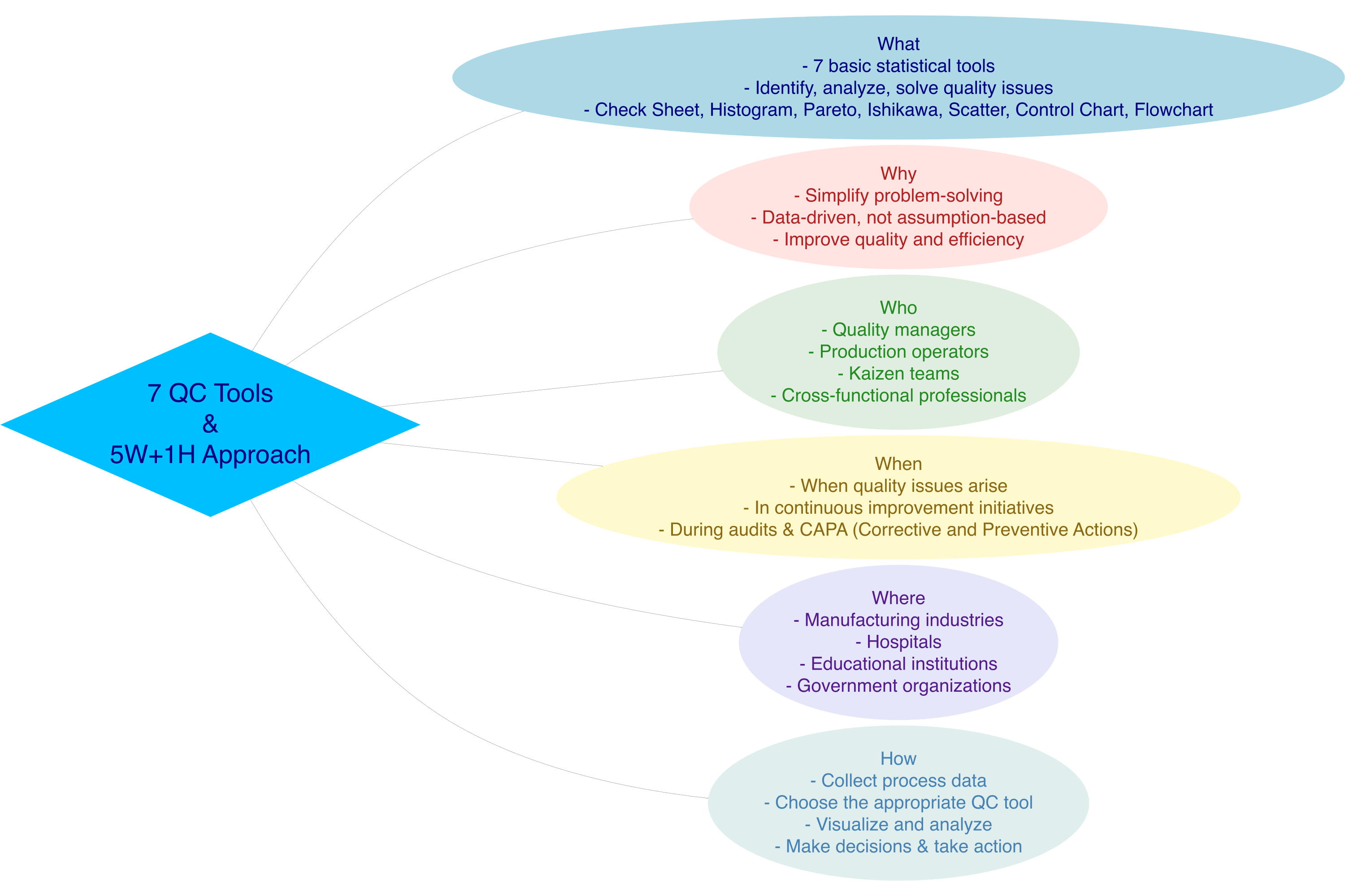
8 Seven Tools Analysis
8.1 Introduction to 7 QC Tools
Definition: The 7 QC Tools (Seven Quality Control Tools) are simple statistical methods used to systematically identify, analyze, and solve quality-related problems.
8.2 What
What are the 7 QC Tools?
The 7 QC Tools are seven simple, statistics-based tools used in quality management to systematically identify, analyze, and resolve problems. Here are the seven tools:
- Check Sheet – A structured data collection sheet
- Histogram – A frequency distribution graph
- Pareto Chart – A bar chart based on the 80/20 principle
- Cause and Effect Diagram (Fishbone/Ishikawa) – A diagram to trace root causes
- Scatter Diagram – A plot showing relationships between two variables
- Control Chart – A process monitoring control chart
- Flowchart – A visual representation of a process flow
8.3 Why
Why are the 7 QC Tools important?
- Easy to use by anyone, even those without a statistical background
- Problem-solving is based on data, not assumptions
- Improves process efficiency and effectiveness
- Supports fact-based decision making
- Enhances product/service quality and customer satisfaction
8.4 Who
Who uses the 7 QC Tools?
- Quality managers and quality control staff
- Production operators and supervisors
- Continuous Improvement / Kaizen teams
- Internal and external auditors
- Professionals from various fields: education, healthcare, public services, etc.
8.5 Where
Where are the 7 QC Tools used?
- Manufacturing industries and factories
- Hospitals and healthcare services
- Service and financial companies
- Educational institutions
- Government organizations and public services
8.6 When
When are the 7 QC Tools used?
- When recurring quality issues arise
- During continuous improvement initiatives
- When conducting root cause analysis
- During internal or external quality audits
- When developing corrective and preventive actions (CAPA)
8.7 How
How to use the 7 QC Tools?
- Collect data from relevant processes or activities
- Choose the appropriate QC tool for your analysis goal
- Visualize the data using one of the 7 tools
- Analyze data patterns and trends
- Identify the root cause of the issue
- Develop solutions and improvement plans
- Take follow-up action and monitor improvement results
8.8 Applied of 7 QC Tools
The application of the 7 QC Tools is highly effective in helping organizations identify and mitigate potential operational risks.
For example, in the context of delivery delays, the process can begin with a Check Sheet to collect data on dates, times, and reasons for the delays. The gathered data is then analyzed using a Histogram to observe frequency distribution patterns, and a Pareto Chart to identify the dominant causes that should be prioritized.
Next, a Fishbone Diagram (Cause and Effect) can be used to explore root causes based on factors like Man, Machine, Method, Material, and Environment. Once the root causes are identified, a Scatter Diagram helps to examine the relationship between key variables—such as the link between order quantity and delay frequency. A Control Chart is then used to monitor process stability over time, ensuring variations remain within acceptable limits. Finally, a Flowchart is used to map the entire logistics process, helping to pinpoint potential risk areas.
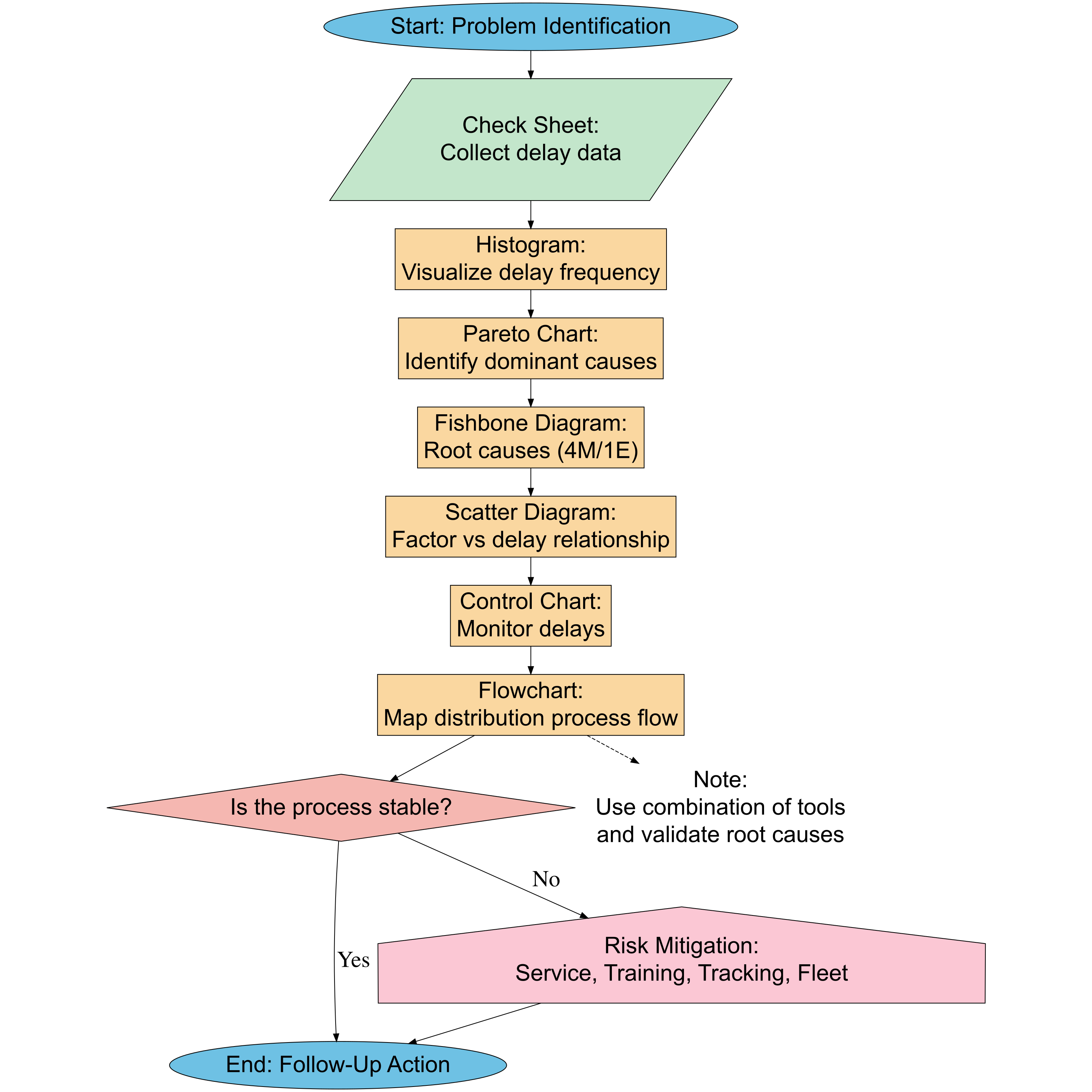
By using the 7 QC Tools, organizations can make data-driven decisions to formulate risk mitigation strategies, such as staff training, regular fleet maintenance, or improving delivery tracking systems. The systematic implementation of the 7 QC Tools not only enhances service quality but also reduces the potential losses due to unmanaged risks.
In operational and logistics management, risks such as delivery delays, data discrepancies, and process errors often arise and affect service quality. To address this, a data-driven approach becomes crucial, and the 7 QC Tools provide the right solution because they can identify, analyze, and help reduce the root causes of these issues systematically.
8.8.1 Cheeck Sheet
Check Sheet is the first step in identifying a problem. This tool helps gather field data quickly and accurately, especially when we do not yet know the specific problem. In risk mitigation, Check Sheet serves as a tool to observe and document risk-causing events systematically.
| Aspect | Description |
|---|---|
| Brief Definition | A simple QC tool used to collect data systematically and in real-time, typically in the form of a table to record the frequency of specific events. |
| Main Function | - Record data quickly and accurately - Identify patterns or event frequencies - Facilitate preliminary analysis of issues |
| Case Example | A logistics team creates a check sheet to record the date, time, and reasons for delivery delays over the course of one month. This data becomes the basis for further analysis. |
8.8.1.1 Check Sheet in R
- Data Check Sheet
- Frequency Tabulation
# Count frequency of each delay reason
library(dplyr)
library(DT)

reason_summary <- check_sheet %>%
  count(Reason, sort = TRUE) %>%
  rename(Frequency = n)

# Display summary table
datatable(
  reason_summary,
  options = list(
    scrollCollapse = TRUE,
    searching = FALSE,   # Remove search box
    paging = FALSE       # Remove pagination
  ),
  rownames = FALSE,
  caption = htmltools::tags$caption(
    style = 'caption-side: top; text-align: left;
             font-size: 18px; font-weight: bold;',
    'Check Sheet: Summary of Delay Reasons'
  ),
  class = 'stripe hover compact'
)- Simple Visualization
library(plotly)

# Interactive bar chart using plotly
plot_ly(reason_summary,
        x = ~Frequency,
        y = ~reorder(Reason, Frequency),
        type = 'bar',
        orientation = 'h',
        marker = list(
          color = ~Frequency,
          colorscale = 'Viridis',  # Can also try: 'Bluered', 'Cividis', 'YlOrRd'
          showscale = TRUE
        )
) %>%
  layout(
    title = list(text = "Check Sheet: Frequency of Delay Reasons", font = list(size = 18)),
    xaxis = list(title = "Frequency"),
    yaxis = list(title = "Reason"),
    margin = list(l = 120)
  )
8.8.1.2 Check Sheet in Python
- Data Check Sheet
import pandas as pd
import numpy as np
import dash
from dash import dash_table, html, dcc
import plotly.express as px
from datetime import datetime, timedelta

# Simulate data
np.random.seed(123)
dates = pd.date_range(start="2025-04-01", end="2025-04-30")
delay_reasons = [
    "Bad Weather",
    "Fleet Issues",
    "Road Closure",
    "Schedule Error",
    "Late Departure",
    "Operational Issue",
    "Driver Sick",
    "Sudden Request",
    "Document Error",
    "Technical Disruption"
]

data = {
    "Date": np.random.choice(dates, 100),
    "Reason": np.random.choice(delay_reasons, 100)
}

check_sheet = pd.DataFrame(data)- Frequency Tabulation
# Count frequency of delay reasons
reason_summary = check_sheet['Reason'].value_counts().reset_index()
reason_summary.columns = ['Reason', 'Frequency']
reason_summary
Reason Frequency
0 Schedule Error 16
1 Technical Disruption 13
2 Fleet Issues 13
3 Driver Sick 13
4 Document Error 12
5 Sudden Request 12
6 Late Departure 6
7 Operational Issue 5
8 Bad Weather 5
9 Road Closure 5- Simple Visualization
# Create a horizontal bar plot
fig = px.bar(
    reason_summary.sort_values("Frequency"),
    x="Frequency",
    y="Reason",
    orientation='h',
    title="Check Sheet: Frequency of Delay Reasons",
    color="Frequency",
    color_continuous_scale='Viridis'
)
fig.update_layout(margin=dict(l=120), xaxis_title="Frequency", yaxis_title="Reason")
8.8.2 Histogram
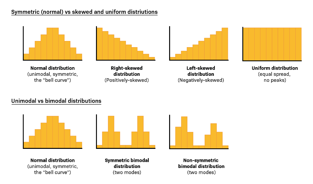
Once the data is collected, the next step is to present it in a visual format that is easy to understand. A histogram is used to see how often a problem or risk occurs, so we can begin recognizing patterns in the events.
| Aspect | Description |
|---|---|
| Brief Definition | A bar graph that shows the frequency distribution of data within a certain interval. |
| Main Function | - Shows how often an event occurs - Identifies distribution patterns - Finds process variations |
| Case Example | The team creates a histogram from the check sheet data to see how many times delays occur at 8 AM, 9 AM, 10 AM, etc. |
8.8.2.1 Histogram in R
# Install and load necessary libraries
library(plotly)

# Generate normal distribution data (mean = 50, standard deviation = 10)
set.seed(123)
normal_data <- rnorm(1000, mean = 50, sd = 10)  # 1000 random data points

# Calculate the density of the normal data
density_data <- density(normal_data)

# Create a histogram of the normal data using plotly
histogram_plot <- plot_ly(
  x = normal_data,
  type = 'histogram',
  marker = list(color = 'lightblue', line = list(color = 'black', width = 1)),
  name = 'Histogram of Normal Data',
  nbinsx = 30,
  opacity = 0.6,
  showlegend = TRUE
) %>%
  # Add the density curve
  add_trace(
    x = density_data$x,
    y = density_data$y * length(normal_data) * diff(range(normal_data)) / 30,
    type = 'scatter',
    mode = 'lines',
    name = 'Density Curve',
    line = list(color = 'black', width = 3),
    showlegend = TRUE
  ) %>%
  layout(
    title = 'Histogram of Normal Distribution with Density Curve',
    xaxis = list(title = 'Value', showgrid = FALSE),
    yaxis = list(title = 'Frequency / Density', showgrid = FALSE),
    bargap = 0.1,
    plot_bgcolor = 'white',
    paper_bgcolor = 'white',
    showlegend = TRUE,
    legend = list(
      orientation = 'v',    # vertical legend
      x = 0.98,             # almost at the right edge
      xanchor = 'right',
      y = 0.98,             # almost at the top
      yanchor = 'top',
      bgcolor = 'rgba(255,255,255,0.8)',  # semi-transparent background
      bordercolor = 'black',
      borderwidth = 0.3
    )
  )

# Show the plot
histogram_plot
8.8.2.2 Histogram in Python
import numpy as np
import plotly.graph_objs as go
from scipy.stats import gaussian_kde

# Generate normal distribution data (mean = 50, std = 10)
np.random.seed(123)
normal_data = np.random.normal(loc=50, scale=10, size=1000)

# Calculate density
density = gaussian_kde(normal_data)
x_density = np.linspace(min(normal_data), max(normal_data), 500)
y_density = density(x_density)

# Scale the density to match histogram frequency scale
hist_counts, hist_bins = np.histogram(normal_data, bins=30)
bin_width = hist_bins[1] - hist_bins[0]
scaling_factor = len(normal_data) * bin_width
y_density_scaled = y_density * scaling_factor

# Create histogram trace
histogram_trace = go.Histogram(
    x=normal_data,
    nbinsx=30,
    name='Histogram of Normal Data',
    marker=dict(color='lightblue', line=dict(color='black', width=1)),
    opacity=0.6
)

# Create density curve trace (placed *after* so it appears on top)
density_trace = go.Scatter(
    x=x_density,
    y=y_density_scaled,
    mode='lines',
    name='Density Curve',
    line=dict(color='black', width=3)
)

# Layout
layout = go.Layout(
    title='Histogram of Normal Distribution with Density Curve',
    xaxis=dict(title='Value', showgrid=False),
    yaxis=dict(title='Frequency / Density', showgrid=False),
    plot_bgcolor='white',
    paper_bgcolor='white',
    bargap=0.1,
    legend=dict(
        orientation='v',
        x=0.98,
        xanchor='right',
        y=0.98,
        yanchor='top',
        bgcolor='rgba(255,255,255,0.8)',
        bordercolor='black',
        borderwidth=0.3
    )
)

# Combine traces and show the plot
fig = go.Figure(data=[histogram_trace, density_trace], layout=layout)
fig.show()
8.8.3 Pareto Chart
Pareto Chart is used to identify the main causes of a problem based on the 80/20 principle — that is, 80% of problems are caused by 20% of the causes. This chart combines a bar graph (showing frequency of problems) with a cumulative line graph (showing cumulative percentages), making it easier for users to focus on the most significant causes.
| Aspect | Description |
|---|---|
| Brief Definition | A combination of bar and line charts that illustrates the 80/20 rule, where the majority of problems come from a few major causes. |
| Main Functions | - Prioritize the main causes - Focus on improvements with high impact - Develop mitigation strategies based on data |
| Example Case | Based on histogram data, 80% of delivery delays are caused by three factors: traffic jams, late drivers, and incomplete addresses. |

Case Example: A customer service manager records the main reasons for customer complaints over the course of one month.
8.8.3.1 Pareto in R
# Load libraries
library(dplyr)
library(plotly)

# Summarize the number of delays by reason
pareto_data <- check_sheet %>%
  count(Reason, sort = TRUE) %>%
  mutate(
    cum_freq = cumsum(n) / sum(n) * 100  # cumulative percentage
  )

# Create different colors for each Reason
colors <- RColorBrewer::brewer.pal(n = length(pareto_data$Reason), name = "Set3")

# Create Plotly Pareto Chart
fig <- plot_ly()

# Add Bar Chart (Count) - with different colors
fig <- fig %>% add_bars(
  x = ~reorder(pareto_data$Reason, -pareto_data$n),
  y = ~pareto_data$n,
  name = 'Number of Delays',
  marker = list(color = colors),
  yaxis = "y1"
)

# Add Cumulative Line
fig <- fig %>% add_lines(
  x = ~reorder(pareto_data$Reason, -pareto_data$n),
  y = ~pareto_data$cum_freq,
  name = 'Cumulative (%)',
  yaxis = "y2",
  line = list(color = 'red', dash = 'dash')
)

# Add Cut-off Line at 80%
fig <- fig %>% add_lines(
  x = ~reorder(pareto_data$Reason, -pareto_data$n),
  y = rep(80, length(pareto_data$Reason)),
  name = 'Cut-off 80%',
  yaxis = "y2",
  line = list(color = 'green', dash = 'dot')
)

# Adjust layout
fig <- fig %>% layout(
  title = "Pareto Chart - Delay Reasons",
  xaxis = list(
    title = "Delay Reasons",
    tickangle = -45   # tilt 45 degrees
  ),
  yaxis = list(title = "Number of Delays"),
  yaxis2 = list(
    title = "Cumulative (%)",
    overlaying = "y",
    side = "right",
    range = c(0, 100)
  ),
  legend = list(x = 0.8, y = 0.75),
  shapes = list(
    list(
      type = "line",
      x0 = -0.5,
      x1 = length(pareto_data$Reason) - 0.5,
      y0 = 80,
      y1 = 80,
      yref = "y2",
      line = list(color = "green", width = 2, dash = "dot")
    )
  )
)

# Show chart
fig
8.8.3.2 Pareto in Python
8.8.4 Fishbone
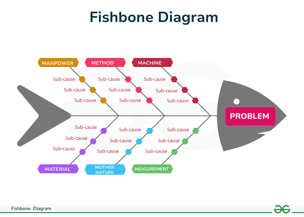
This tool is useful for digging into root causes thoroughly. The Fishbone Diagram divides causes into general categories, making it ideal for brainstorming sessions aimed at risk mitigation.
| Aspect | Description |
|---|---|
| Brief Definition | A fishbone diagram used to identify and categorize potential causes of a problem. |
| Main Function | - Digging into root causes - Categorizing causes into groups (Man, Machine, Method, Material, etc.) |
| Case Example | Delays identified due to “Man” (driver lack of discipline), “Method” (inefficient route schedule), and “Machine” (old vehicle). |
8.8.4.1 Fishbone in R
library(DiagrammeR)
library(rsvg)

graph <- grViz("
digraph fishbone {
  graph [layout = dot, rankdir = LR]

  # Default node styles
  node [fontname=Helvetica, fontsize=25, style=filled]

  # Central problem
  Problem [label='Delayed \\n Goods Delivery', shape=ellipse, fillcolor=lightcoral, width=5.0, height=1.2]

  # Category nodes (shared style)
  node [shape=diamond, width=2.5, height=1.0, fillcolor='#FFD700']
  A1 [label='Man']
  A2 [label='Method']
  A3 [label='Machine']
  A4 [label='Material']
  A5 [label='Environment']
  A6 [label='Measurement']

  # Reset node style for sub-categories
  node [shape=ellipse, width=2.5, height=0.6, fillcolor='#90EE90']
  A1a [label='Undisciplined driver']
  A1b [label='Inexperienced staff']
  A1c [label='Overloaded schedule']

  A2a [label='Inefficient route planning']
  A2b [label='Unrealistic delivery timing']

  A3a [label='Old vehicle']
  A3b [label='Unexpected breakdown']

  A4a [label='Incomplete shipping documents']
  A4b [label='Goods not ready']

  A5a [label='Traffic congestion']
  A5b [label='Bad weather']

  A6a [label='No delivery time indicator']
  A6b [label='Inaccurate tracking system']

  # Relationships
  A1 -> Problem
  A2 -> Problem
  A3 -> Problem
  A4 -> Problem
  A5 -> Problem
  A6 -> Problem

  A1a -> A1
  A1b -> A1
  A1c -> A1

  A2a -> A2
  A2b -> A2

  A3a -> A3
  A3b -> A3

  A4a -> A4
  A4b -> A4

  A5a -> A5
  A5b -> A5

  A6a -> A6
  A6b -> A6
}
")

# Output directory and saving
dir.create("images/bab8", recursive = TRUE, showWarnings = FALSE)
svg_code <- export_svg(graph)
rsvg_png(charToRaw(svg_code), file = "images/bab8/fishbone_delivery_en.png", width = 3000, height = 3000)
rsvg_pdf(charToRaw(svg_code), file = "images/bab8/fishbone_delivery_en.pdf")

knitr::include_graphics("images/bab8/fishbone_delivery_en.png")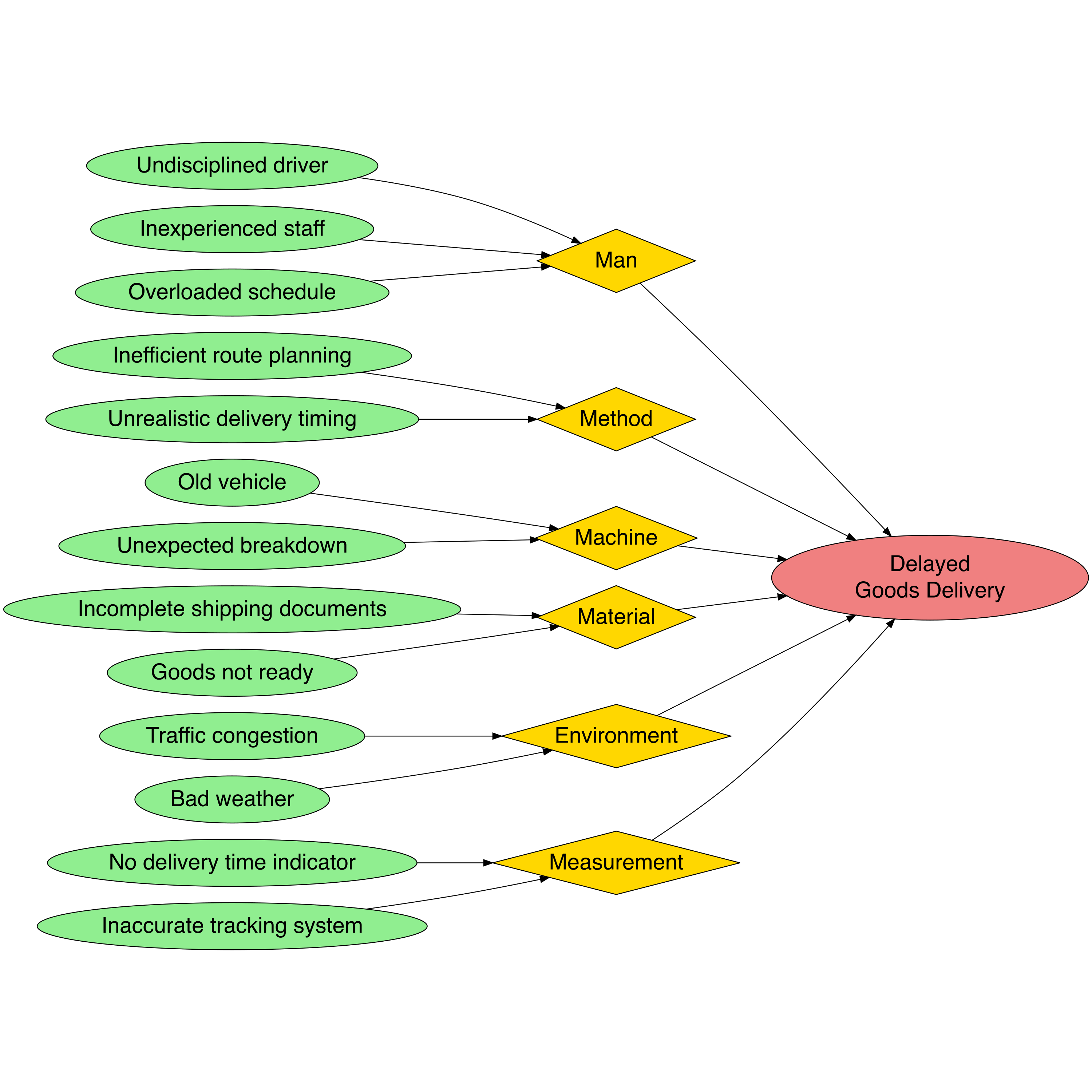
8.8.4.2 Fishbone in Python
Your job8.8.5 Scatter Diagram
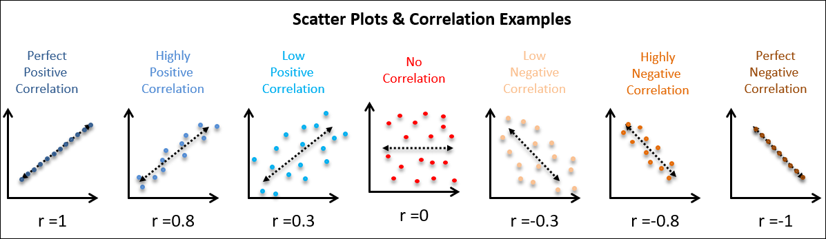
To examine the relationship between two risk variables, the Scatter Diagram is an ideal tool. For example, is there a relationship between the number of deliveries and the frequency of delays?
| Aspect | Description |
|---|---|
| Brief Definition | A scatter diagram used to observe the relationship between two variables. |
| Main Function | - Determines if two variables are related - Supports correlation analysis |
| Case Example | The team examines the relationship between the number of daily deliveries and the number of delays. The result shows that as the number of deliveries increases, delays also increase. |
8.8.5.1 Scatter Diagram in R
# Install the required package if not already installed
# install.packages("plotly")

# Load the plotly package
library(plotly)

# Create a dataset with correlation around 0.90
set.seed(42)  # For reproducibility
data <- data.frame(
  Number_of_Deliveries = c(50, 75, 100, 125, 150, 175, 200, 225, 250, 275,
                           300, 325, 350, 375, 400, 425, 450, 475, 500, 525),
  Number_of_Delays = c(5, 9, 12, 16, 19, 22, 25, 28, 32, 35,
                       38, 41, 44, 47, 50, 53, 56, 58, 61, 64)
)

# Introduce some noise to get a correlation of around 0.9
data$Number_of_Delays <- data$Number_of_Delays + rnorm(n = 20, mean = 0, sd = 2)

# Calculate the correlation coefficient between the number of deliveries and the number of delays
correlation_value <- cor(data$Number_of_Deliveries, data$Number_of_Delays)

# Create a scatter plot using Plotly with a linear regression line
fig <- plot_ly(data,
               x = ~Number_of_Deliveries,
               y = ~Number_of_Delays,
               type = 'scatter',
               mode = 'markers',
               marker = list(color = 'blue', size = 10)) %>%
  add_lines(x = data$Number_of_Deliveries,
            y = predict(lm(Number_of_Delays ~ Number_of_Deliveries, data = data)),
            line = list(color = 'red', dash = 'solid', width = 2)) %>%
  layout(title = paste("Scatter Plot: Relationship Between Number of Deliveries and Number of Delays\nCorrelation: ", round(correlation_value, 2)),
         xaxis = list(title = "Number of Deliveries"),
         yaxis = list(title = "Number of Delays"))

# Show the plot
fig
8.8.5.2 Scatter Diagram in Python
Your job8.8.6 Control Chart
When a process is running, we need to ensure its stability. The Control Chart is used to monitor whether the variation in risk is still within acceptable limits or is heading toward dangerous deviations.
| Aspect | Description |
|---|---|
| Brief Definition | A chart used to monitor process variation over time and identify whether the process is within statistical control. |
| Main Function | - Monitors process stability - Identifies deviations from control limits |
| Case Example | The Control Chart shows that in the second week, the variation in delays exceeded the upper control limit → indicating a specific issue occurred. |
8.8.6.1 Control Chart in R
# Load libraries
library(plotly)
library(dplyr)

# Buat data berat produk
berat_data <- data.frame(
  Hari = 1:30,
  Berat = c(
    502, 498, 509, 497, 500, 503, 492, 504, 499, 505,
    494, 506, 495, 498, 503, 491, 507, 497, 502, 504,
    493, 506, 498, 495, 501, 503, 499, 508, 496, 502
  )
)

# Tentukan batas kendali
CL <- 500
UCL <- 507
LCL <- 493

# Tandai outliers
berat_data <- berat_data %>%
  mutate(Outlier = ifelse(Berat > UCL | Berat < LCL, "Ya", "Tidak"))

# Buat plot
plot_ly(berat_data, x = ~Hari, y = ~Berat, type = 'scatter', mode = 'lines+markers',
        line = list(color = 'blue'),
        marker = list(size = 8, color = ifelse(berat_data$Outlier == "Ya", "red", "blue")),
        hoverinfo = 'text',
        text = ~paste("Hari:", Hari, "<br>Berat:", Berat, "gram")) %>%
  add_lines(y = rep(CL, 30), name = "CL", line = list(color = 'green', dash = 'dot')) %>%
  add_lines(y = rep(UCL, 30), name = "UCL", line = list(color = 'red', dash = 'dot')) %>%
  add_lines(y = rep(LCL, 30), name = "LCL", line = list(color = 'red', dash = 'dot')) %>%
  layout(title = "Control Chart – Berat Kemasan Produk",
         xaxis = list(title = "Hari"),
         yaxis = list(title = "Berat (gram)"),
         legend = list(orientation = 'h', x = 0.3, y = -0.2))
8.8.6.2 Control Chart in Python
Your job8.8.7 Flowchart
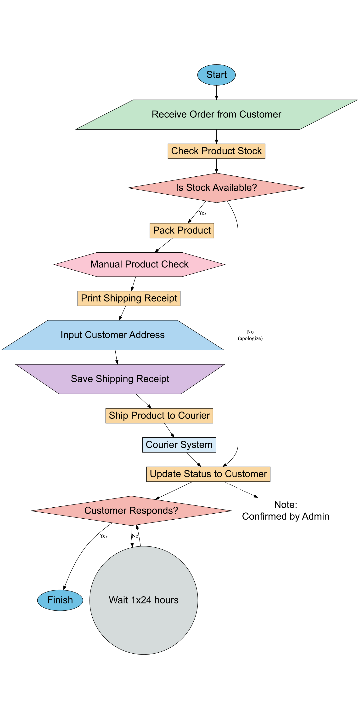
To understand the entire process flow and identify potential obstacles or errors in the system, a flowchart is very useful. It serves as a foundation for reviewing steps that need improvement.
| Aspect | Description |
|---|---|
| Brief Definition | A process flow diagram that shows the stages or steps in a system or activity. |
| Main Function | - Visually maps the process flow - Identifies stages prone to errors or obstacles |
| Case Example | A flowchart is used to depict the process of distributing goods from the warehouse to the customer, highlighting that address verification is often overlooked. |
8.8.7.1 Flowchart in R
8.8.7.2 Flowchart in Python
Your job8.9 Discussion Materials
| Topic | Trigger Questions | 📝 Notes / Personal Reflection |
|---|---|---|
| Relevance & Experience | • Have you encountered recurring problems in your work or life? • Which QC tool is most suitable to help understand or solve those problems? |
|
| Readiness for Implementation | • Have you or your workplace already implemented a data-driven approach? • What are the main challenges in starting to use the 7 QC Tools? |
|
| Impact & Change | • What is the difference in the impact of decisions based on assumptions vs. data? • Imagine a small change you could start tomorrow using one of the QC Tools. |
|
| Team Collaboration | • How does team collaboration play a role in the use of QC tools? • How can you involve more team members in implementing QC Tools? |
|
| Follow-up Actions | • Which QC tool would you like to learn more about? • Do you need training, mentoring, or real case studies to delve deeper into it? |
8.10 Several Applications
The Application of 7 QC Tools in Business & Everyday Life