18 Moderation
Moderation analysis is essential for understanding interaction effects, when the relationship between two variables depends on the value of a third. This chapter introduces the concept through real-world examples. After outlining common types of moderation (binary, continuous, hierarchical), the chapter walks through the key terminology, including moderators, focal predictors, and conditional effects. It covers the classic moderation model and introduces interaction terms in regression. Later sections delve into two-way and three-way interactions, providing detailed guidance on specification, estimation, and interpretation. Graphical methods for exploring interaction effects are emphasized, using interaction plots and marginal effects visualization. The chapter ensures readers are able not only to model interaction effects correctly but to communicate them clearly to non-technical stakeholders.
Moderation analysis examines how the relationship between an independent variable (\(X\)) and a dependent variable (\(Y\)) changes depending on a third variable, the moderator (\(M\)). In regression terms, moderation is represented as an interaction effect.
18.1 Types of Moderation Analyses
There are two primary approaches to analyzing moderation:
1. Spotlight Analysis
- Also known as Simple Slopes Analysis.
- Examines the effect of \(X\) on \(Y\) at specific values of \(M\) (e.g., mean, \(\pm 1\) SD, percentiles).
- Typically used for categorical or discretized moderators.
2. Floodlight Analysis
- Extends spotlight analysis to examine moderation across the entire range of \(M\).
- Based on Johnson-Neyman Intervals, identifying values of \(M\) where the effect of \(X\) on \(Y\) is statistically significant.
- Useful when the moderator is continuous and no specific cutoffs are predefined.
18.2 Key Terminology
- Main Effect: The effect of an independent variable without considering interactions.
- Interaction Effect: The combined effect of \(X\) and \(M\) on \(Y\).
- Simple Slope: The slope of \(X\) on \(Y\) at a specific value of \(M\) (used when \(M\) is continuous).
- Simple Effect: The effect of \(X\) on \(Y\) at a particular level of \(M\) when \(X\) is categorical.
18.3 Moderation Model
A typical moderation model is represented as:
\[ Y = \beta_0 + \beta_1 X + \beta_2 M + \beta_3 X \times M + \varepsilon \]
where:
\(\beta_0\): Intercept
\(\beta_1\): Main effect of \(X\)
\(\beta_2\): Main effect of \(M\)
\(\beta_3\): Interaction effect of \(X\) and \(M\)
If \(\beta_3\) is significant, it suggests that the effect of \(X\) on \(Y\) depends on \(M\).
18.4 Types of Interactions
- Continuous by Continuous: Both \(X\) and \(M\) are continuous (e.g., age moderating the effect of income on spending).
- Continuous by Categorical: \(X\) is continuous, and \(M\) is categorical (e.g., gender moderating the effect of education on salary).
- Categorical by Categorical: Both \(X\) and \(M\) are categorical (e.g., the effect of a training program on performance, moderated by job role).
18.5 Three-Way Interactions
For models with a second moderator (\(W\)), we examine:
\[ \begin{aligned} Y &= \beta_0 + \beta_1 X + \beta_2 M + \beta_3 W + \beta_4 X \times M \\ &+ \beta_5 X \times W + \beta_6 M \times W + \beta_7 X \times M \times W + \varepsilon \end{aligned} \]
- To interpret three-way interactions, the slope difference test can be used (Dawson and Richter 2006).
18.6 Additional Resources
-
Bayesian ANOVA models:
BANOVALpackage allows floodlight analysis. -
Structural Equation Modeling:
cSEMpackage includesdoFloodlightAnalysis.
For more details, refer to (Spiller et al. 2013).
18.7 Application
18.7.1 emmeans Package
The emmeans package (Estimated Marginal Means) is a powerful tool for post-hoc analysis of linear models, enabling researchers to explore interaction effects through simple slopes and estimated marginal means.
To install and load the package:
install.packages("emmeans")The dataset used in this section is sourced from the UCLA Statistical Consulting Group, where:
gender(male, female) andprog(exercise program: jogging, swimming, reading) are categorical variables.lossrepresents weight loss, andhoursandeffortare continuous predictors.
library(tidyverse)

dat <- readRDS("data/exercise.rds") %>%
    mutate(prog = factor(prog, labels = c("jog", "swim", "read"))) %>%
    mutate(gender = factor(gender, labels = c("male", "female")))
18.7.1.1 Continuous by Continuous Interaction
We begin with an interaction model between two continuous variables: hours (exercise duration) and effort (self-reported effort level).
contcont <- lm(loss ~ hours * effort, data = dat)
summary(contcont)
#>
#> Call:
#> lm(formula = loss ~ hours * effort, data = dat)
#>
#> Residuals:
#>    Min     1Q Median     3Q    Max
#> -29.52 -10.60  -1.78  11.13  34.51
#>
#> Coefficients:
#>              Estimate Std. Error t value Pr(>|t|)
#> (Intercept)   7.79864   11.60362   0.672   0.5017
#> hours        -9.37568    5.66392  -1.655   0.0982 .
#> effort       -0.08028    0.38465  -0.209   0.8347
#> hours:effort  0.39335    0.18750   2.098   0.0362 *
#> ---
#> Signif. codes:  0 '***' 0.001 '**' 0.01 '*' 0.05 '.' 0.1 ' ' 1
#>
#> Residual standard error: 13.56 on 896 degrees of freedom
#> Multiple R-squared:  0.07818,    Adjusted R-squared:  0.07509
#> F-statistic: 25.33 on 3 and 896 DF,  p-value: 9.826e-16
18.7.1.1.1 Simple Slopes Analysis (Spotlight Analysis)
Following Aiken and West (2005), the spotlight analysis examines the effect of hours on loss at three levels of effort:
Mean of
effortplus one standard deviationMean of
effortMean of
effortminus one standard deviation
library(emmeans)
effar <- round(mean(dat$effort) + sd(dat$effort), 1)
effr  <- round(mean(dat$effort), 1)
effbr <- round(mean(dat$effort) - sd(dat$effort), 1)


# Define values for estimation
mylist <- list(effort = c(effbr, effr, effar))

# Compute simple slopes
emtrends(contcont, ~ effort, var = "hours", at = mylist)
#>  effort hours.trend    SE  df lower.CL upper.CL
#>    24.5       0.261 1.350 896   -2.392     2.91
#>    29.7       2.307 0.915 896    0.511     4.10
#>    34.8       4.313 1.310 896    1.745     6.88
#>
#> Confidence level used: 0.95

# Visualization of the interaction
mylist <- list(hours = seq(0, 4, by = 0.4),
               effort = c(effbr, effr, effar))
emmip(contcont, effort ~ hours, at = mylist, CIs = TRUE)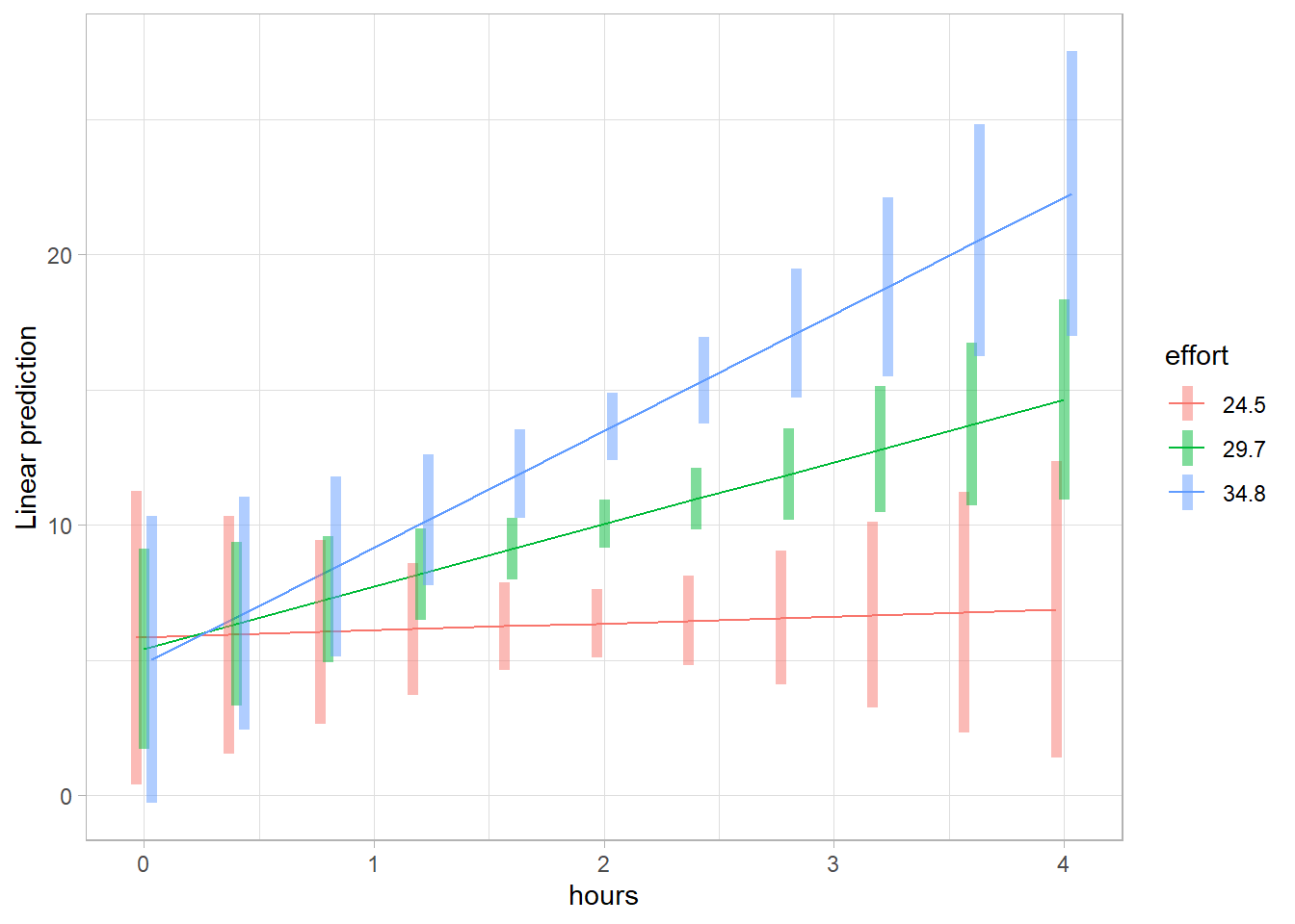
Figure 18.1: Linear Prediction Plot
# Test statistical differences in slopes
emtrends(
    contcont,
    pairwise ~ effort,
    var = "hours",
    at = mylist,
    adjust = "none"
)
#> $emtrends
#>  effort hours.trend    SE  df lower.CL upper.CL
#>    24.5       0.261 1.350 896   -2.392     2.91
#>    29.7       2.307 0.915 896    0.511     4.10
#>    34.8       4.313 1.310 896    1.745     6.88
#>
#> Results are averaged over the levels of: hours
#> Confidence level used: 0.95
#>
#> $contrasts
#>  contrast                estimate    SE  df t.ratio p.value
#>  effort24.5 - effort29.7    -2.05 0.975 896  -2.098  0.0362
#>  effort24.5 - effort34.8    -4.05 1.930 896  -2.098  0.0362
#>  effort29.7 - effort34.8    -2.01 0.956 896  -2.098  0.0362
#>
#> Results are averaged over the levels of: hours
The three p-values obtained above correspond to the interaction term in the regression model.
For a professional figure, we refine the visualization using ggplot2:
library(ggplot2)

# Prepare data for plotting
mylist <- list(hours = seq(0, 4, by = 0.4),
               effort = c(effbr, effr, effar))
contcontdat <-
    emmip(contcont,
          effort ~ hours,
          at = mylist,
          CIs = TRUE,
          plotit = FALSE)

# Convert effort levels to factors
contcontdat$feffort <- factor(contcontdat$effort)
levels(contcontdat$feffort) <- c("low", "medium", "high")
ggplot(data = contcontdat,
       aes(x = hours, y = yvar, color = feffort)) +
    geom_line() +
    geom_ribbon(aes(ymax = UCL, ymin = LCL, fill = feffort),
                alpha = 0.4) + labs(x = "Exercise Hours",
                                    y = "Weight Loss",
                                    color = "Effort",
                                    fill = "Effort Level") +
    theme_minimal()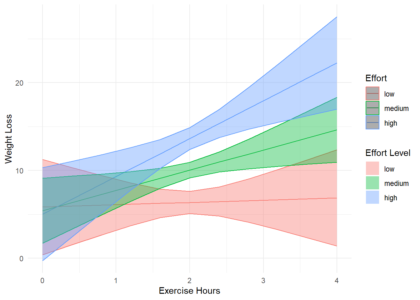
Figure 18.2: Weight Loss vs Exercise Hours
18.7.1.2 Continuous by Categorical Interaction
Next, we examine an interaction where hours (continuous) interacts with gender (categorical). We set “Female” as the reference category:
dat$gender <- relevel(dat$gender, ref = "female")
contcat <- lm(loss ~ hours * gender, data = dat)
summary(contcat)
#>
#> Call:
#> lm(formula = loss ~ hours * gender, data = dat)
#>
#> Residuals:
#>     Min      1Q  Median      3Q     Max
#> -27.118 -11.350  -1.963  10.001  42.376
#>
#> Coefficients:
#>                  Estimate Std. Error t value Pr(>|t|)
#> (Intercept)         3.335      2.731   1.221    0.222
#> hours               3.315      1.332   2.489    0.013 *
#> gendermale          3.571      3.915   0.912    0.362
#> hours:gendermale   -1.724      1.898  -0.908    0.364
#> ---
#> Signif. codes:  0 '***' 0.001 '**' 0.01 '*' 0.05 '.' 0.1 ' ' 1
#>
#> Residual standard error: 14.06 on 896 degrees of freedom
#> Multiple R-squared:  0.008433,   Adjusted R-squared:  0.005113
#> F-statistic:  2.54 on 3 and 896 DF,  p-value: 0.05523
Simple Slopes by Gender
# Compute simple slopes for each gender
emtrends(contcat, ~ gender, var = "hours")
#>  gender hours.trend   SE  df lower.CL upper.CL
#>  female        3.32 1.33 896    0.702     5.93
#>  male          1.59 1.35 896   -1.063     4.25
#>
#> Confidence level used: 0.95

# Test slope differences
emtrends(contcat, pairwise ~ gender, var = "hours")
#> $emtrends
#>  gender hours.trend   SE  df lower.CL upper.CL
#>  female        3.32 1.33 896    0.702     5.93
#>  male          1.59 1.35 896   -1.063     4.25
#>
#> Confidence level used: 0.95
#>
#> $contrasts
#>  contrast      estimate  SE  df t.ratio p.value
#>  female - male     1.72 1.9 896   0.908  0.3639
Since this test is equivalent to the interaction term in the regression model, a significant result confirms a moderating effect of gender.
emmip(contcat, gender ~ hours, at = mylist, CIs = TRUE)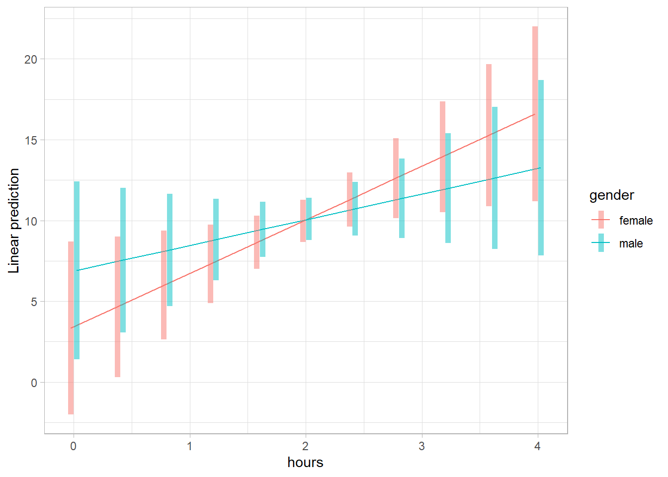
Figure 18.3: Linear prediction vs hours
18.7.1.3 Categorical by Categorical Interaction
Now, we examine the interaction between two categorical variables: gender (male, female) and prog (exercise program). We set “Read” as the reference category for prog and “Female” for gender:
dat$prog   <- relevel(dat$prog, ref = "read")
dat$gender <- relevel(dat$gender, ref = "female")

catcat <- lm(loss ~ gender * prog, data = dat)
summary(catcat)
#>
#> Call:
#> lm(formula = loss ~ gender * prog, data = dat)
#>
#> Residuals:
#>      Min       1Q   Median       3Q      Max
#> -19.1723  -4.1894  -0.0994   3.7506  27.6939
#>
#> Coefficients:
#>                     Estimate Std. Error t value Pr(>|t|)
#> (Intercept)          -3.6201     0.5322  -6.802 1.89e-11 ***
#> gendermale           -0.3355     0.7527  -0.446    0.656
#> progjog               7.9088     0.7527  10.507  < 2e-16 ***
#> progswim             32.7378     0.7527  43.494  < 2e-16 ***
#> gendermale:progjog    7.8188     1.0645   7.345 4.63e-13 ***
#> gendermale:progswim  -6.2599     1.0645  -5.881 5.77e-09 ***
#> ---
#> Signif. codes:  0 '***' 0.001 '**' 0.01 '*' 0.05 '.' 0.1 ' ' 1
#>
#> Residual standard error: 6.519 on 894 degrees of freedom
#> Multiple R-squared:  0.7875, Adjusted R-squared:  0.7863
#> F-statistic: 662.5 on 5 and 894 DF,  p-value: < 2.2e-16
Simple Effects and Contrast Analysis
# Estimated marginal means for all combinations of gender and program
emcatcat <- emmeans(catcat, ~ gender * prog)

# Compare effects of gender within each program
contrast(emcatcat, "revpairwise", by = "prog", adjust = "bonferroni")
#> prog = read:
#>  contrast      estimate    SE  df t.ratio p.value
#>  male - female   -0.335 0.753 894  -0.446  0.6559
#>
#> prog = jog:
#>  contrast      estimate    SE  df t.ratio p.value
#>  male - female    7.483 0.753 894   9.942  <.0001
#>
#> prog = swim:
#>  contrast      estimate    SE  df t.ratio p.value
#>  male - female   -6.595 0.753 894  -8.762  <.0001
emmip(catcat, prog ~ gender, CIs = TRUE)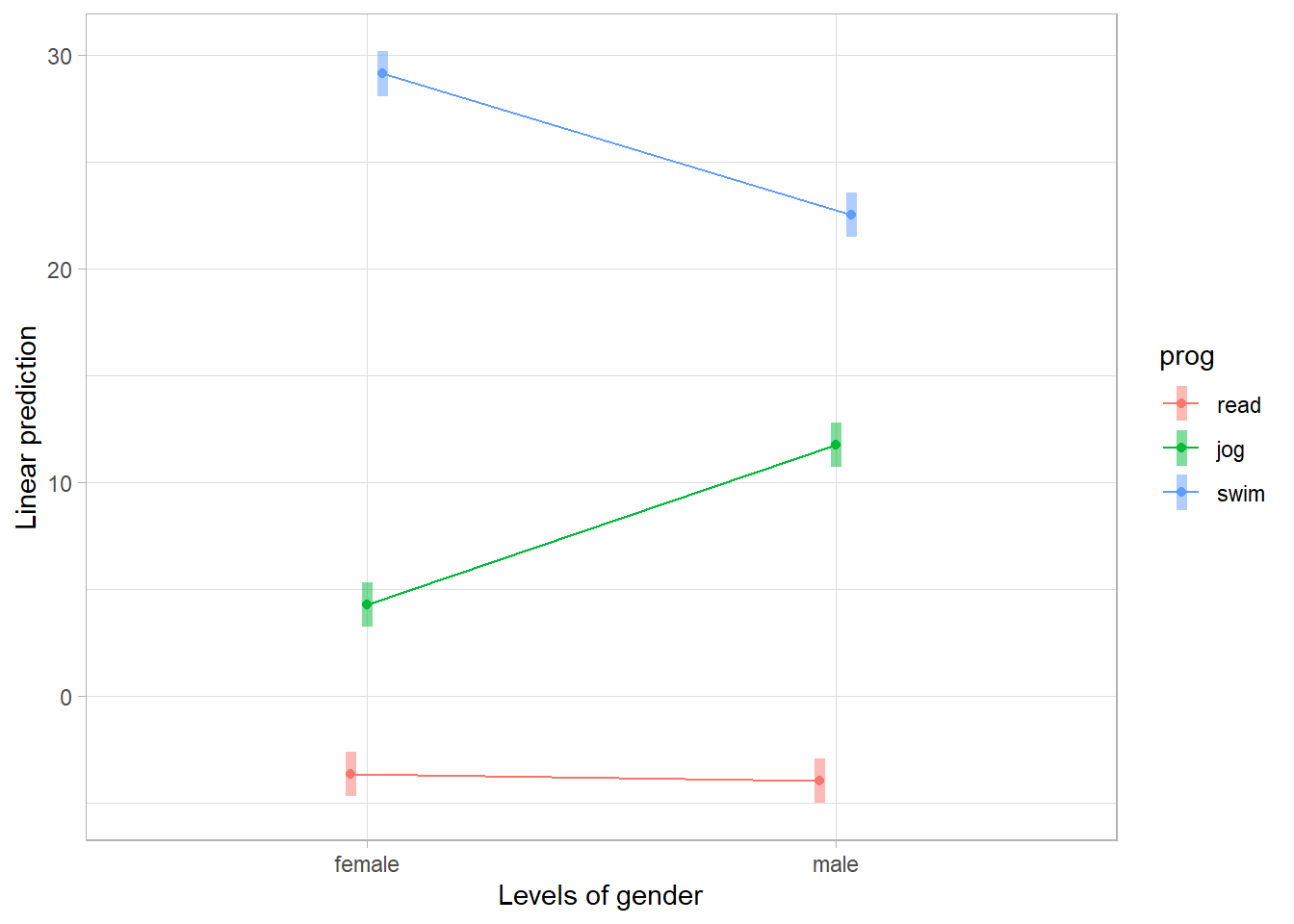
Figure 18.4: Linear prediction vs Gender
For a more intuitive presentation, we use a bar graph with error bars
# Prepare data
catcatdat <- emmip(catcat,
                   gender ~ prog,
                   CIs = TRUE,
                   plotit = FALSE)
ggplot(data = catcatdat,
       aes(x = prog, y = yvar, fill = gender)) +
    geom_bar(stat = "identity", position = "dodge") + geom_errorbar(
        position = position_dodge(.9),
        width = .25,
        aes(ymax = UCL, ymin = LCL),
        alpha = 0.3
    )  + labs(x = "Exercise Program",
              y = "Weight Loss",
              fill = "Gender")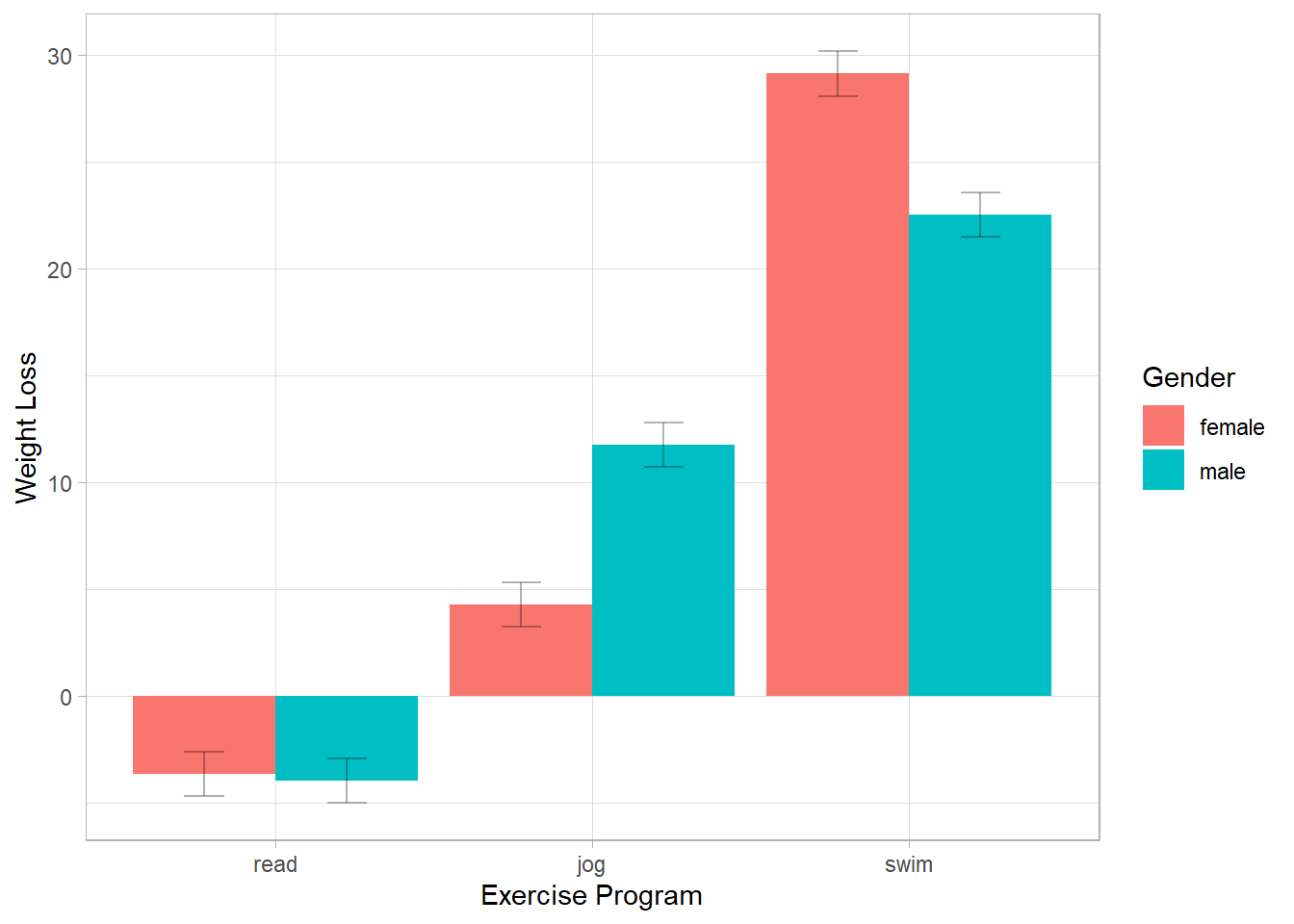
Figure 18.5: Weigth Loss vs Exercise Program
18.7.2 probemod Package
The probemod package is designed for moderation analysis, particularly focusing on Johnson-Neyman intervals and simple slopes analysis. However, this package is not recommended due to known issues with subscript handling and formatting errors in some outputs.
install.packages("probemod", dependencies = T)The Johnson-Neyman technique identifies values of the moderator (gender) where the effect of the independent variable (hours) on the dependent variable (loss) is statistically significant. This method is particularly useful when the moderator is continuous but can also be applied to categorical moderators.
Example: J-N Analysis in a loss ~ hours * gender Model
library(probemod)

myModel <-
    lm(loss ~ hours * gender, data = dat %>%
           select(loss, hours, gender))

jnresults <- jn(myModel,
                dv = 'loss',
                iv = 'hours',
                mod = 'gender')
The jn() function computes Johnson-Neyman intervals, highlighting the values of gender at which the relationship between hours and loss is statistically significant.
The Pick-a-Point method tests the simple effect of hours at specific values of gender, akin to spotlight analysis.
pickapoint(
    myModel,
    dv = 'loss',
    iv = 'hours',
    mod = 'gender',
    alpha = .01
)

plot(jnresults)
18.7.3 interactions Package
The interactions package is a recommended tool for visualizing and interpreting interaction effects in regression models. It provides user-friendly functions for interaction plots, simple slopes analysis, and Johnson-Neyman intervals, making it an excellent choice for moderation analysis.
install.packages("interactions")18.7.3.1 Continuous by Continuous Interaction
This section covers interactions where at least one of the two variables is continuous.
Example: Interaction Between Illiteracy and Murder
We use the state.x77 dataset to explore how Illiteracy Rate and Murder Rate interact to predict Income across U.S. states.
states <- as.data.frame(state.x77)
fiti <- lm(Income ~ Illiteracy * Murder + `HS Grad`, data = states)
summary(fiti)
#>
#> Call:
#> lm(formula = Income ~ Illiteracy * Murder + `HS Grad`, data = states)
#>
#> Residuals:
#>     Min      1Q  Median      3Q     Max
#> -916.27 -244.42   28.42  228.14 1221.16
#>
#> Coefficients:
#>                   Estimate Std. Error t value Pr(>|t|)
#> (Intercept)        1414.46     737.84   1.917  0.06160 .
#> Illiteracy          753.07     385.90   1.951  0.05724 .
#> Murder              130.60      44.67   2.923  0.00540 **
#> `HS Grad`            40.76      10.92   3.733  0.00053 ***
#> Illiteracy:Murder   -97.04      35.86  -2.706  0.00958 **
#> ---
#> Signif. codes:  0 '***' 0.001 '**' 0.01 '*' 0.05 '.' 0.1 ' ' 1
#>
#> Residual standard error: 459.5 on 45 degrees of freedom
#> Multiple R-squared:  0.4864, Adjusted R-squared:  0.4407
#> F-statistic: 10.65 on 4 and 45 DF,  p-value: 3.689e-06
For continuous moderators, the standard values chosen for visualization are:
Mean + 1 SD
Mean
Mean - 1 SD
The interact_plot() function provides an easy way to visualize these effects.
library(interactions)
interact_plot(fiti,
              pred = Illiteracy,
              modx = Murder,

              # Disable automatic mean-centering
              centered = "none",

              # Exclude the mean value of the moderator
              # modx.values = "plus-minus",

              # Divide the moderator's distribution into three groups
              # modx.values = "terciles",

              plot.points = TRUE, # Overlay raw data

              # Different shapes for different levels of the moderator
              point.shape = TRUE,

              # Jittering to prevent overplotting
              jitter = 0.1,

              # Custom appearance
              x.label = "Illiteracy Rate (%)",
              y.label = "Income ($)",
              main.title = "Interaction Between Illiteracy and Murder Rate",
              legend.main = "Murder Rate Levels",
              colors = "blue",

              # Confidence bands
              interval = TRUE,
              int.width = 0.9,
              robust = TRUE # Use robust standard errors
) 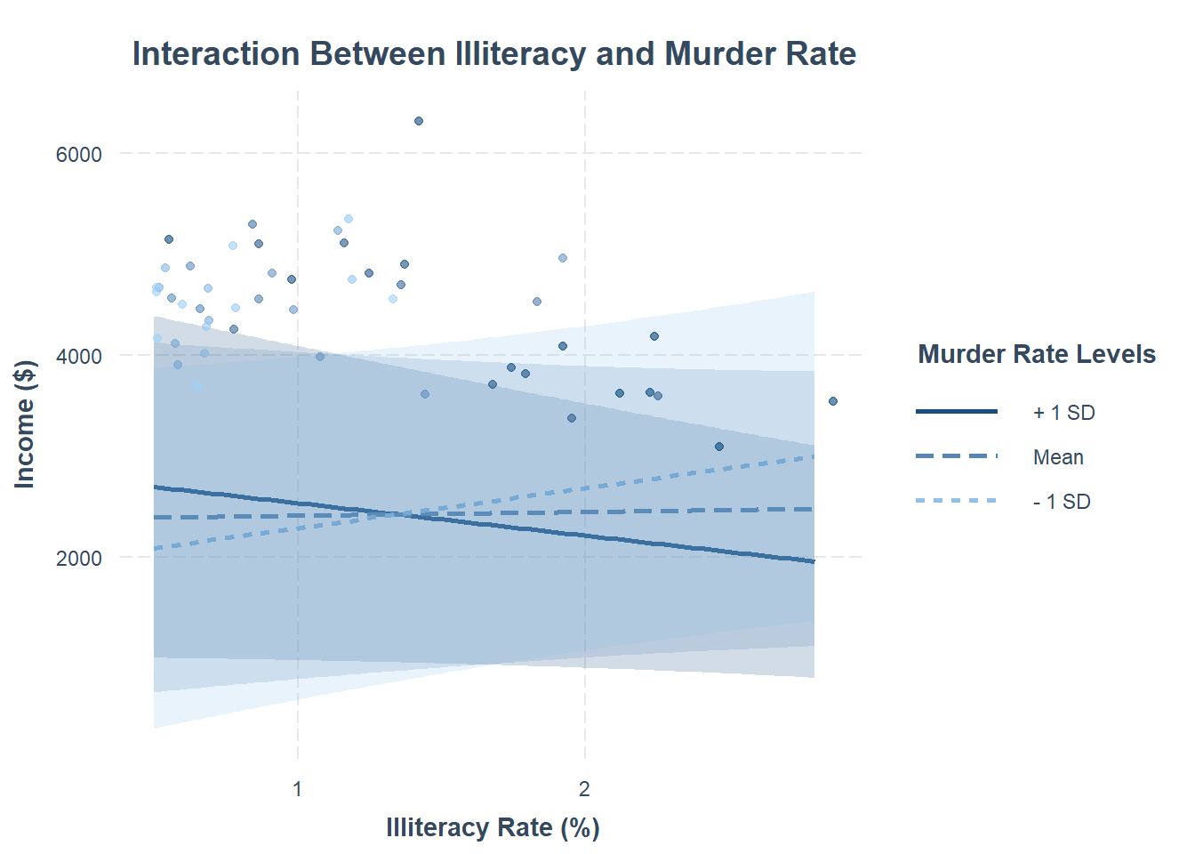
Figure 18.6: Interaction Between Illiteracy and Murder Rate
If the model includes weights, they can be incorporated into the visualization.
fiti <- lm(Income ~ Illiteracy * Murder,
           data = states,
           weights = Population)
interact_plot(fiti,
              pred = Illiteracy,
              modx = Murder,
              plot.points = TRUE)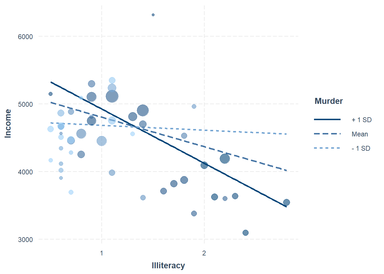
Figure 18.7: Bubble Chart between Income and Illiteracy
A partial effect plot shows how the effect of one variable changes across different levels of another variable while controlling for other predictors.
library(ggplot2)
data(cars)

fitc <- lm(cty ~ year + cyl * displ + class + fl + drv,
           data = mpg)
summary(fitc)
#>
#> Call:
#> lm(formula = cty ~ year + cyl * displ + class + fl + drv, data = mpg)
#>
#> Residuals:
#>     Min      1Q  Median      3Q     Max
#> -5.9772 -0.7164  0.0018  0.7690  5.9314
#>
#> Coefficients:
#>                   Estimate Std. Error t value Pr(>|t|)
#> (Intercept)     -200.97599   47.00954  -4.275 2.86e-05 ***
#> year               0.11813    0.02347   5.033 1.01e-06 ***
#> cyl               -1.85648    0.27745  -6.691 1.86e-10 ***
#> displ             -3.56467    0.65943  -5.406 1.70e-07 ***
#> classcompact      -2.60177    0.92972  -2.798 0.005597 **
#> classmidsize      -2.62996    0.93273  -2.820 0.005253 **
#> classminivan      -4.40817    1.03844  -4.245 3.24e-05 ***
#> classpickup       -4.37322    0.93416  -4.681 5.02e-06 ***
#> classsubcompact   -2.38384    0.92943  -2.565 0.010997 *
#> classsuv          -4.27352    0.86777  -4.925 1.67e-06 ***
#> fld                6.34343    1.69499   3.742 0.000233 ***
#> fle               -4.57060    1.65992  -2.754 0.006396 **
#> flp               -1.91733    1.58649  -1.209 0.228158
#> flr               -0.78873    1.56551  -0.504 0.614901
#> drvf               1.39617    0.39660   3.520 0.000525 ***
#> drvr               0.48740    0.46113   1.057 0.291694
#> cyl:displ          0.36206    0.07934   4.564 8.42e-06 ***
#> ---
#> Signif. codes:  0 '***' 0.001 '**' 0.01 '*' 0.05 '.' 0.1 ' ' 1
#>
#> Residual standard error: 1.526 on 217 degrees of freedom
#> Multiple R-squared:  0.8803, Adjusted R-squared:  0.8715
#> F-statistic: 99.73 on 16 and 217 DF,  p-value: < 2.2e-16
interact_plot(
    fitc,
    pred = displ,
    modx = cyl,

    # Show observed data as partial residuals
    partial.residuals = TRUE,

    # Specify moderator values manually
    modx.values = c(4, 5, 6, 8)
)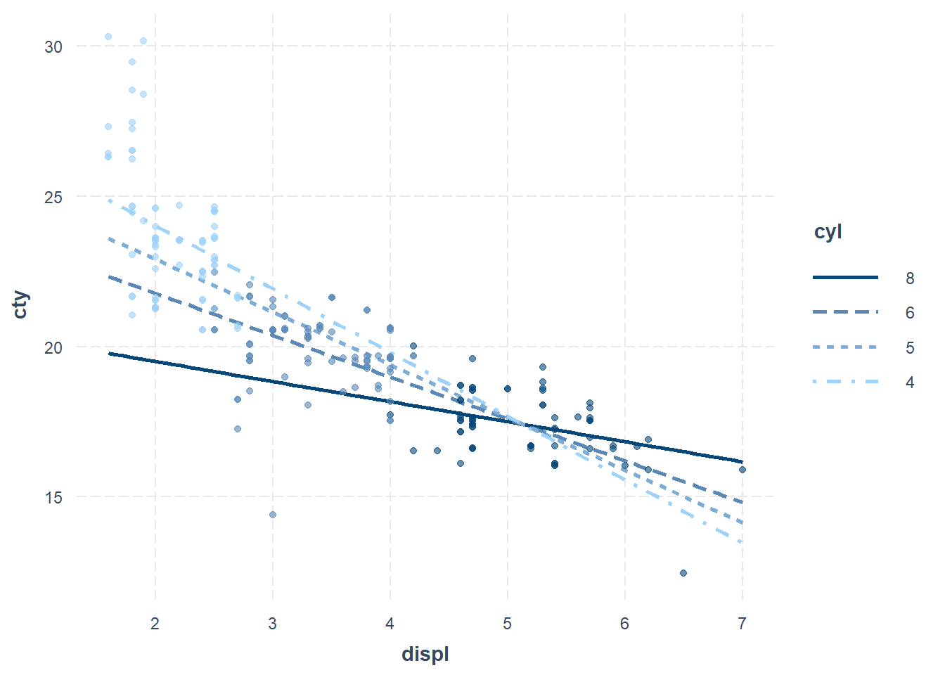
Figure 18.8: Scatter Plot between cty and displ
To check whether an interaction is truly linear, we can compare fitted lines based on:
The whole sample (black line)
Subsamples based on the moderator (red line)
# Generate synthetic data
x_2 <- runif(n = 200, min = -3, max = 3)
w   <- rbinom(n = 200, size = 1, prob = 0.5)
err <- rnorm(n = 200, mean = 0, sd = 4)
y_2 <- 2.5 - x_2 ^ 2 - 5 * w + 2 * w * (x_2 ^ 2) + err

data_2 <- as.data.frame(cbind(x_2, y_2, w))

# Fit interaction model
model_2 <- lm(y_2 ~ x_2 * w, data = data_2)
summary(model_2)
#>
#> Call:
#> lm(formula = y_2 ~ x_2 * w, data = data_2)
#>
#> Residuals:
#>      Min       1Q   Median       3Q      Max
#> -10.8281  -3.2379   0.2682   2.9339  12.4055
#>
#> Coefficients:
#>             Estimate Std. Error t value Pr(>|t|)
#> (Intercept)  -0.6138     0.4703  -1.305    0.193
#> x_2          -0.1370     0.2690  -0.509    0.611
#> w             1.0077     0.6800   1.482    0.140
#> x_2:w         0.3123     0.3954   0.790    0.430
#>
#> Residual standard error: 4.761 on 196 degrees of freedom
#> Multiple R-squared:  0.01547,    Adjusted R-squared:  0.0004036
#> F-statistic: 1.027 on 3 and 196 DF,  p-value: 0.3818
# Linearity check plot
interact_plot(
    model_2,
    pred = x_2,
    modx = w,
    linearity.check = TRUE,
    plot.points = TRUE
)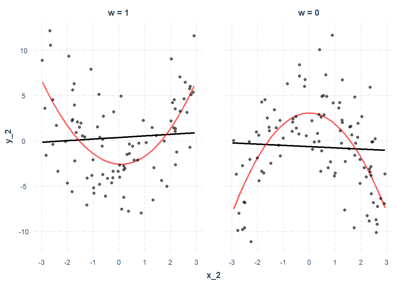
Figure 18.9: Interaction Plot
18.7.3.1.1 Simple Slopes Analysis
A simple slopes analysis examines the conditional effect of an independent variable (\(X\)) at specific levels of the moderator (\(M\)).
How sim_slopes() Works:
Continuous moderators: Analyzes effects at the mean and ±1 SD.
Categorical moderators: Uses all factor levels.
Mean-centers all variables except the predictor of interest.
Example: Continuous by Continuous Interaction
library(interactions)
sim_slopes(fiti,
           pred = Illiteracy,
           modx = Murder,
           johnson_neyman = FALSE)
#> SIMPLE SLOPES ANALYSIS
#>
#> Slope of Illiteracy when Murder =  5.420973 (- 1 SD):
#>
#>     Est.     S.E.   t val.      p
#> -------- -------- -------- ------
#>   -17.43   250.08    -0.07   0.94
#>
#> Slope of Illiteracy when Murder =  8.685043 (Mean):
#>
#>      Est.     S.E.   t val.      p
#> --------- -------- -------- ------
#>   -399.64   178.86    -2.23   0.03
#>
#> Slope of Illiteracy when Murder = 11.949113 (+ 1 SD):
#>
#>      Est.     S.E.   t val.      p
#> --------- -------- -------- ------
#>   -781.85   189.11    -4.13   0.00
We can also visualize the simple slopes
# Store results
ss <- sim_slopes(fiti,
                 pred = Illiteracy,
                 modx = Murder,
                 modx.values = c(0, 5, 10))
plot(ss)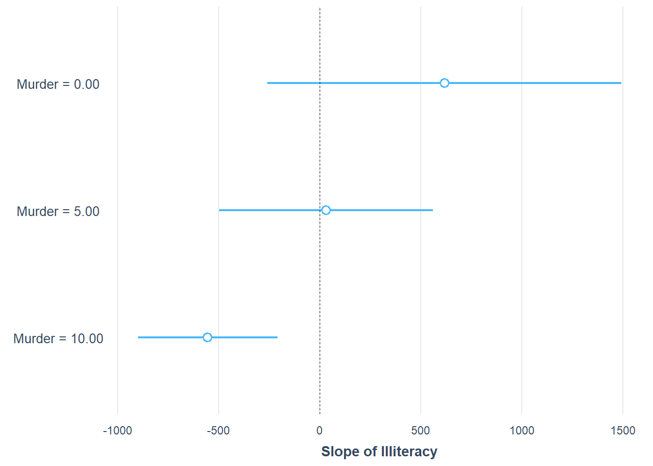
Figure 18.10: Slope of Illiteracy
For publication-quality results, we convert the simple slopes analysis into a table using huxtable.
library(huxtable)

ss <- sim_slopes(fiti,
                 pred = Illiteracy,
                 modx = Murder,
                 modx.values = c(0, 5, 10))

# Convert to a formatted table
print(as_huxtable(ss))
#>                      Value of Murder   Slope of Illiteracy
#>                    ─────────────────────────────────────────
#>                      0.00              617.34 (434.85)
#>                      5.00              31.86 (262.63)
#>                      10.00             -553.62 (171.42)**
18.7.3.1.2 Johnson-Neyman Intervals
The Johnson-Neyman technique identifies the range of the moderator (\(M\)) where the effect of the predictor (\(X\)) on the dependent variable (\(Y\)) is statistically significant. This approach is useful when the moderator is continuous, allowing us to determine where an effect exists rather than arbitrarily choosing values.
Although the J-N approach has been widely used (P. O. Johnson and Neyman 1936), it has known inflated Type I error rates (Bauer and Curran 2005). A correction method was proposed by Esarey and Sumner (2018) to address these issues.
Since J-N performs multiple comparisons across all values of the moderator, it inflates Type I error. To control for this, we use False Discovery Rate correction.
Example: Johnson-Neyman Analysis
sim_slopes(
    fiti,
    pred = Illiteracy,
    modx = Murder,
    johnson_neyman = TRUE,
    control.fdr = TRUE,  # Correction for Type I and II errors

    # Include conditional intercepts
    # cond.int = TRUE,

    robust = "HC3",  # Use robust SE

    # Don't mean-center non-focal variables
    # centered = "none",

    jnalpha = 0.05  # Significance level
)
#> JOHNSON-NEYMAN INTERVAL
#>
#> When Murder is OUTSIDE the interval [-7.87, 8.51], the slope of Illiteracy
#> is p < .05.
#>
#> Note: The range of observed values of Murder is [1.40, 15.10]
#>
#> Interval calculated using false discovery rate adjusted t = 2.35
#>
#> SIMPLE SLOPES ANALYSIS
#>
#> Slope of Illiteracy when Murder =  5.420973 (- 1 SD):
#>
#>     Est.     S.E.   t val.      p
#> -------- -------- -------- ------
#>   -17.43   227.37    -0.08   0.94
#>
#> Slope of Illiteracy when Murder =  8.685043 (Mean):
#>
#>      Est.     S.E.   t val.      p
#> --------- -------- -------- ------
#>   -399.64   158.77    -2.52   0.02
#>
#> Slope of Illiteracy when Murder = 11.949113 (+ 1 SD):
#>
#>      Est.     S.E.   t val.      p
#> --------- -------- -------- ------
#>   -781.85   156.96    -4.98   0.00
To visualize the J-N intervals
johnson_neyman(fiti,
               pred = Illiteracy,
               modx = Murder,
               control.fdr = TRUE, # Corrects for Type I error
               alpha = .05)
#> JOHNSON-NEYMAN INTERVAL
#>
#> When Murder is OUTSIDE the interval [-22.57, 8.52], the slope of Illiteracy
#> is p < .05.
#>
#> Note: The range of observed values of Murder is [1.40, 15.10]
#>
#> Interval calculated using false discovery rate adjusted t = 2.33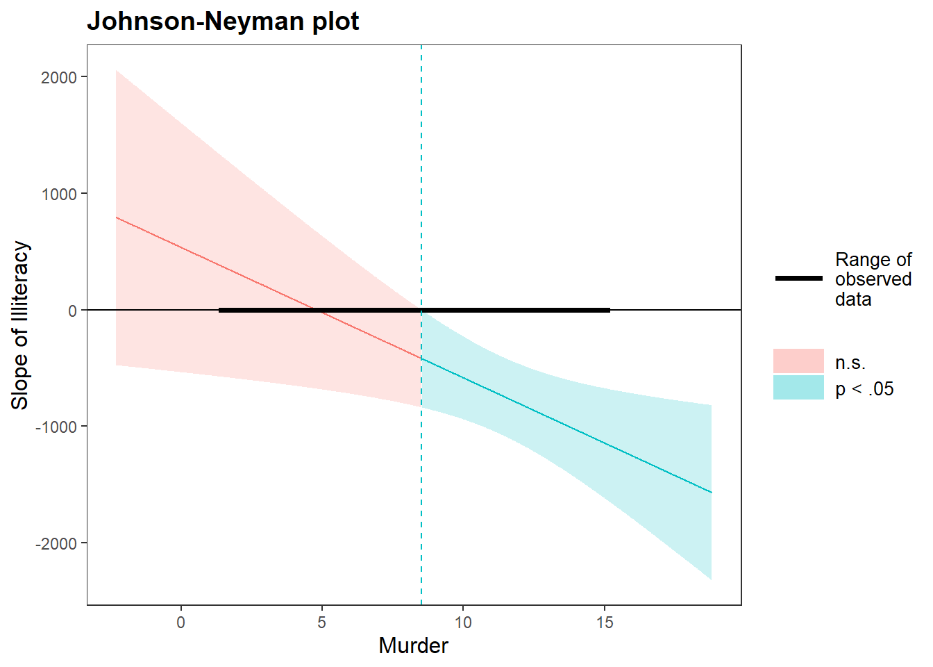
Figure 18.11: Johnson Neyman Plot
The y-axis represents the conditional slope of the predictor (\(X\)).
The x-axis represents the values of the moderator (\(M\)).
The shaded region represents the range where the effect of \(X\) on \(Y\) is statistically significant.
18.7.3.1.3 Three-Way Interactions
In three-way interactions, the effect of \(X\) on \(Y\) depends on two moderators (\(M_1\) and \(M_2\)). This allows for a more nuanced understanding of moderation effects.
Example: 3-Way Interaction Visualization
library(jtools)
# Convert 'cyl' to factor
mtcars$cyl <- factor(mtcars$cyl,
                     labels = c("4 cylinder", "6 cylinder", "8 cylinder"))

# Fit the model
fitc3 <- lm(mpg ~ hp * wt * cyl, data = mtcars)
interact_plot(fitc3,
              pred = hp,
              modx = wt,
              mod2 = cyl) +
    theme_apa(legend.pos = "bottomright")
Figure 18.12: Interaction Plot
18.7.3.1.4 Johnson-Neyman for Three-Way Interaction
The Johnson-Neyman technique can also be applied in a three-way interaction context
library(survey)
data(api)

# Define survey design
dstrat <- svydesign(
    id = ~ 1,
    strata = ~ stype,
    weights = ~ pw,
    data = apistrat,
    fpc = ~ fpc
)

# Fit 3-way interaction model
regmodel3 <-
    survey::svyglm(api00 ~ avg.ed * growth * enroll, design = dstrat)
# Johnson-Neyman analysis with visualization
sim_slopes(
    regmodel3,
    pred = growth,
    modx = avg.ed,
    mod2 = enroll,
    jnplot = TRUE
)
#> ███████████████ While enroll (2nd moderator) =  153.0518 (- 1 SD) ██████████████
#>
#> JOHNSON-NEYMAN INTERVAL
#>
#> When avg.ed is OUTSIDE the interval [2.75, 3.82], the slope of growth is p
#> < .05.
#>
#> Note: The range of observed values of avg.ed is [1.38, 4.44]
#>
#> SIMPLE SLOPES ANALYSIS
#>
#> Slope of growth when avg.ed = 2.085002 (- 1 SD):
#>
#>   Est.   S.E.   t val.      p
#> ------ ------ -------- ------
#>   1.25   0.32     3.86   0.00
#>
#> Slope of growth when avg.ed = 2.787381 (Mean):
#>
#>   Est.   S.E.   t val.      p
#> ------ ------ -------- ------
#>   0.39   0.22     1.75   0.08
#>
#> Slope of growth when avg.ed = 3.489761 (+ 1 SD):
#>
#>    Est.   S.E.   t val.      p
#> ------- ------ -------- ------
#>   -0.48   0.35    -1.37   0.17
#>
#> ████████████████ While enroll (2nd moderator) =  595.2821 (Mean) ███████████████
#>
#> JOHNSON-NEYMAN INTERVAL
#>
#> When avg.ed is OUTSIDE the interval [2.84, 7.83], the slope of growth is p
#> < .05.
#>
#> Note: The range of observed values of avg.ed is [1.38, 4.44]
#>
#> SIMPLE SLOPES ANALYSIS
#>
#> Slope of growth when avg.ed = 2.085002 (- 1 SD):
#>
#>   Est.   S.E.   t val.      p
#> ------ ------ -------- ------
#>   0.72   0.22     3.29   0.00
#>
#> Slope of growth when avg.ed = 2.787381 (Mean):
#>
#>   Est.   S.E.   t val.      p
#> ------ ------ -------- ------
#>   0.34   0.16     2.16   0.03
#>
#> Slope of growth when avg.ed = 3.489761 (+ 1 SD):
#>
#>    Est.   S.E.   t val.      p
#> ------- ------ -------- ------
#>   -0.04   0.24    -0.16   0.87
#>
#> ███████████████ While enroll (2nd moderator) = 1037.5125 (+ 1 SD) ██████████████
#>
#> JOHNSON-NEYMAN INTERVAL
#>
#> The Johnson-Neyman interval could not be found. Is the p value for your
#> interaction term below the specified alpha?
#>
#> SIMPLE SLOPES ANALYSIS
#>
#> Slope of growth when avg.ed = 2.085002 (- 1 SD):
#>
#>   Est.   S.E.   t val.      p
#> ------ ------ -------- ------
#>   0.18   0.31     0.58   0.56
#>
#> Slope of growth when avg.ed = 2.787381 (Mean):
#>
#>   Est.   S.E.   t val.      p
#> ------ ------ -------- ------
#>   0.29   0.20     1.49   0.14
#>
#> Slope of growth when avg.ed = 3.489761 (+ 1 SD):
#>
#>   Est.   S.E.   t val.      p
#> ------ ------ -------- ------
#>   0.40   0.27     1.49   0.14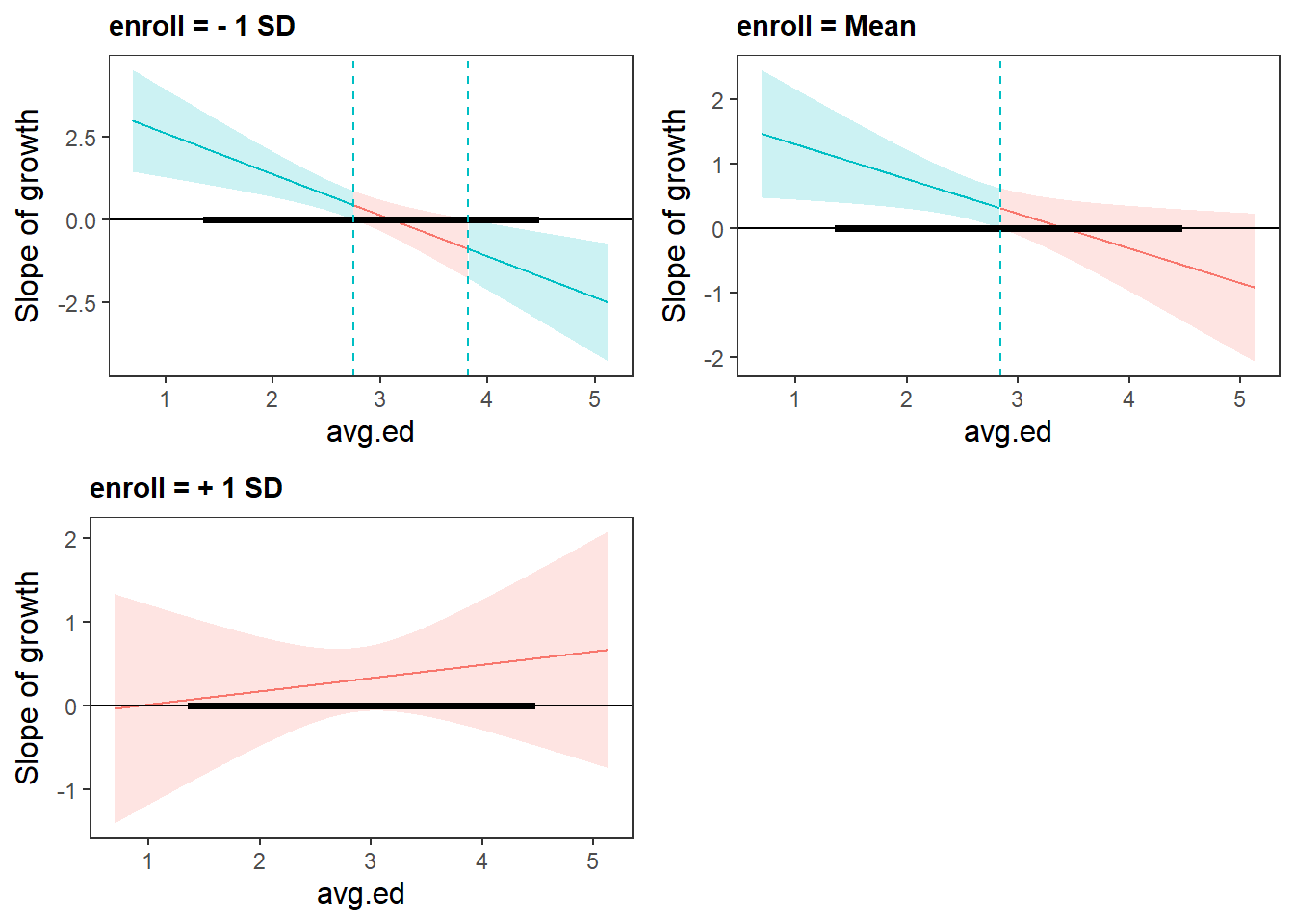
Figure 18.13: Slope of Growth
To present the results in a publication-ready format, we generate tables and plots
ss3 <-
    sim_slopes(regmodel3,
               pred = growth,
               modx = avg.ed,
               mod2 = enroll)
# Plot results
plot(ss3)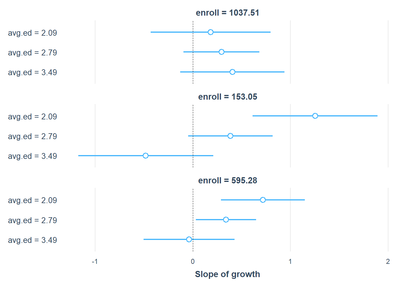
Figure 18.14: Slope of Growth
# Convert results into a formatted table
library(huxtable)
print(as_huxtable(ss3))
#>                      ─────────────────────────────────────
#>                        enroll = 153
#>                        Value of avg.ed   Slope of growth
#>                      ─────────────────────────────────────
#>                        2.09              1.25 (0.32)***
#>                        2.79              0.39 (0.22)#
#>                        3.49              -0.48 (0.35)
#>                      ─────────────────────────────────────
#>                        enroll = 595.28
#>                        Value of avg.ed   Slope of growth
#>                      ─────────────────────────────────────
#>                        2.09              0.72 (0.22)**
#>                        2.79              0.34 (0.16)*
#>                        3.49              -0.04 (0.24)
#>                      ─────────────────────────────────────
#>                        enroll = 1037.51
#>                        Value of avg.ed   Slope of growth
#>                      ─────────────────────────────────────
#>                        2.09              0.18 (0.31)
#>                        2.79              0.29 (0.20)
#>                        3.49              0.40 (0.27)
18.7.3.2 Categorical Interactions
Interactions between categorical predictors can be visualized using categorical plots.
Example: Interaction Between cyl, fwd, and auto
library(ggplot2)
library(tidyverse)

# Convert variables to factors
mpg2 <- mpg %>%
    mutate(cyl = factor(cyl))

mpg2["auto"] <- "auto"
mpg2$auto[mpg2$trans %in% c("manual(m5)", "manual(m6)")] <- "manual"
mpg2$auto <- factor(mpg2$auto)

mpg2["fwd"] <- "2wd"
mpg2$fwd[mpg2$drv == "4"] <- "4wd"
mpg2$fwd <- factor(mpg2$fwd)

# Drop cars with 5 cylinders (since most have 4, 6, or 8)
mpg2 <- mpg2[mpg2$cyl != "5",]

# Fit the model
fit3 <- lm(cty ~ cyl * fwd * auto, data = mpg2)

library(jtools) # For summ()
summ(fit3)| Observations | 230 |
| Dependent variable | cty |
| Type | OLS linear regression |
| F(11,218) | 61.37 |
| R² | 0.76 |
| Adj. R² | 0.74 |
| Est. | S.E. | t val. | p | |
|---|---|---|---|---|
| (Intercept) | 21.37 | 0.39 | 54.19 | 0.00 |
| cyl6 | -4.37 | 0.54 | -8.07 | 0.00 |
| cyl8 | -8.37 | 0.67 | -12.51 | 0.00 |
| fwd4wd | -2.91 | 0.76 | -3.83 | 0.00 |
| automanual | 1.45 | 0.57 | 2.56 | 0.01 |
| cyl6:fwd4wd | 0.59 | 0.96 | 0.62 | 0.54 |
| cyl8:fwd4wd | 2.13 | 0.99 | 2.15 | 0.03 |
| cyl6:automanual | -0.76 | 0.90 | -0.84 | 0.40 |
| cyl8:automanual | 0.71 | 1.18 | 0.60 | 0.55 |
| fwd4wd:automanual | -1.66 | 1.07 | -1.56 | 0.12 |
| cyl6:fwd4wd:automanual | 1.29 | 1.52 | 0.85 | 0.40 |
| cyl8:fwd4wd:automanual | -1.39 | 1.76 | -0.79 | 0.43 |
| Standard errors: OLS |
cat_plot(fit3,
         pred = cyl,
         modx = fwd,
         plot.points = TRUE)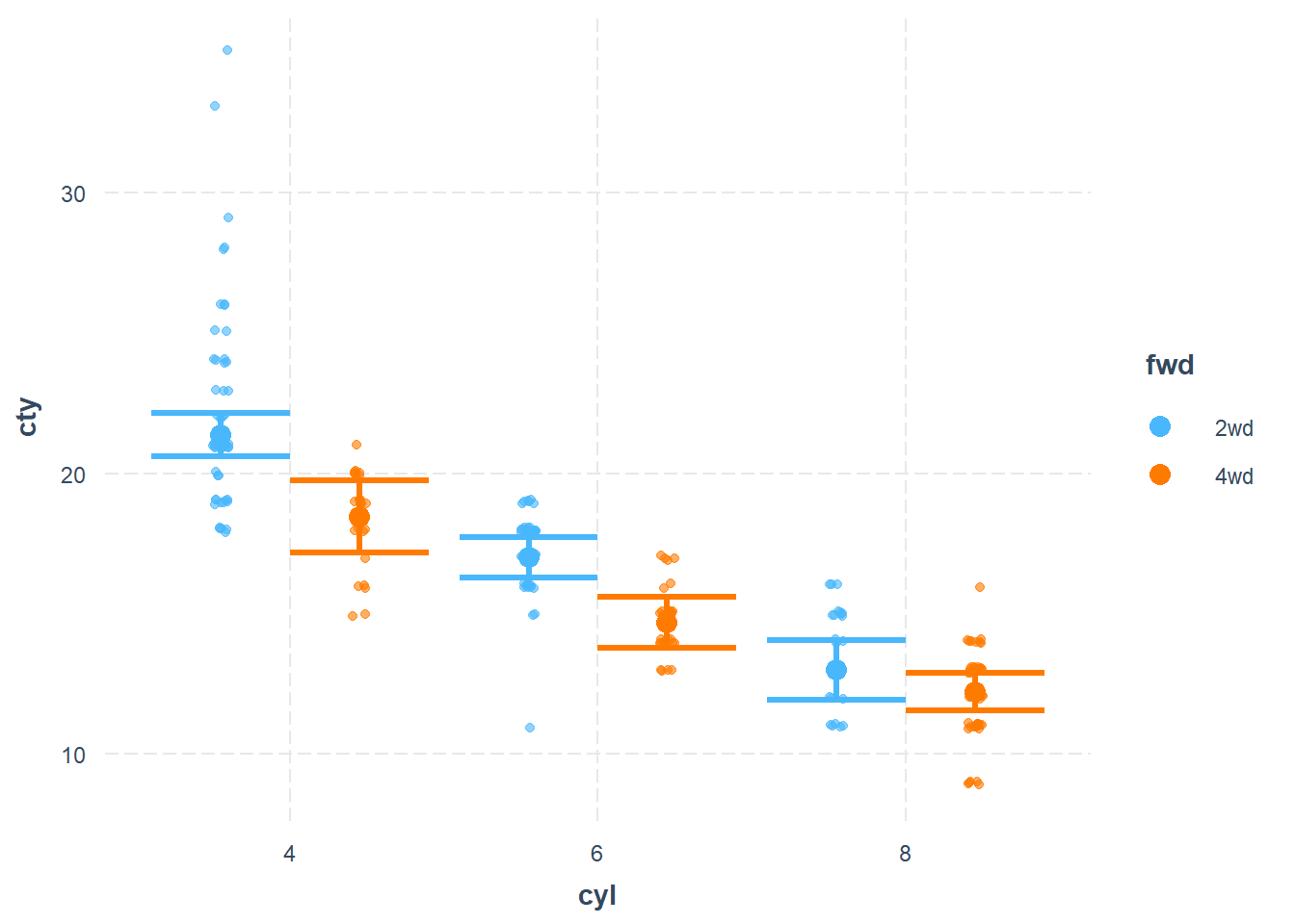
Figure 18.15: Scatter Plot
Line Plot for Categorical Interaction
cat_plot(
    fit3,
    pred = cyl,
    modx = fwd,
    geom = "line",
    point.shape = TRUE,
    vary.lty = TRUE
)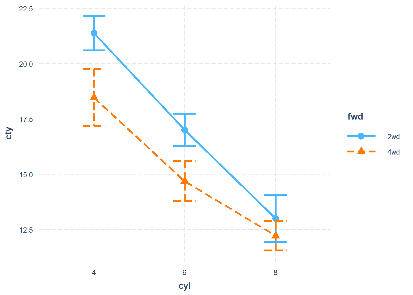
Figure 18.16: Line Chart between cty and cyl
Bar Plot Representation
cat_plot(
    fit3,
    pred = cyl,
    modx = fwd,
    geom = "bar",
    interval = TRUE,
    plot.points = TRUE
)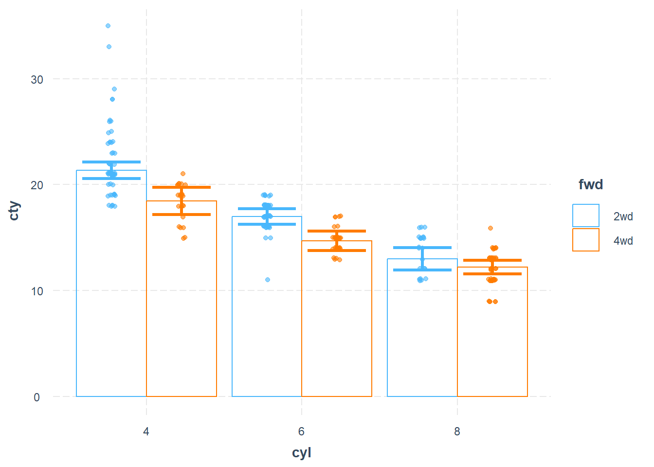
Figure 18.17: Bar Chart between cty and cyl
18.7.4 interactionR Package
The interactionR package is designed for publication-quality reporting of interaction effects, particularly in epidemiology and social sciences. It provides tools for computing interaction measures, confidence intervals, and statistical inference following well-established methodologies.
Key Features:
- Publication-Ready Interaction Analysis
- Confidence intervals calculated using:
- Delta method (Hosmer and Lemeshow 1992)
- Variance recovery (“mover”) method (G. Y. Zou 2008)
- Bootstrapping (Assmann et al. 1996)
- Standardized reporting guidelines based on (Knol and VanderWeele 2012).
install.packages("interactionR", dependencies = T)
18.7.5 sjPlot Package
The sjPlot package is highly recommended for publication-quality visualizations of interaction effects. It provides enhanced aesthetics and customizable interaction plots suitable for academic journals.
More details: sjPlot interaction visualization
install.packages("sjPlot")18.7.6 Summary of Moderation Analysis Packages
| Package | Purpose | Key Features | Recommended? |
|---|---|---|---|
emmeans |
Estimated marginal means & simple slopes | Computes simple slopes, spotlight analysis, floodlight analysis (J-N method) | Yes |
probemod |
Johnson-Neyman technique | Tests moderator significance ranges | No (Subscript issues) |
interactions |
Interaction visualization | Produces robust, customizable interaction plots | Yes |
interactionR |
Epidemiological interaction measures | Computes RERI, AP, SI for additive scale interactions | Yes (for public health research) |
sjPlot |
Publication-quality interaction plots | Highly customizable, ideal for academic papers | Highly Recommended |
18.8 Interaction Debate: Binning Estimators vs. Generalized Additive Models
While the classical moderation framework, as outlined above, is the dominant approach in applied research, it assumes that the specified interaction term fully captures how the relationship between \(X\) and \(Y\) changes with \(M\). In practice, this approach relies on strong functional form assumptions, particularly linearity in both the main effects and the interaction. If these assumptions are violated, the estimated interaction effect may be biased or misleading.
It is precisely these concerns that have motivated a recent and influential methodological debate about how interactions should be estimated and interpreted in observational data. At the center of this debate are two competing approaches: binning-based estimators, which aim to relax functional form assumptions through localized estimation, and generalized additive models (GAMs), which model nonlinear relationships directly. Understanding this debate is critical, because the choice of method can fundamentally change the conclusions we draw from moderation analyses.
Imagine you’re a business researcher studying how advertising effectiveness varies with market competition. You run a regression with an interaction term between advertising spend and competitive intensity. Your results show statistical significance, but are they valid? This question lies at the heart of a methodological debate that has profound implications for how we analyze interactions in observational data.
In 2019, political scientists Jens Hainmueller, Jonathan Mummolo, and Yiqing Xu (HMX) published a highly influential paper proposing the “binning estimator” as a solution to problems with multiplicative interaction models (Hainmueller, Mummolo, and Xu 2019). Their approach has been widely adopted, with over 1,200 citations by the time of this writing. However, in 2024, Uri Simonsohn challenged this method, arguing that it can produce severely biased results when the underlying relationships are nonlinear, a condition that is arguably the norm rather than the exception in real-world data (Simonsohn 2024).
This debate affects thousands of studies across business, economics, and social sciences. The choice between methods can determine whether you conclude that:
Marketing effectiveness increases with firm size (or doesn’t)
Employee training has differential effects across experience levels (or doesn’t)
Product quality matters more in competitive markets (or doesn’t)
18.8.1 The Stakes
Consider that approximately 71% of articles in top journals test for interactions (Simonsohn 2024). If the standard methods are flawed, this represents a massive potential for incorrect conclusions. The debate centers on a fundamental question: What exactly are we trying to estimate when we probe an interaction?
- Team HMX (Hainmueller, Mummolo, Xu + Liu, Liu) (Hainmueller, Mummolo, and Xu 2019; Hainmueller et al. 2025):
Advocate for the binning estimator and kernel methods
Focus on flexible estimation without strong functional form assumptions
Emphasize practical diagnostics for applied researchers
- Team Simonsohn (Simonsohn 2024) (Blog post 1, 2):
Champions Generalized Additive Models (GAMs)
Argues that binning violates ceteris paribus principles
Emphasizes the importance of handling nonlinearities correctly
Before diving into the debate, let’s establish a solid foundation. An interaction effect occurs when the relationship between two variables depends on the value of a third variable.
The standard linear interaction model is the workhorse model in social sciences:
\[Y = \beta_0 + \beta_1 D + \beta_2 X + \beta_3 D \times X + \epsilon\]
Where:
\(Y\) = outcome variable (e.g., sales revenue)
\(D\) = treatment/focal variable (e.g., advertising spend)
\(X\) = moderator (e.g., market competition)
\(D \times X\) = interaction term
The marginal effect of \(D\) on \(Y\) is:
\[\frac{\partial Y}{\partial D} = \beta_1 + \beta_3 X\]
This tells us that the effect of advertising on sales is \(\beta_1\) when competition is zero, and changes by \(\beta_3\) for each unit increase in competition.
For example, consider a retail business studying how price changes affect sales, moderated by customer loyalty status:
\[ Sales = \beta_0 + \beta_1(Price) + \beta_2(Loyalty) + \beta_3(Price × Loyalty) + \epsilon \]
If \(\beta_3\) is positive, it suggests loyal customers are less price-sensitive.
However, the standard model assumes all relationships are linear. This means:
- The effect of price on sales changes at a constant rate with loyalty
- The relationships don’t curve or bend
- Effects are symmetric (increases and decreases have opposite but equal effects)
But what if these assumptions are violated?
18.8.2 The Core Problem: When Linearity Fails
The real world is frustratingly nonlinear. Consider these business realities:
Common Nonlinearities in Business:
- Diminishing Returns: Marketing effectiveness often follows a logarithmic pattern
- Threshold Effects: Quality improvements may not matter until they cross a perceptibility threshold
- Saturation Points: Customer satisfaction can’t exceed 100%
- Network Effects: Value may increase exponentially with user base size
The Three Problems Identified
- Problem 1 (HMX): Researchers often probe interactions at extreme or impossible values of the moderator.
- Problem 2 (HMX): The interaction itself may be nonlinear.
- Problem 3 (Simonsohn): When predictors are correlated and have nonlinear effects, the interaction term captures these nonlinearities, leading to false positives.
To understand problem 3, consider the true model: \[Y = D^2 + \epsilon\]
Where \(D\) and \(X\) are correlated (\(r = 0.5\)), but \(X\) doesn’t actually affect \(Y\).
If we estimate: \[Y = \beta_0 + \beta_1 D + \beta_2 X + \beta_3 D \times X + \epsilon\]
The interaction term \(\beta_3\) will be significant even though there’s no true interaction! This happens because:
- The omitted \(D^2\) term correlates with \(D \times X\) (due to the correlation between \(D\) and \(X\))
- The interaction term acts as a proxy for the missing nonlinearity
- We mistakenly conclude that the effect of \(D\) depends on \(X\)
Imagine studying whether employee training effectiveness depends on prior experience. If both training hours and experience affect productivity nonlinearly, and they’re correlated (more experienced employees often receive more training), you might falsely conclude that training works better for experienced employees when really you’re just capturing the nonlinear effect of training itself.
18.8.3 Binning Estimator Approach
HMX proposed the binning estimator as a practical solution. Here’s how it works:
- Split the moderator into bins (typically terciles: low, medium, high)
- Estimate separate regressions within each bin
- Compare effects across bins
For three bins, estimate: \[Y = \sum_{j=1}^{3} \{\mu_j + \alpha_j D + \eta_j (X-\bar{x}_j) + \beta_j(X-\bar{x}_j)D\}G_j + \epsilon\]
Where:
\(G_j\) = indicator for bin \(j\)
\(\bar{x}_j\) = median value of \(X\) in bin \(j\)
\(\alpha_j\) = effect of \(D\) at the median of bin \(j\)
Advantages Claimed by HMX
- Simplicity: Easy to implement and understand
- Flexibility: Doesn’t impose strict functional form
- Diagnostics: Reveals nonlinearities in the interaction
- Common Support: Only estimates effects where data exist
18.8.4 Simonsohn’s Critique
Simonsohn provides a devastating example that illustrates the core problem with mathematical precision. Consider PhD admissions where professors rate PhD applicants:
The True Data Generating Process: \(\text{Rating} = \log(\text{GRE}) + \epsilon\)
Key Facts:
Research experience does NOT enter the rating function
But: \(\text{Corr}(\text{GRE}, \text{Experience}) = 0.5\) (more experienced applicants tend to have higher GRE scores)
Researchers want to know: Does research experience moderate the GRE-rating relationship?
What the Linear Model Estimates: \(\text{Rating} = \beta_0 + \beta_1 \text{GRE} + \beta_2 \text{Experience} + \beta_3 (\text{GRE} \times \text{Experience}) + \epsilon\)
The researcher finds \(\beta_3 < 0\) and significant! Interpretation: “GRE matters less for experienced applicants.”
What the Binning Estimator Shows:
Let’s work through the math. Suppose:
Low experience bin: Mean GRE = 400
Medium experience bin: Mean GRE = 550
High experience bin: Mean GRE = 700
Within each bin, the binning estimator calculates: \(\frac{\partial \text{Rating}}{\partial \text{GRE}} \bigg|_{\text{bin}} \approx \frac{\Delta \log(\text{GRE})}{\Delta \text{GRE}} \bigg|_{\text{mean GRE in bin}}\)
Since Rating = log(GRE), the true marginal effect is: \(\frac{\partial \text{Rating}}{\partial \text{GRE}} = \frac{1}{\text{GRE}}\)
Therefore:
Low bin (GRE \(\approx\) 400): Marginal effect \(\approx\) 1/400 = 0.0025
Medium bin (GRE \(\approx\) 550): Marginal effect \(\approx\) 1/550 = 0.0018
High bin (GRE \(\approx\) 700): Marginal effect \(\approx\) 1/700 = 0.0014
The Spurious Finding:
The binning estimator shows a declining marginal effect across experience levels (0.0025 \(\to\) 0.0018 \(\to\) 0.0014), leading to the false conclusion that “GRE matters less for experienced applicants.”
Why This Happens
- Omitted Variable Bias: The true model contains log(GRE), which is approximately GRE - GRE\(^2\) /2 + GRE\(^3\) /3 + … by Taylor expansion
- Correlation Structure: Since Experience correlates with GRE, it also correlates with GRE²
- The Interaction Term as Proxy: The interaction GRE × Experience partially captures the omitted GRE² term
-
Binning Doesn’t Help: Within each bin, we still have:
- Different average GRE levels
- The same nonlinear relationship
- Violation of ceteris paribus
18.8.5 Simonsohn’s Core Criticism
The binning estimator violates ceteris paribus. When comparing across bins, you’re changing both:
The moderator value (intentionally)
The average value of correlated predictors (unintentionally)
This confounding makes it impossible to isolate the true interaction effect.
18.8.6 Generalized Additive Models Alternative
Simonsohn advocates for GAMs as a superior alternative. Let’s understand what they are and why he believes they solve the problem.
A GAM extends the linear model by replacing linear terms with smooth functions:
Linear Model: \(Y = \beta_0 + \beta_1 X_1 + \beta_2 X_2 + \epsilon\)
GAM: \(Y = \beta_0 + f_1(X_1) + f_2(X_2) + \epsilon\)
Where \(f_1\) and \(f_2\) are smooth functions estimated from the data.
GAMs can model interactions flexibly: \[Y = f_1(D) + f_2(X) + f_3(D, X) + \epsilon\]
Where \(f_3(D, X)\) captures any interaction beyond the main effects.
How GAMs Work
- Basis Expansion: Each smooth function is represented as a weighted sum of basis functions (like splines)
- Penalized Estimation: A penalty prevents overfitting by controlling wiggliness
- Automatic Selection: The degree of smoothness is determined by the data
A smooth function in a GAM is represented as: \[f(x) = \sum_{k=1}^{K} \beta_k b_k(x)\]
Where:
\(b_k(x)\) are basis functions (e.g., cubic splines)
\(\beta_k\) are coefficients to be estimated
\(K\) determines the maximum complexity
Advantages of GAMs
- Flexibility: Can capture any smooth relationship
- Ceteris Paribus: Properly isolates effects
- No Binning: Uses all data efficiently
- Automatic Complexity: Data determines the functional form
Simonsohn proposes “GAM Simple Slopes” for probing interactions:
- Fit the GAM with interaction
- Calculate predicted values at specific moderator values
- Plot the relationship between \(D\) and \(Y\) at each moderator value
This maintains ceteris paribus by holding other variables constant.
18.8.7 Mathematical Foundations of the Disagreement
The core disagreement is philosophical: What is the estimand (target of estimation)?
Conditional Marginal Effect (CME)
- What HMX target: \[\theta(x) = E\left[\frac{\partial Y_i(d)}{\partial d} \bigg| X_i = x\right]\]
This marginalizes over the distribution of \(D\) and other covariates \(Z\) at \(X = x\).
Conditional Average Partial Effect (CAPE)
- What Simonsohn argues GAMs estimate: \[\rho(d, x) = E\left[\frac{\partial Y_i(d)}{\partial d} \bigg| D_i = d, X_i = x\right]\]
This conditions on specific values of \(D\).
The Fundamental Difference
HMX argue their estimand answers: “What’s the average effect of \(D\) for units with \(X = x\)?”
Simonsohn argues researchers want: “What’s the effect of \(D\) at \(X = x\), holding all else constant?”
A Business Translation
HMX Estimand: “What’s the average effect of price changes for stores in high-competition markets?” (Includes the fact that high-competition stores might have different pricing patterns)
Simonsohn Estimand: “If we took a store and changed only its price, how would the effect differ in high vs. low competition?” (Pure ceteris paribus effect)
18.8.8 Mathematical Example
True model: \(Y = D^2 - 0.5D + \epsilon\)
With \(Corr(D, X) = 0.5\):
HMX’s CME: \(\theta(x) = x - 0.5\) (Not zero! Increases with \(X\))
Why? As \(X\) increases, the distribution of \(D\) shifts up. Since \(\frac{\partial Y}{\partial D} = 2D - 0.5\) increases with \(D\), the average effect increases with \(X\).
Simonsohn’s Interpretation: There’s no interaction because \(X\) doesn’t appear in the true model.
18.8.9 When to Use Each Method
Use Traditional Linear Models When:
You have strong theoretical reasons to expect linear relationships
Sample size is small (< 200)
Interpretability is paramount
You’ve tested and confirmed linearity assumptions
Use Binning Estimator When:
You have experimental data (random assignment)
You need a quick diagnostic tool
You’re presenting to non-technical audiences
As a robustness check, not primary analysis
Use GAMs When:
You have observational data
Sample size is adequate (> 500 preferred)
You suspect nonlinear relationships
You need to maintain ceteris paribus
18.8.10 Best Practices for Any Method
-
Always visualize your data first
# Scatterplot matrix pairs(~ Y + D + X, data = data, lower.panel = panel.smooth) -
Test for nonlinearity
-
Check correlations among predictors
-
Consider theoretical expectations
- Are diminishing returns plausible?
- Could there be threshold effects?
- Is the scale bounded?
-
Report multiple approaches
- Primary analysis with GAM
- Robustness check with binning
- Show how conclusions change (or don’t)
18.8.11 A Decision Tree
Start: Do I need to test an interaction?
│
├─ Is at least one variable randomly assigned?
│  ├─ Yes → Experimental/Quasi-experimental
│  │  ├─ Sample size < 200 → Use linear model (with caution)
│  │  ├─ Sample size 200-500 → Use binning as diagnostic + GAM
│  │  └─ Sample size > 500 → Use GAM simple slopes
│  │
│  └─ No → Observational Data
│     │
│     ├─ Are predictors likely correlated?
│     │  ├─ Yes (usually) → Strong nonlinearity concern
│     │  │  ├─ Can implement GAM? → Use GAM
│     │  │  └─ Cannot implement GAM? → Add quadratic controls
│     │  │
│     │  └─ No (rare) → Proceed with caution
│     │
│     └─ Check for nonlinearity
│        ├─ Theory suggests nonlinearity → Use GAM
│        ├─ Bounded scales → Use GAM
│        └─ Previous literature → Use GAM