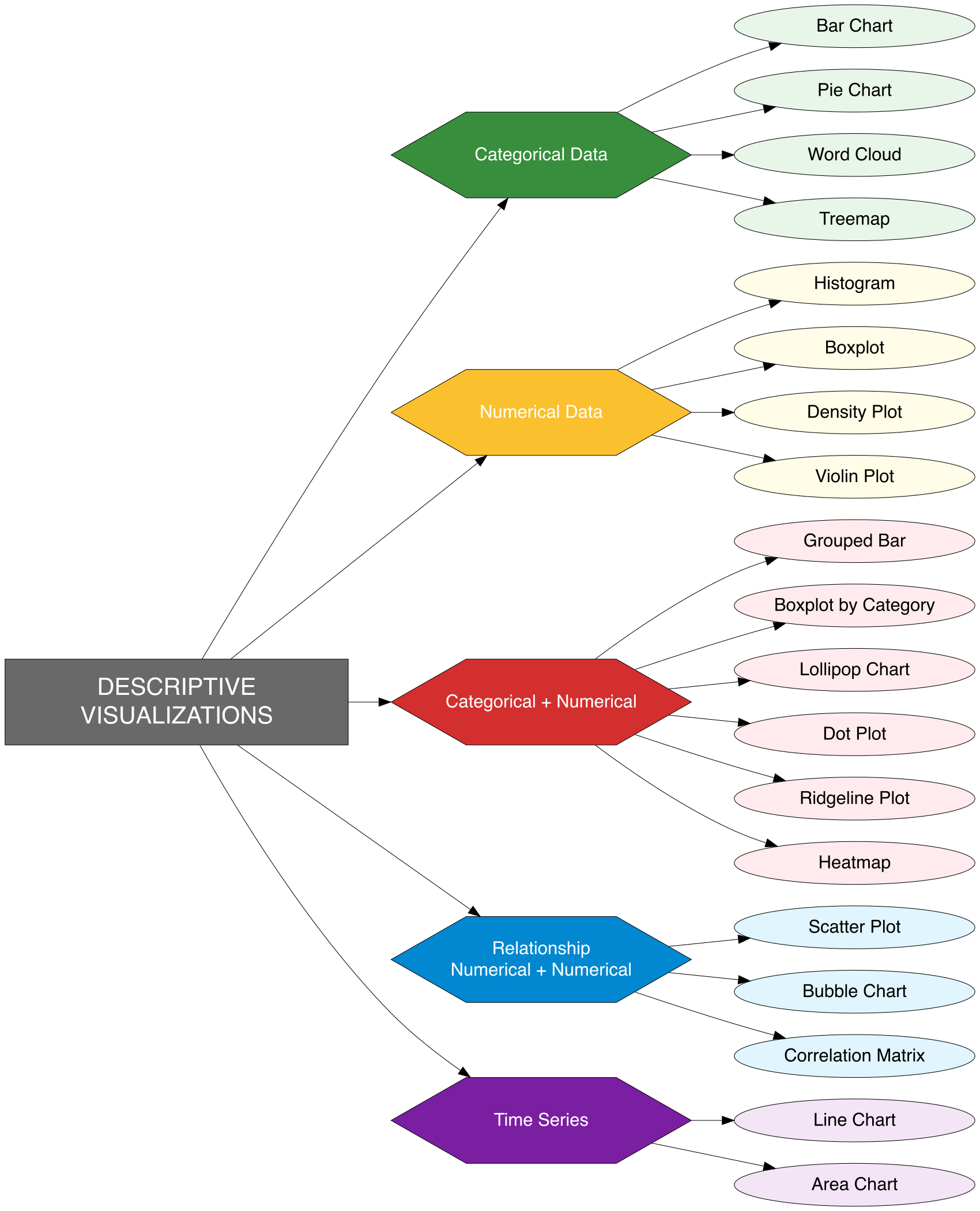
8 Descriptive Visualizations
Descriptive visualizations are charts and plots employed in Exploratory Data Analysis to succinctly summarize and uncover essential patterns, relationships, and anomalies within data. They transform raw data into clear, interpretable visuals that enhance comprehension and support informed decision-making. These tools are crucial for examining distributions, correlations, comparisons, trends, and outliers, providing a fundamental basis for more advanced modeling and analysis.
Descriptive visualizations differ according to data type—bar and pie charts are ideal for categorical data, whereas histograms and boxplots are more appropriate for numerical data. Selecting the appropriate visualization depends on the analytical objective: grouped bar charts facilitate comparisons across groups, line charts effectively reveal trends over time, scatter plots illustrate relationships between continuous variables, and boxplots highlight skewness, variability, and outliers. These visual tools are indispensable for distilling complex datasets into comprehensible insights, empowering analysts and decision-makers to better understand customer behavior, monitor sales performance, evaluate operational efficiency, and identify strategic opportunities or risks. The following section will showcase these visualization techniques applied to a business dataset, demonstrating how they can uncover hidden insights, support hypotheses, and lay the groundwork for advanced analytical modeling.
By visualizing this data, we seek to uncover hidden patterns, identify anomalies, and reveal insights that raw tables alone cannot convey. These insights will ultimately enable more informed business decisions and strategic planning.
In the forthcoming sections, we will apply a variety of visual techniques to transform this structured data into clear, interpretable graphics—laying the foundation for compelling and effective data storytelling.
8.1 Categorical Data
Visualizations for categorical data help display the distribution and frequency of categories in a dataset. Here are the most common and effective types of visualizations used for categorical variables:
8.1.1 Bar Chart
A Bar Chart is a graphical representation of categorical data in which each category is represented by a bar, with the height (or length) of the bar corresponding to the frequency or count of data in that category.
Key Characteristics of a Bar Chart:
- Represents categorical data using rectangular bars, where the height or length of each bar reflects the value or frequency of the category.
- One axis (usually the x-axis) shows the categories, while the other axis (usually the y-axis) displays the numerical values.
- Bars are separated from each other, emphasizing that the data is discrete, unlike histograms.
- Can be displayed as vertical (column chart) or horizontal bars, depending on the layout or clarity needs.
- Useful for comparing values across categories clearly and intuitively.
- Can include additional variations like grouped or stacked bar charts for comparing subcategories.
- Easily labeled and color-coded for enhanced readability and interpretation.
R Code (Barchart)
# Load required libraries
library(dplyr)        # For data manipulation
library(ggplot2)      # For creating the bar chart
library(viridis)      # For color palette
library(scales)       # For formatting currency labels

# Step 1: Prepare the data
data_bisnis <- read.csv("data/bab8/data_bisnis.csv")
sales_summary <- data_bisnis %>%
  group_by(Product_Category) %>%
  summarise(Total_Sales = sum(Total_Price, na.rm = TRUE)) %>%
  arrange(desc(Total_Sales))

# Step 2: Generate a color palette
custom_colors <- viridis::turbo(n = nrow(sales_summary))

# Step 3: Create bar chart with value labels
ggplot(sales_summary, aes(x = reorder(Product_Category, -Total_Sales),
                          y = Total_Sales,
                          fill = Product_Category)) +
  geom_col(show.legend = FALSE) +
  geom_text(aes(label = scales::label_comma(prefix = "Rp ")(Total_Sales)),
            vjust = -0.5, size = 6) +
  scale_fill_manual(values = custom_colors) +
  scale_y_continuous(labels = scales::label_comma(prefix = "Rp "),
                     expand = expansion(mult = c(0, 0.1))) +
  labs(
    title = "Total Sales by Product Category (2020–2024)",
    subtitle = "Based on Transaction Value",
    x = "Product Category",
    y = "Total Sales",
    caption = "@siregarbakti") +
theme_minimal(base_size = 25) 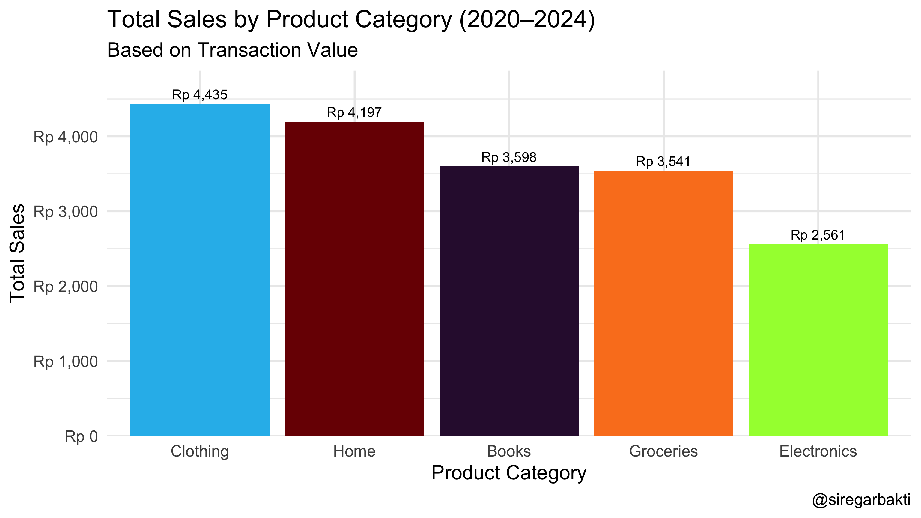
Python Code (Barchart)
import pandas as pd
import matplotlib.pyplot as plt
from matplotlib.ticker import FuncFormatter
from matplotlib import cm
import numpy as np

data_bisnis = pd.read_csv("data/bab8/data_bisnis.csv")

# Step 1: Prepare the data
sales_summary = (
    data_bisnis
    .groupby('Product_Category', as_index=False)
    .agg(Total_Sales=('Total_Price', 'sum'))
    .sort_values('Total_Sales', ascending=False)
)

# Step 2: Generate color palette
num_categories = sales_summary.shape[0]
colors = cm.turbo(np.linspace(0, 1, num_categories))

# Step 3: Create figure and axis
fig, ax = plt.subplots(figsize=(12, 6))

# Step 4: Plot bar chart
bars = ax.bar(
    sales_summary['Product_Category'],
    sales_summary['Total_Sales'],
    color=colors,
    edgecolor='black',
    linewidth=0.8
)

# Step 5: Format y-axis as currency
formatter = FuncFormatter(lambda x, _: f'Rp {int(x):,}'.replace(',', '.'))
ax.yaxis.set_major_formatter(formatter)
ax.grid(axis='y', linestyle='--', alpha=0.6)

# Step 6: Axis labels and ticks
ax.set_xlabel('Product Category', fontsize=14)
ax.set_ylabel('Total Sales', fontsize=14)
plt.setp(ax.get_xticklabels(), rotation=45, ha='right', fontsize=12);
ax.tick_params(axis='y', labelsize=12)


# Step 7: Add value labels on bars
for bar in bars:
    height = bar.get_height()
    ax.text(
        bar.get_x() + bar.get_width() / 2,
        height + max(sales_summary['Total_Sales']) * 0.01,
        f'Rp {int(height):,}'.replace(',', '.'),
        ha='center',
        va='bottom',
        fontsize=11
    )

# Step 8: Titles
fig.suptitle('Total Sales by Product Category (2020–2024)',
             fontsize=20, weight='bold', y=0.93)
ax.set_title('Based on Transaction Value', fontsize=16, pad=5, loc='center')

# Step 9: Credit
fig.text(0.98, 0.01, '@siregarbakti', ha='right', fontsize=16, color='gray')

# Step 10: Layout
plt.tight_layout(rect=[0, 0.03, 1, 0.92])

# Show plot once
plt.show();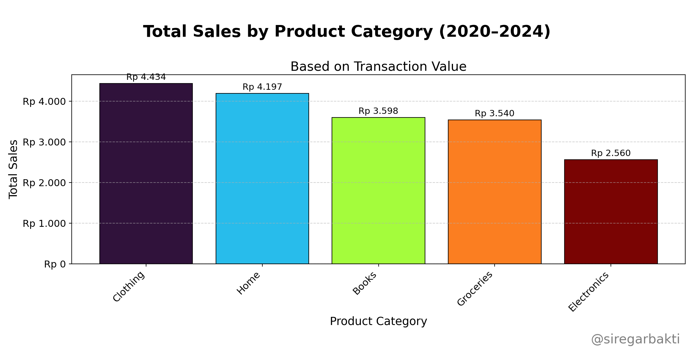
8.1.2 Pie Chart
A Pie Chart is a circular statistical graphic that displays categorical data as slices of a circle, where each slice represents a proportion or percentage of the whole.
Key Characteristics of a Pie Chart:
- Represents parts of a whole — the full circle equals 100%.
- Each slice corresponds to a category, sized by its proportion or percentage of the total.
- Labels or legends are used to indicate the name and value (or percentage) of each slice.
- Best suited for categorical data with limited categories (ideally fewer than 6) to maintain clarity.
- Colors are commonly used to visually differentiate between categories.
- Slices are not ordered—they follow the input sequence unless sorted manually.
- Commonly used to highlight the dominance or imbalance of categories within a dataset.
- Often used in business reports or dashboards for quick, high-level summaries.
R Code (Pie-Chart)
# Load necessary libraries
library(dplyr) # For data manipulation
library(ggplot2) # For data visualization
library(viridis) # For color palettes
library(scales) # For formatting percentages
# Step 1: Summarize total sales by product category
data_bisnis <- read.csv("data/bab8/data_bisnis.csv")
sales_summary <- data_bisnis %>%
group_by(Product_Category) %>%
summarise(Total_Sales = sum(Total_Price, na.rm = TRUE)) %>%
arrange(desc(Total_Sales)) %>%
mutate(
Percentage = Total_Sales / sum(Total_Sales),# Calculate share
Label = paste0(Product_Category, "\n", # Create label with line break
scales::percent(Percentage, accuracy = 1)))
# Step 2: Create custom color palette
custom_colors <- viridis::turbo(n = nrow(sales_summary))
# Step 3: Plot donut chart
ggplot(sales_summary, aes(x =2, y = Percentage, fill = Product_Category)) +
geom_col(width = 1, color = "white", show.legend = FALSE) + # donut slices
coord_polar(theta = "y") + # Convert to circular layout
geom_text(aes(label = Label), # Add labels inside slices
position = position_stack(vjust = 0.5),
size = 7, color = "white", fontface = "bold") +
scale_fill_manual(values = custom_colors) +
xlim(0.5, 2.5) + # Expand size of donut
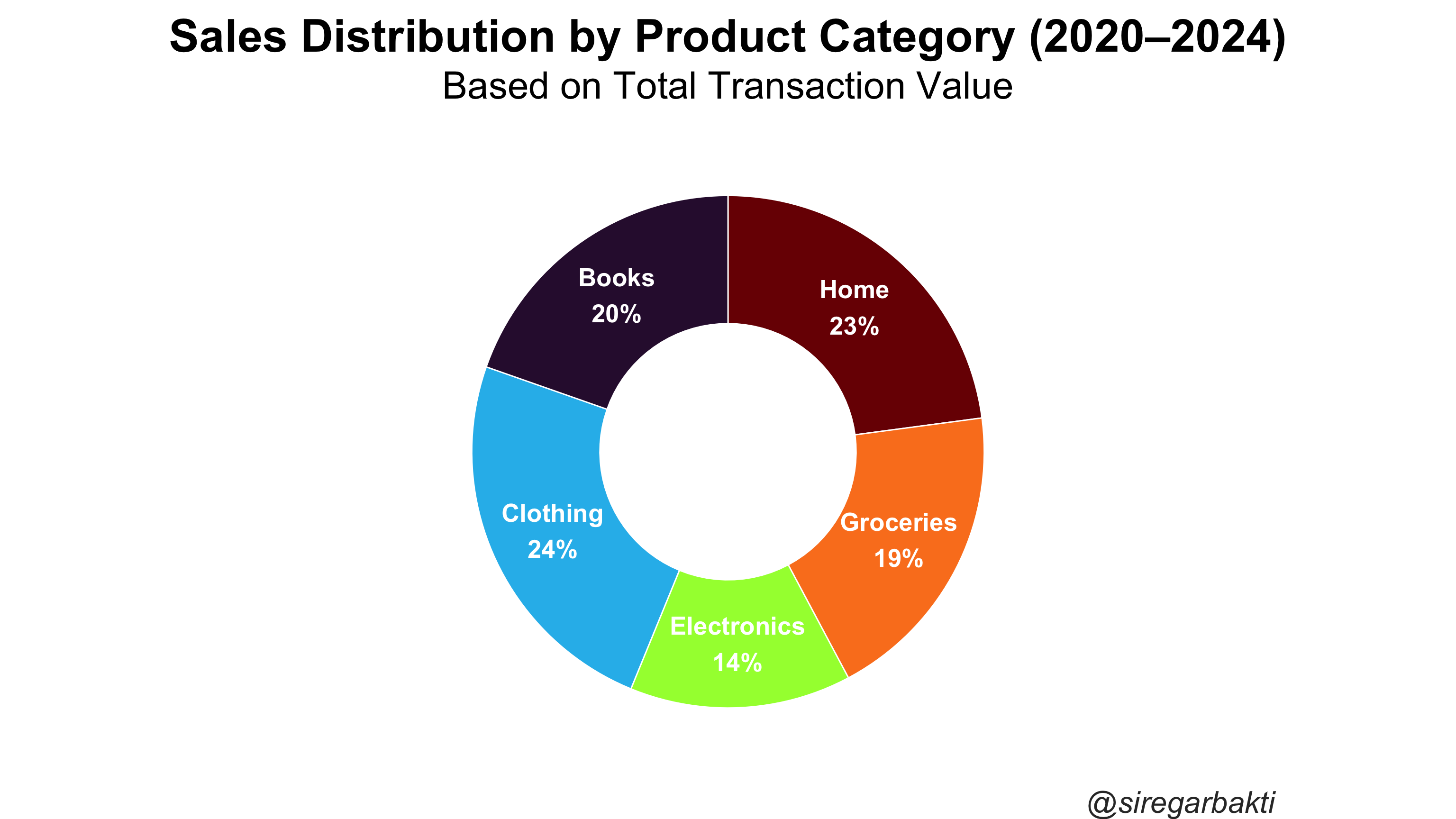
labs(
title = "Sales Distribution by Product Category (2020–2024)",
subtitle = "Based on Total Transaction Value",
caption = "@siregarbakti"
) +
theme_void(base_size = 30) + # Clean theme
theme(
plot.title = element_text(face = "bold", hjust = 0.5), # Centered title
plot.subtitle = element_text(margin = margin(t = 8, b = 20), hjust = 0.5),
plot.caption = element_text(margin = margin(t = 15), hjust = 1.5,
color = "gray20", face = "italic")
)
Python Code (Pie-Chart)
import matplotlib.pyplot as plt
from matplotlib import cm
import numpy as np

data_bisnis = pd.read_csv("data/bab8/data_bisnis.csv")

# Ringkasan Total Sales per Product_Category
sales_summary = (
    data_bisnis
    .groupby('Product_Category', as_index=False)
    .agg(Total_Sales=('Total_Price', 'sum'))
    .sort_values('Total_Sales', ascending=False)
)

# Persentase dan label
sales_summary['Percentage'] = sales_summary['Total_Sales']/sales_summary['Total_Sales'].sum()
sales_summary['Label'] = sales_summary.apply(
    lambda row: f"{row['Product_Category']}\n{row['Percentage']:.0%}", axis=1
)

# Warna turbo
num_categories = sales_summary.shape[0]
colors = cm.get_cmap('turbo')(np.linspace(0, 1, num_categories))

# Plot donut chart
fig, ax = plt.subplots(figsize=(7, 7))
wedges, _ = ax.pie(
    sales_summary['Percentage'],
    labels=None,
    startangle=90,
    counterclock=False,
    colors=colors,
    wedgeprops=dict(width=0.5, edgecolor='white')
)

# Tambahkan label ke setiap sektor
for i, (wedge, label) in enumerate(zip(wedges, sales_summary['Label'])):
    angle = (wedge.theta2 + wedge.theta1) / 2
    x = np.cos(np.radians(angle)) * 0.7
    y = np.sin(np.radians(angle)) * 0.7
    ax.text(x, y, label, ha='center', va='center', fontsize=10,
            color='white', weight='bold')

# Judul dan estetika
fig.suptitle('Distribusi Penjualan per Kategori Produk (2020–2024)',
            fontsize=15, weight='bold')
ax.set_title('Berdasarkan Total Nilai Transaksi', fontsize=12, pad=10)
fig.text(0.98, 0.02, '@siregarbakti', ha='right',
        fontsize=12, color='gray', style='italic')

# Tampilan
ax.axis('equal')  # Buat pie jadi lingkaran sempurna
plt.tight_layout()
plt.show();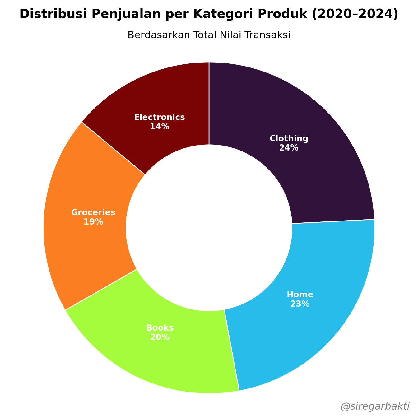
8.1.3 Word Cloud
A Word Cloud is a visual representation of textual data where the size of each word indicates its frequency or importance within a dataset. It is especially useful for quickly identifying the most prominent terms in unstructured text.
Key Characteristics of a Word Cloud:
- Displays words in varying sizes, where size reflects frequency or importance in the text data.
- Often used to summarize large volumes of unstructured text at a glance.
- Words are typically shown in a free-form, non-linear layout, often randomized for visual variety.
- Works best for exploratory text analysis, not precise quantitative interpretation.
- Commonly excludes stop words (e.g., “and”, “the”, “of”) to emphasize meaningful terms.
- Can be customized in terms of font, color, shape, orientation, and layout.
- Especially effective in identifying dominant themes or keywords from sources like customer feedback, social media posts, and survey responses.
R Code (Word Cloud)
# ==============================
# 1. Install & Load Required Packages
# ==============================
packages <- c("dplyr", "tm", "wordcloud", "RColorBrewer")
new_packages <- packages[!(packages %in% installed.packages()[, "Package"])]
if(length(new_packages)) install.packages(new_packages)

library(dplyr)
library(tm)
library(wordcloud)
library(RColorBrewer)

# ==============================
# 2. Read and Combine Text Columns
# ==============================
data_bisnis <- read.csv("data/bab8/data_bisnis.csv")

# Combine text columns into one
text_data <- paste(data_bisnis$Product_Category,
                   data_bisnis$Region,
                   data_bisnis$Sales_Channel,
                   sep = " ")

# ==============================
# 3. Clean and Prepare Text
# ==============================
corpus <- VCorpus(VectorSource(text_data))

corpus_clean <- corpus %>%
  tm_map(content_transformer(tolower)) %>%  # convert to lowercase
  tm_map(removePunctuation) %>%             # remove punctuation
  tm_map(removeNumbers) %>%                 # remove numbers
  tm_map(removeWords, stopwords("english")) %>%  # remove English stopwords
  tm_map(stripWhitespace)                   # remove extra whitespace

# Remove empty documents (if any)
non_empty_idx <- sapply(corpus_clean, function(doc) {
  nchar(content(doc)) > 0
})
corpus_clean <- corpus_clean[non_empty_idx]

# ==============================
# 4. Create Term-Document Matrix & Word Frequencies
# ==============================
tdm <- TermDocumentMatrix(corpus_clean)
m <- as.matrix(tdm)
word_freqs <- sort(rowSums(m), decreasing = TRUE)
df_words <- data.frame(word = names(word_freqs), freq = word_freqs)

# ==============================
# 5. Generate Word Cloud (Full Screen)
# ==============================
set.seed(123)
wordcloud(words = df_words$word,
          freq = df_words$freq,
          scale = c(8, 8),       # adjust for large size
          min.freq = 1,
          max.words = 300,
          random.order = FALSE,
          rot.per = 0.3,
          colors = brewer.pal(8, "Dark2"))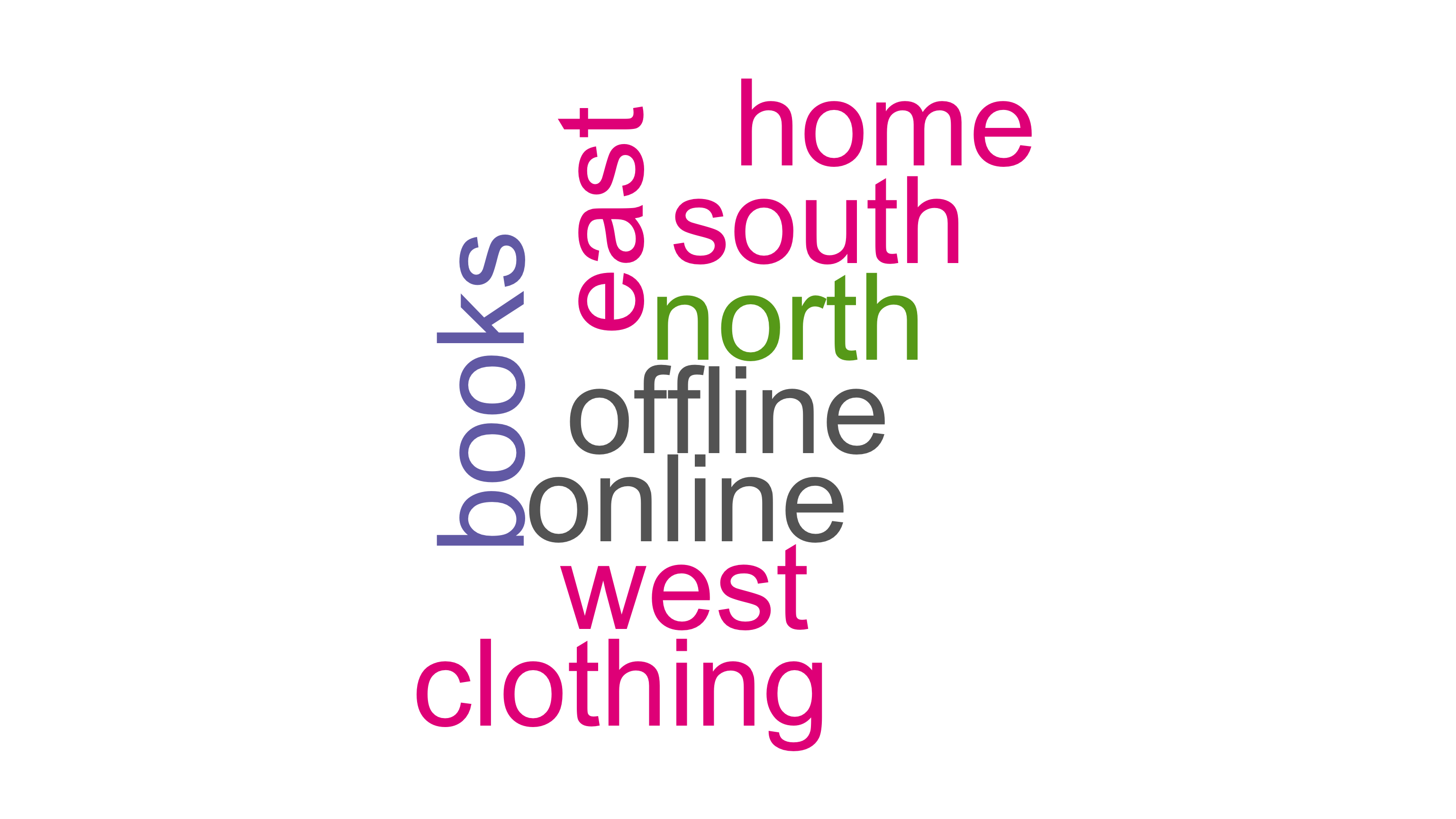
Python Code (Word Cloud)
import pandas as pd
import re
import nltk
from nltk.corpus import stopwords
from sklearn.feature_extraction.text import CountVectorizer
from wordcloud import WordCloud
import matplotlib.pyplot as plt

# 1. Install and load required packages
# (Make sure nltk stopwords are downloaded)
nltk.download('stopwords')

# 2. Read and Combine Text Columns
data_bisnis = pd.read_csv("data/bab8/data_bisnis.csv")

# Combine text columns into a single string per row
text_data = data_bisnis['Product_Category'].fillna('') + " " + \
            data_bisnis['Region'].fillna('') + " " + \
            data_bisnis['Sales_Channel'].fillna('')

# 3. Clean and Prepare Text - similar to tm_map pipeline in R
stop_words = set(stopwords.words('english'))

def clean_text(text):
    text = text.lower()                        # tolower()
    text = re.sub(r'[^\w\s]', ' ', text)      # removePunctuation()
    text = re.sub(r'\d+', '', text)            # removeNumbers()
    text = re.sub(r'\s+', ' ', text)           # stripWhitespace()
    words = text.strip().split()
    words = [w for w in words if w not in stop_words]  # removeWords(stopwords)
    return " ".join(words)

cleaned_docs = text_data.apply(clean_text)

# Remove empty documents (like non_empty_idx in R)
cleaned_docs = cleaned_docs[cleaned_docs.str.strip() != ""]

# 4. Create Term-Document Matrix & Word Frequencies
vectorizer = CountVectorizer()
tdm = vectorizer.fit_transform(cleaned_docs)

# Sum the counts of each word over all documents
word_freqs = tdm.sum(axis=0).A1  # convert to 1D array
words = vectorizer.get_feature_names_out()

# Create dataframe like df_words in R
df_words = pd.DataFrame({'word': words, 'freq': word_freqs})
df_words = df_words.sort_values(by='freq', ascending=False)

# 5. Generate Word Cloud (Full Screen)
plt.figure(figsize=(16, 9))  # Full screen size similar to options(repr.plot.width=16, repr.plot.height=9)

wc = WordCloud(width=1200, height=900,
               background_color='white',
               max_words=300,
               min_font_size=8,
               random_state=123,
               prefer_horizontal=0.7,
               colormap='Dark2')

wc.generate_from_frequencies(dict(zip(df_words['word'], df_words['freq'])))

plt.imshow(wc, interpolation='bilinear')
plt.axis('off')
plt.tight_layout(pad=0)
plt.show()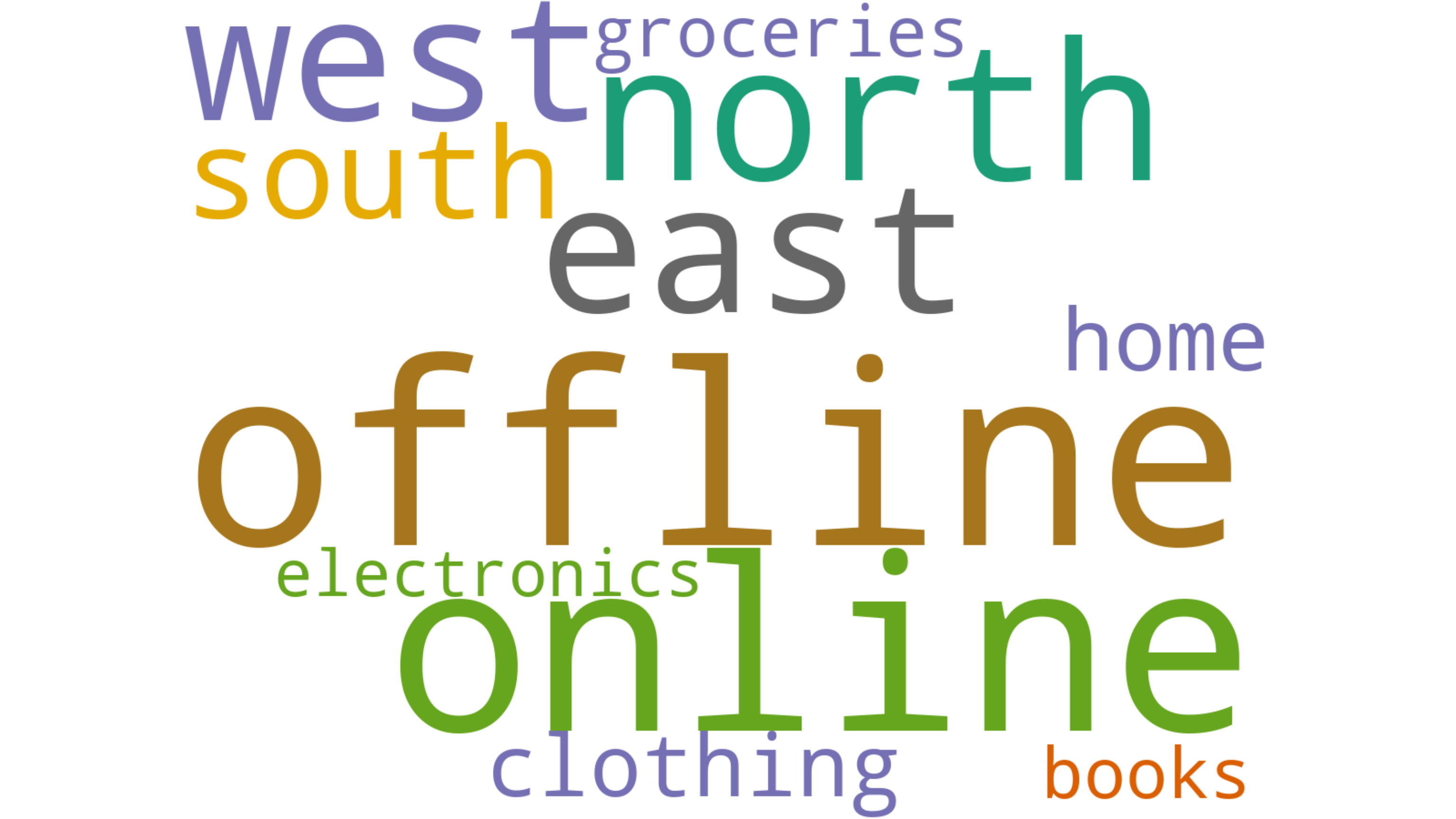
8.1.4 Treemap
A Tree Map is a visual representation of hierarchical data using nested rectangles, where the size and color of each rectangle reflect quantitative values. It is especially useful for displaying proportions within categories and subcategories in a compact and intuitive way.
Key Characteristics of a Tree Map:
- Represents hierarchical or categorical data as nested rectangles.
- The size of each rectangle corresponds to a quantitative variable (e.g., sales volume, population, revenue).
- Can include color gradients to reflect an additional dimension, such as growth rate or change over time.
- Allows for quick comparison of relative sizes across categories and subcategories.
- Efficient use of space—can display a large amount of data in a compact form.
- Works best when comparing proportions and identifying dominant segments in a dataset.
- Commonly used in fields such as business intelligence, finance, and data dashboards.
- Ideal for visualizing data like market share, product performance, regional sales distribution, or inventory breakdown.
R Code (Treemap)
# ==============================
# 1. Install & Load Required Packages
# ==============================
packages <- c("treemapify", "dplyr", "ggplot2")
new_packages <- packages[!(packages %in% installed.packages()[, "Package"])]
if(length(new_packages)) install.packages(new_packages)

# Load libraries
library(treemapify)
library(ggplot2)
library(dplyr)

# ==============================
# 2. Prepare Aggregated Treemap Data
# ==============================
data_bisnis <- read.csv("data/bab8/data_bisnis.csv")
tree_data <- data_bisnis %>%
  group_by(Product_Category, Region) %>%
  summarise(
    Total_Sales = sum(Total_Price, na.rm = TRUE),
    .groups = "drop"
  ) %>%
  mutate(
    label_combined = paste0(Region, "\n", round(Total_Sales, 0))
  )

# ==============================
# 3. Create Static Tree Map with Combined Labels
# ==============================

ggplot(tree_data, aes(
  area = Total_Sales,
  fill = Product_Category,
  subgroup = Product_Category
)) +
  geom_treemap() +
  geom_treemap_subgroup_border(color = "white") +

  geom_treemap_text(
    aes(label = label_combined),
    colour = "white",
    place = "centre",
    grow = FALSE,
    reflow = TRUE,
    size = 50 / .pt,       # Adjust overall font size
    min.size = 3
  ) +

  labs(
    title = "Tree Map of Total Sales by Product Category and Region"
  ) +
  theme_minimal()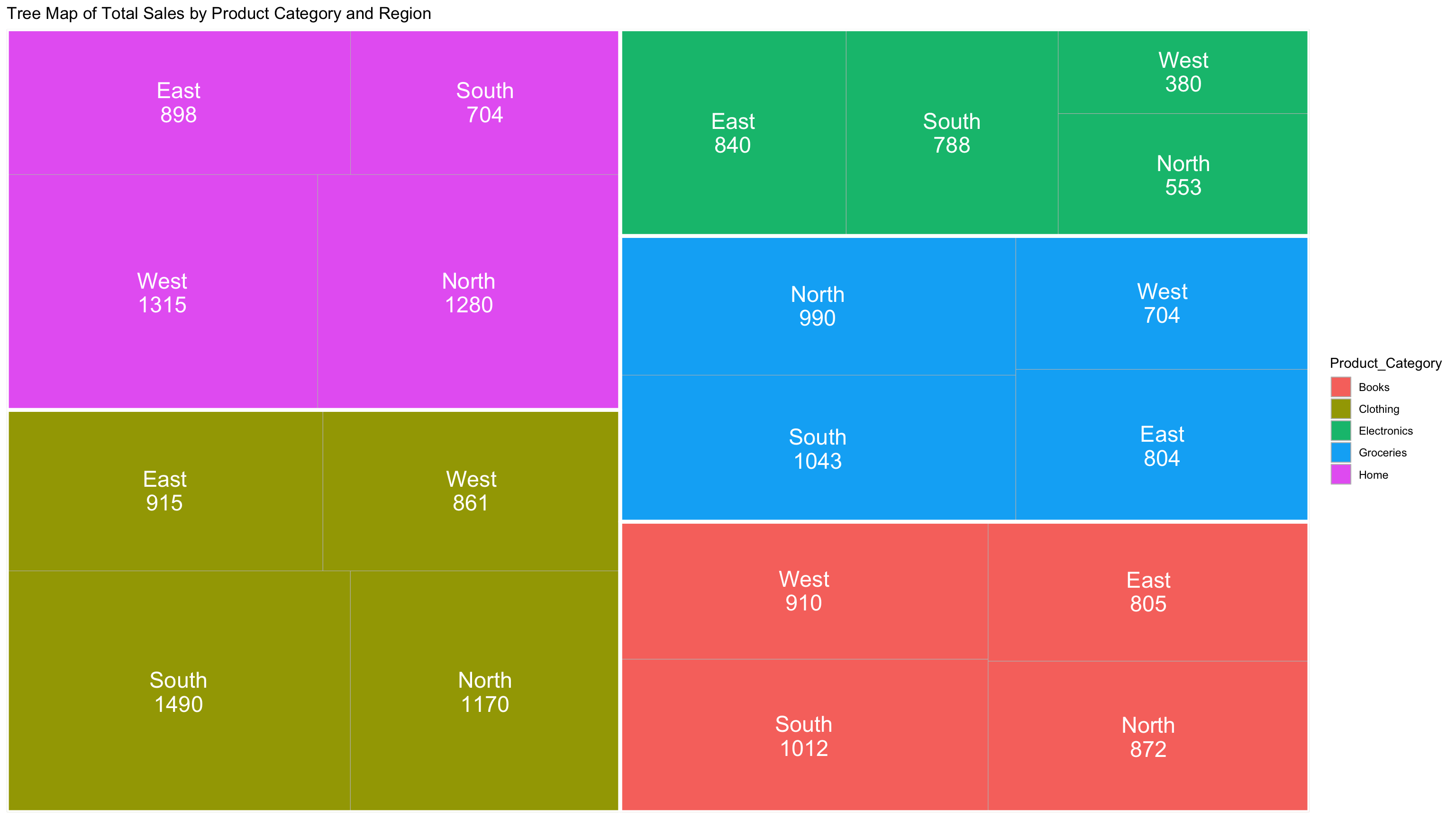
Python Code (Treemap)
import pandas as pd
import matplotlib.pyplot as plt
import squarify
import matplotlib.patches as mpatches

# ==============================
# 1. Prepare Data
# ==============================

# Load data
data_bisnis = pd.read_csv("data/bab8/data_bisnis.csv", dtype=str)

# Convert 'Total_Price' to numeric
data_bisnis['Total_Price'] = pd.to_numeric(data_bisnis['Total_Price'], errors='coerce')

# ==============================
# 2. Prepare Aggregated Treemap Data
# ==============================

# Aggregate sales by Product_Category and Region
tree_data = (
    data_bisnis
    .groupby(['Product_Category', 'Region'], as_index=False)
    .agg(Total_Sales=('Total_Price', 'sum'))
)

# Create combined label
tree_data['label_combined'] = tree_data.apply(
    lambda row: f"{row['Region']}\n{round(row['Total_Sales'], 0)}", axis=1
)

# ==============================
# 3. Create Static Treemap with Legend
# ==============================

# Treemap values
sizes = tree_data['Total_Sales'].values
labels = tree_data['label_combined'].values
categories = tree_data['Product_Category'].values

# Color palette like R (Set3 from ggplot2)
unique_categories = tree_data['Product_Category'].unique()
palette = plt.get_cmap('Set3')
color_dict = {
    cat: palette(i / len(unique_categories)) for i, cat in enumerate(unique_categories)
}
colors = [color_dict[cat] for cat in categories]

# Create plot
fig, ax = plt.subplots(figsize=(16, 9))
squarify.plot(
    sizes=sizes,
    label=labels,
    color=colors,
    alpha=0.85,
    ax=ax,
    text_kwargs={'fontsize': 16, 'color': 'black'}
)

# Set title and remove axis
ax.set_title("Tree Map of Total Sales by Product Category and Region", fontsize=20)
ax.axis('off')

# ==============================
# 4. Add Legend
# ==============================

# Create legend handles
legend_handles = [
    mpatches.Patch(color=color_dict[cat], label=cat) for cat in unique_categories
]

# Place legend outside the plot (right side)
plt.legend(
    handles=legend_handles,
    title='Product Category',
    bbox_to_anchor=(1.05, 1),
    loc='upper left'
)

# ==============================
# 5. Show Plot
# ==============================

plt.tight_layout()
plt.show();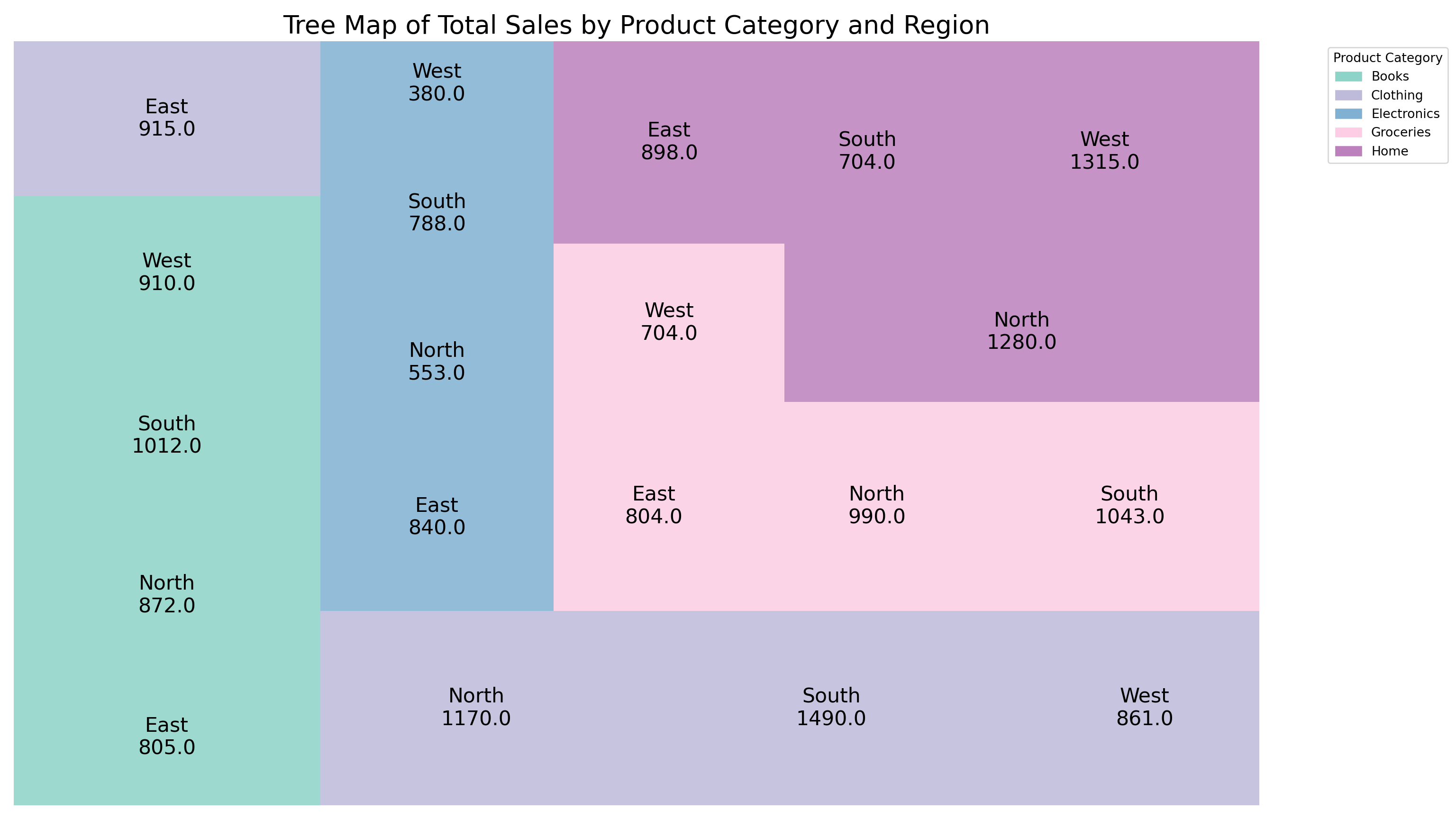
8.2 Numerical Data
Numerical Data refers to data that consists of numbers and represents measurable quantities. It is fundamental in statistics, scientific research, economics, and data analysis due to its ability to be directly manipulated using mathematical operations.
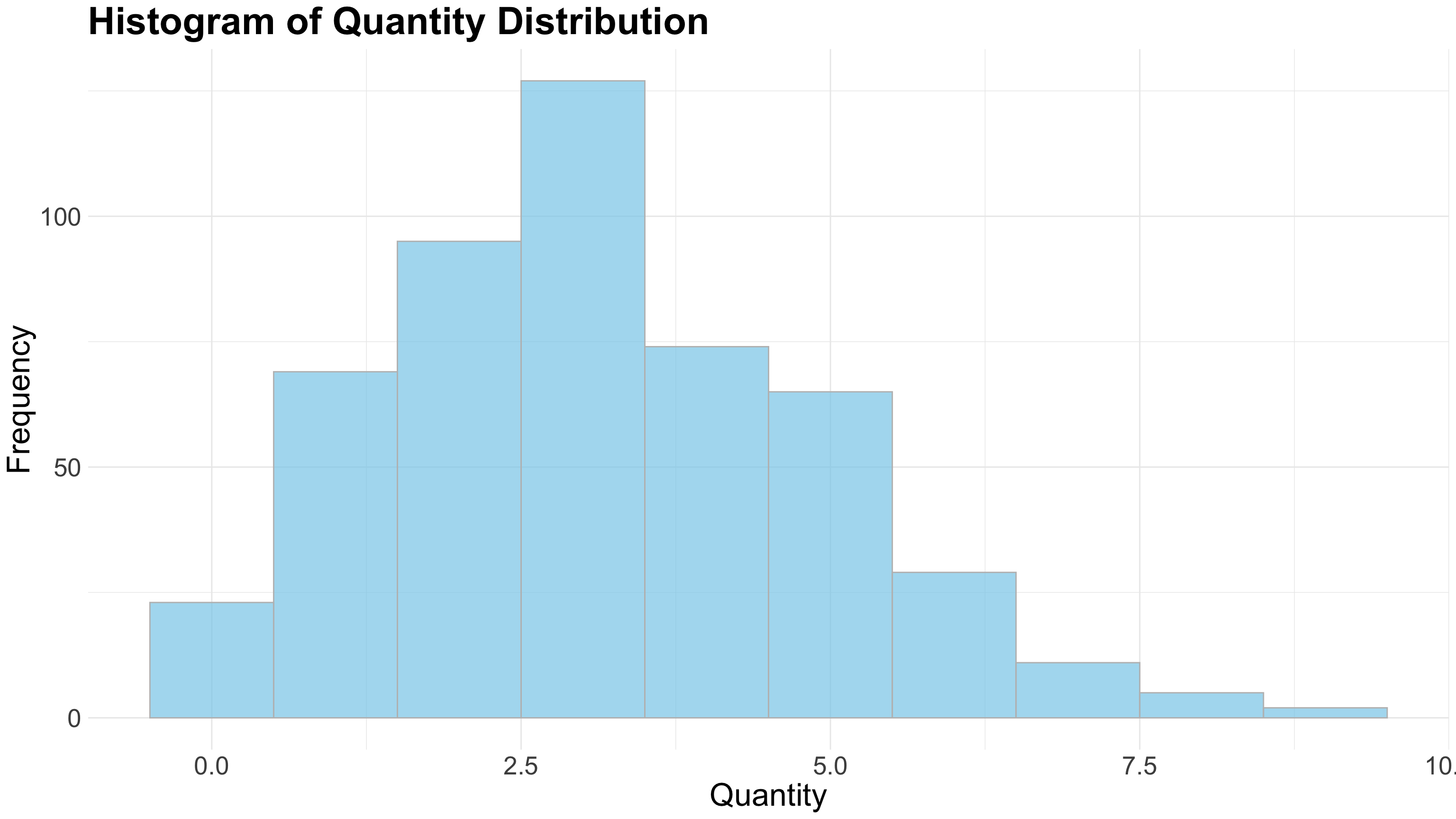
8.2.1 Histogram
A Histogram is a graphical representation that organizes a group of data points into user-specified ranges (bins). It displays the frequency distribution of numerical data by showing how many data points fall within each bin as adjacent bars.
Key Characteristics of a Histogram:
- Visualizes the distribution of numerical data.
- Divides data into continuous intervals called bins or classes.
- The height of each bar represents the frequency (count) of data points in that bin.
- Bars are adjacent without gaps, reflecting continuous data intervals.
- Helps identify patterns such as skewness, modality (uni-, bi-, multi-modal), and spread of the data.
- Useful for detecting outliers and data concentration.
- Commonly used in statistics, quality control, finance, and many scientific fields.
- Ideal for showing data like exam scores, customer ages, sensor measurements, or production times.
R Code (Histogram)
# ==============================
# 1. Load Required Libraries
# ==============================
library(ggplot2)
library(dplyr)

# ==============================
# 2. Prepare Data
# ==============================
data_bisnis <- read.csv("data/bab8/data_bisnis.csv")
data_bisnis <- data_bisnis %>%
  mutate(Quantity = as.numeric(Quantity))

# ==============================
# 3. Create Histogram of Quantity with Custom Font Sizes
# ==============================
ggplot(data_bisnis, aes(x = Quantity)) +
  geom_histogram(binwidth = 1,
                 fill = "skyblue",
                 color = "gray",
                 alpha = 0.7) +
  labs(
    title = "Histogram of Quantity Distribution",
    x = "Quantity",
    y = "Frequency"
  ) +
  theme_minimal() +
  theme(
    plot.title = element_text(size = 30, face = "bold"),  # Title size and bold
    axis.title.x = element_text(size = 25),               # X label size
    axis.title.y = element_text(size = 25),               # Y label size
    axis.text.x = element_text(size = 20),                # X axis numbers size
    axis.text.y = element_text(size = 20)                 # Y axis numbers size
  )
Python Code (Histogram)
import pandas as pd
import matplotlib.pyplot as plt
import seaborn as sns

# ==============================
# 1. Prepare Data
# ==============================
# Assuming data_bisnis is a pandas DataFrame loaded already

# Load data
data_bisnis = pd.read_csv("data/bab8/data_bisnis.csv", dtype=str)
data_bisnis['Quantity'] = pd.to_numeric(data_bisnis['Quantity'], errors='coerce')

# Drop missing values in Quantity
data_clean = data_bisnis.dropna(subset=['Quantity'])

# ==============================
# 2. Plot Histogram with Custom Font Sizes
# ==============================
plt.figure(figsize=(16, 9))

sns.histplot(data_clean['Quantity'],
             binwidth=1,
             color='skyblue',
             alpha=0.7,
             edgecolor='gray')

plt.title('Histogram of Quantity Distribution', fontsize=30, fontweight='bold')
plt.xlabel('Quantity', fontsize=25)
plt.ylabel('Frequency', fontsize=25)

plt.xticks(fontsize=20)
plt.yticks(fontsize=20)

plt.tight_layout()
plt.show();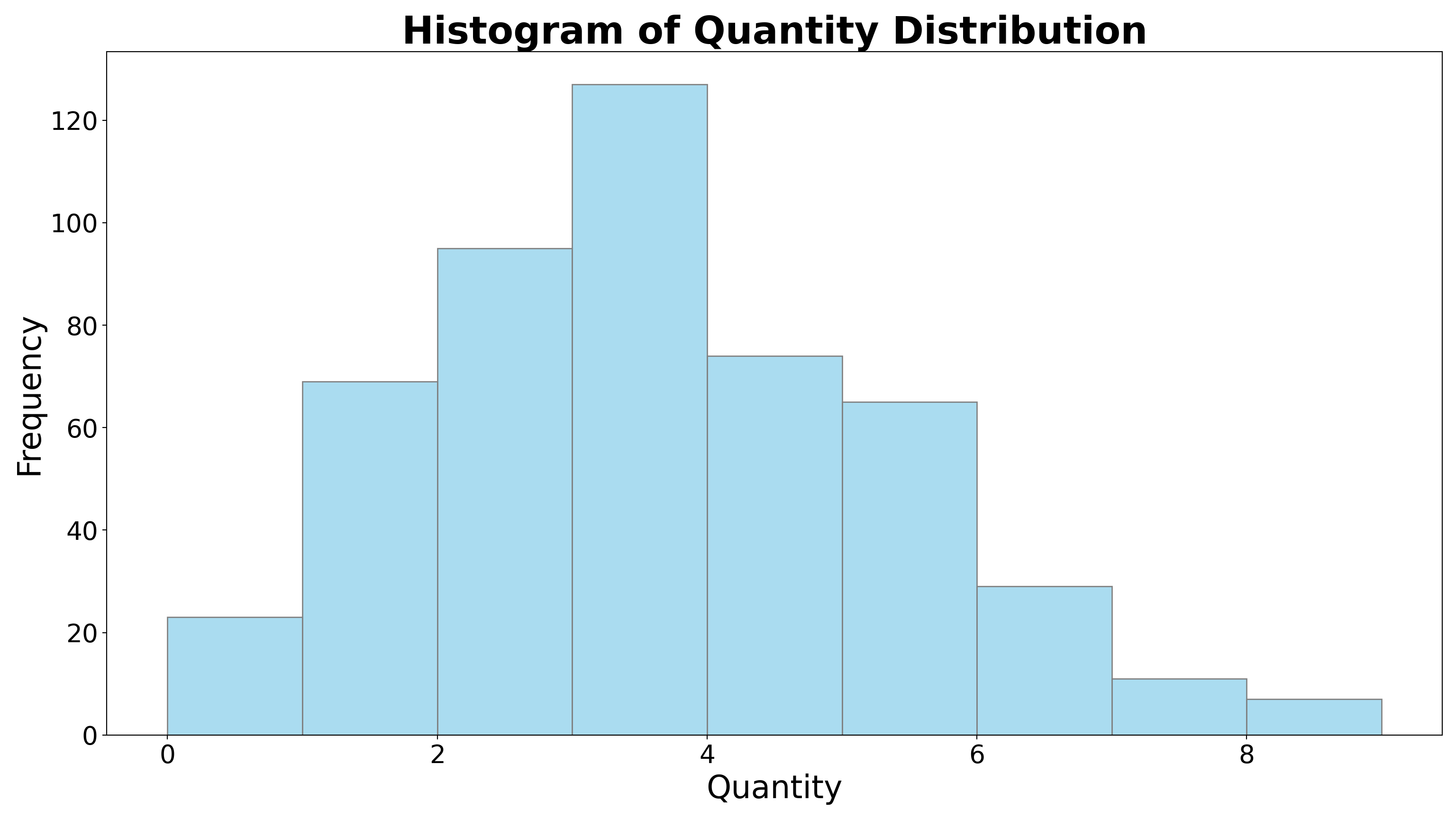
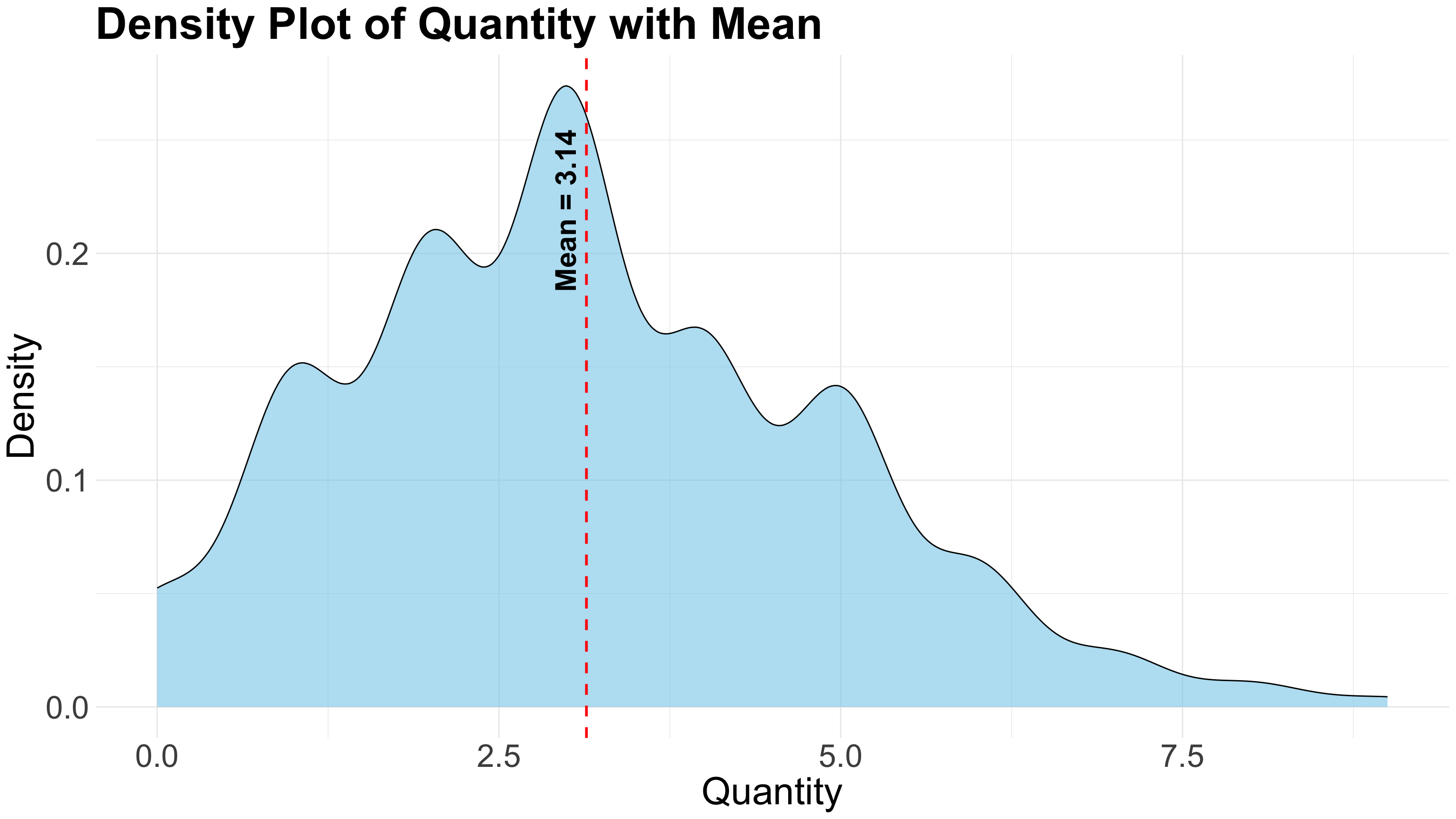
8.2.2 Density Plot
A Density Plot is a smooth, continuous curve that estimates the probability distribution of a numerical variable. Unlike histograms that group data into bins, density plots use kernel smoothing techniques to show the shape of the data distribution, providing a clearer view of underlying patterns.
Key Characteristics of a Density Plot:
- Visualizes the distribution of numerical data as a continuous curve.
- Uses kernel density estimation (KDE) to smooth data points over the range.
- The area under the curve sums to 1, representing a probability density.
- Helps identify the shape, modality (uni-, bi-, multi-modal), and spread of the data more smoothly than histograms.
- Less sensitive to bin width or class intervals compared to histograms.
- Useful for comparing multiple distributions on the same plot.
- Commonly used in statistics, data analysis, machine learning, and scientific research.
- Ideal for showing patterns in data such as height distributions, income levels, or sensor readings.
R Code (Density-plot)
# ==============================
# 1. Load Required Libraries
# ==============================
library(ggplot2)
library(dplyr)

# ==============================
# 2. Prepare Data
# ==============================
data_bisnis <- read.csv("data/bab8/data_bisnis.csv")

# Ensure Quantity is numeric and remove NAs
data_bisnis <- data_bisnis %>%
  mutate(Quantity = as.numeric(Quantity)) %>%
  filter(!is.na(Quantity))

# Calculate mean of Quantity
mean_quantity <- mean(data_bisnis$Quantity, na.rm = TRUE)

# Estimate density to get y-position for label
density_data <- density(data_bisnis$Quantity)
max_y <- max(density_data$y)

# ==============================
# 3. Create Density Plot with Mean Line and Label
# ==============================
ggplot(data_bisnis, aes(x = Quantity)) +
  geom_density(fill = "skyblue", alpha = 0.6) +
  geom_vline(xintercept = mean_quantity, color = "red",
             linetype = "dashed", linewidth = 1) +
  geom_text(
    data = data.frame(x = mean_quantity, y = max_y * 0.8),
    aes(x = x, y = y),
    label = paste("Mean =", round(mean_quantity, 2)),
    color = "black",
    angle = 90,
    vjust = -0.5,
    size = 8,
    fontface = "bold",
    inherit.aes = FALSE
  ) +
  labs(
    title = "Density Plot of Quantity with Mean",
    x = "Quantity",
    y = "Density"
  ) +
  theme_minimal() +
  theme(
    plot.title = element_text(size = 35, face = "bold"),
    axis.title = element_text(size = 30),
    axis.text = element_text(size = 25)
  )
Python Code (Density-plot)
# ==============================
# 1. Load Required Libraries
# ==============================
import pandas as pd
import matplotlib.pyplot as plt
import seaborn as sns
import numpy as np
from scipy.stats import gaussian_kde

# ==============================
# 2. Prepare Data
# ==============================
# Load data
data_bisnis = pd.read_csv("data/bab8/data_bisnis.csv", dtype=str)
data_bisnis['Quantity'] = pd.to_numeric(data_bisnis['Quantity'], errors='coerce')
data_bisnis = data_bisnis.dropna(subset=['Quantity'])

mean_quantity = data_bisnis['Quantity'].mean()

# ==============================
# 3. Calculate density manually (to get y max for label)
# ==============================
values = data_bisnis['Quantity'].values
density = gaussian_kde(values)
x_vals = np.linspace(values.min(), values.max(), 1000)
y_vals = density(x_vals)
max_density_y = y_vals.max()

# ==============================
# 4. Plot density, mean line, and text label
# ==============================
plt.figure(figsize=(16, 9))

# Plot density with seaborn for nice fill
sns.kdeplot(data=data_bisnis, x='Quantity', fill=True, color='skyblue', alpha=0.6)

# Add vertical dashed mean line
plt.axvline(mean_quantity, color='red', linestyle='--', linewidth=1)

# Add text label near the mean line
plt.text(
    mean_quantity,
    max_density_y * 0.8,
    f'Mean = {mean_quantity:.2f}',
    rotation=90,
    verticalalignment='bottom',
    horizontalalignment='right',
    color='black',
    fontsize=12,
    fontweight='bold'
)

# Labels and title
plt.title("Density Plot of Quantity with Mean", fontsize=30, fontweight='bold')
plt.xlabel("Quantity", fontsize=25)
plt.ylabel("Density", fontsize=25)

plt.xticks(fontsize=20)
plt.yticks(fontsize=20)

plt.show();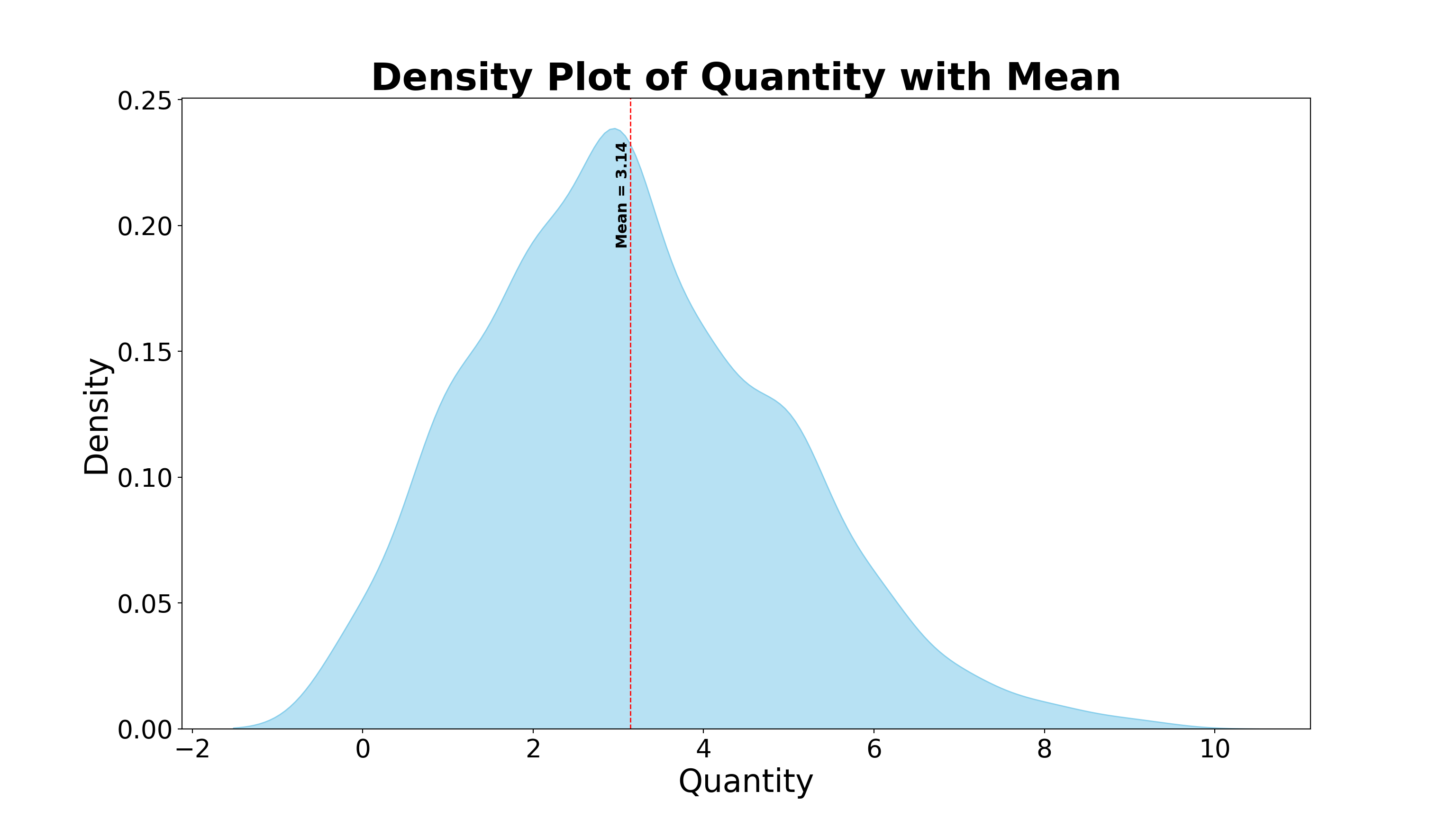
8.2.3 Boxplot
A Boxplot (or box-and-whisker plot) is a graphical summary of a numerical dataset that displays its central tendency, dispersion, and skewness through five key statistics. It provides a quick visual way to identify data spread, central value, and potential outliers.
Key Characteristics of a Boxplot:
- Summarizes numerical data using five-number summary: minimum, first quartile (Q1), median (Q2), third quartile (Q3), and maximum.
- The box spans from Q1 to Q3, representing the interquartile range (IQR) which contains the middle 50% of data.
- The line inside the box marks the median (Q2), showing the central tendency.
- Whiskers extend from the box to the smallest and largest values within 1.5×IQR from the quartiles.
- Points outside the whiskers are considered outliers and plotted individually.
- Useful for comparing distributions between groups or categories.
- Efficiently highlights skewness, spread, and symmetry of the data.
- Widely used in exploratory data analysis, quality control, and statistical reporting.
- Ideal for examining test scores, financial data, experimental measurements, and any data where variability and outliers matter.
R Code (Boxplot)
# ==============================
# 1. Load Libraries
# ==============================
library(ggplot2)
library(dplyr)

# ==============================
# 2. Load and Prepare Data
# ==============================
data_bisnis <- read.csv("data/bab8/data_bisnis.csv", stringsAsFactors = FALSE)

# Convert Quantity to numeric and filter missing
data_bisnis <- data_bisnis %>%
  mutate(Quantity = as.numeric(Quantity)) %>%
  filter(!is.na(Quantity))

# Compute IQR-based outlier bounds
Q1 <- quantile(data_bisnis$Quantity, 0.25)
Q3 <- quantile(data_bisnis$Quantity, 0.75)
IQR_value <- IQR(data_bisnis$Quantity)
lower_whisker <- Q1 - 1.5 * IQR_value
upper_whisker <- Q3 + 1.5 * IQR_value

# ==============================
# 3. Summarize Statistics
# ==============================
stats <- data_bisnis %>%
  summarise(
    Mean = mean(Quantity),
    Q1 = Q1,
    Median = median(Quantity),
    Q3 = Q3,
    Min = min(Quantity),
    Max = max(Quantity),
    Outliers = sum(Quantity < lower_whisker | Quantity > upper_whisker)
  )

# ==============================
# 4. Basic Boxplot with Jitter and Annotations
# ==============================
ggplot(data_bisnis, aes(x = factor(1), y = Quantity)) +
  # Basic boxplot
  geom_boxplot(fill = "skyblue", outlier.shape = NA) +

  # Add jittered points, highlight outliers in red
  geom_jitter(aes(color = Quantity < lower_whisker | Quantity > upper_whisker),
              width = 0.1, size = 2, alpha = 0.5) +
  scale_color_manual(values = c("FALSE" = "black", "TRUE" = "red"), guide = "none") +

  # Highlight max point if not an outlier
  geom_point(data = data_bisnis %>% filter(Quantity == stats$Max[[1]] & Quantity <= upper_whisker),
             aes(x = factor(1), y = Quantity),
             color = "red", size = 20) +

  # Annotations
  ggplot2::annotate("text", x = 1.2, y = stats$Mean[[1]],
           label = paste("Mean:", round(stats$Mean[[1]], 2)),
           hjust = 0, fontface = "bold", color = "blue") +
  ggplot2::annotate("text", x = 1.2, y = stats$Q1[[1]],
           label = paste("Q1:", round(stats$Q1[[1]], 2)),
           hjust = 0, color = "darkgreen") +
  ggplot2::annotate("text", x = 1.2, y = stats$Median[[1]],
           label = paste("Median:", round(stats$Median[[1]], 2)),
           hjust = 0, color = "purple") +
  ggplot2::annotate("text", x = 1.2, y = stats$Q3[[1]],
           label = paste("Q3:", round(stats$Q3[[1]], 2)),
           hjust = 0, color = "darkgreen") +
  ggplot2::annotate("text", x = 1.2, y = stats$Min[[1]],
           label = paste("Min:", round(stats$Min[[1]], 2)),
           hjust = 0, color = "orange") +
  ggplot2::annotate("text", x = 1.2, y = stats$Max[[1]],
           label = paste("Max:", round(stats$Max[[1]], 2)),
           hjust = 0, color = "orange") +
  ggplot2::annotate("text", x = 1, y = stats$Max[[1]] + 0.05 * stats$Max[[1]],
           label = paste("Outliers:", stats$Outliers[[1]]),
           color = "red", fontface = "italic", hjust = 0.5) +

  # Plot formatting
  labs(
    title = "Boxplot of Quantity with Jitter",
    x = NULL,
    y = "Quantity"
  ) +
  theme_minimal() +
  theme(
    axis.text.x = element_blank(),
    axis.ticks.x = element_blank(),
    plot.title = element_text(size = 50, face = "bold"),
    axis.title = element_text(size = 40),
    axis.text = element_text(size = 30)
  )
Python Code (Boxplot)
# Your task8.2.4 Violin Plot
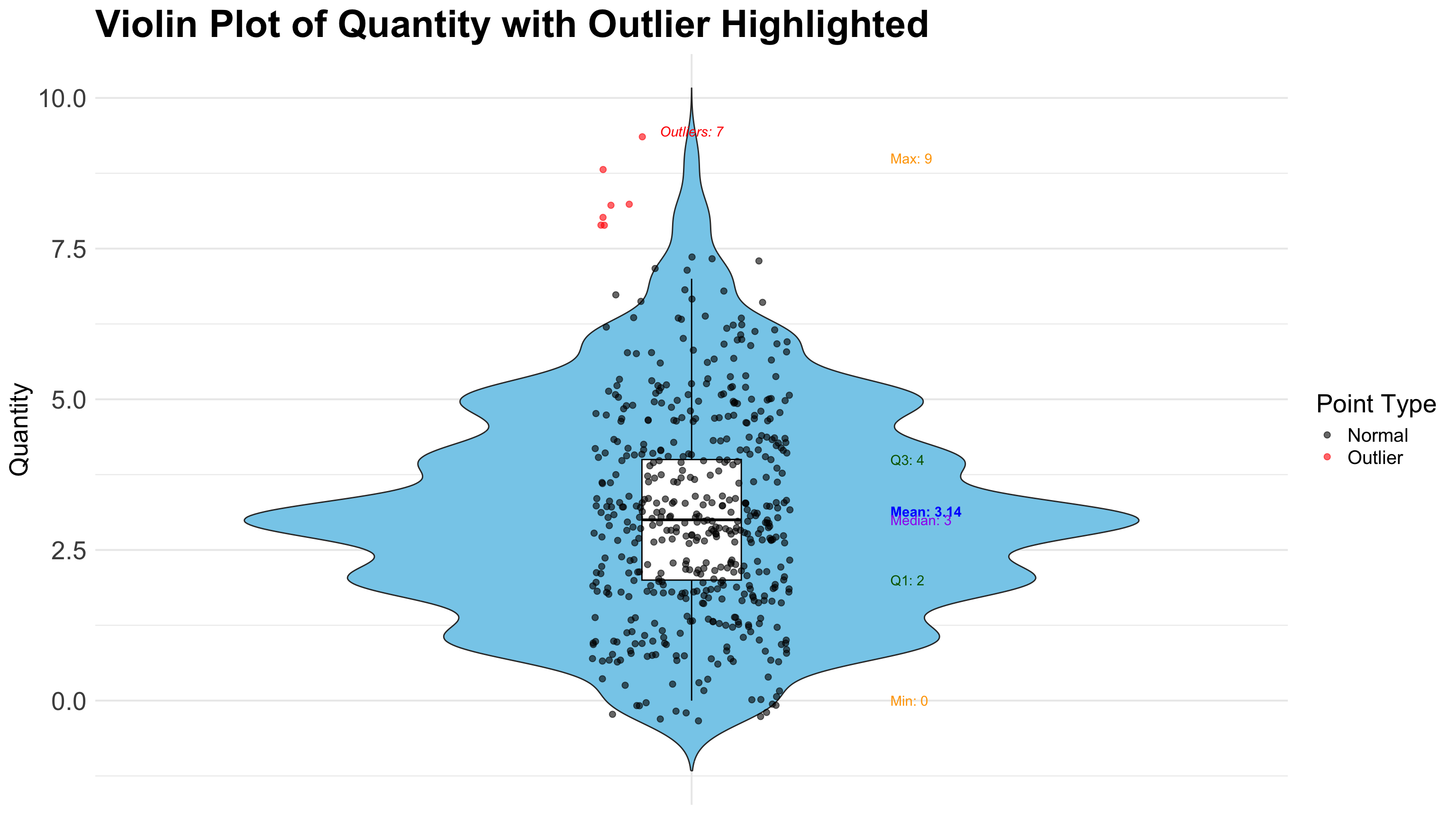
A Violin Plot is a powerful data visualization that combines the features of a boxplot with a kernel density plot, providing a richer view of the distribution of a numerical variable. It is especially useful when you want to assess both summary statistics and the distribution shape of the data.
Key Characteristics of a Violin Plot:
- Combines boxplot and KDE (Kernel Density Estimate): Displays the five-number summary (like a boxplot) and a mirrored density plot showing data distribution.
- Symmetrical density shape: The wider the “violin” at a given value, the more data points exist around that value.
- Shows median and interquartile range (IQR): The central box inside the violin marks the median (Q2), first quartile (Q1), and third quartile (Q3).
- Visualizes multimodal distributions: Unlike boxplots, violin plots can reveal if the data has more than one peak (mode).
- Outliers may be plotted: Depending on the implementation (e.g., in Seaborn), individual points or extreme values can still be shown.
- Great for comparing multiple groups: Just like boxplots, violin plots are often used to compare distributions across different categories.
- Useful in identifying skewness and data spread: The shape of the violin intuitively shows if the distribution is skewed or symmetric.
- Ideal for exploratory data analysis: Especially when understanding the underlying distribution matters, such as in behavioral data, survey responses, or experimental outcomes.
R Code (Violin-plot)
# ==============================
# 1. Load Libraries
# ==============================
library(ggplot2)
library(dplyr)

# ==============================
# 2. Load and Prepare Data
# ==============================
data_bisnis <- read.csv("data/bab8/data_bisnis.csv", stringsAsFactors = FALSE)

# Clean and convert Quantity to numeric
data_bisnis <- data_bisnis %>%
  mutate(Quantity = as.numeric(Quantity)) %>%
  filter(!is.na(Quantity))

# Calculate quartiles and IQR for outlier detection
Q1 <- quantile(data_bisnis$Quantity, 0.25)
Q3 <- quantile(data_bisnis$Quantity, 0.75)
IQR_value <- IQR(data_bisnis$Quantity)
upper_whisker <- Q3 + 1.5 * IQR_value
lower_whisker <- Q1 - 1.5 * IQR_value

# Mark outliers
data_bisnis <- data_bisnis %>%
  mutate(
    is_outlier = ifelse(Quantity < lower_whisker | Quantity > upper_whisker, "Outlier", "Normal")
  )

# ==============================
# 3. Summarize Statistics
# ==============================
stats <- data_bisnis %>%
  summarise(
    Mean = mean(Quantity),
    Q1 = Q1,
    Median = median(Quantity),
    Q3 = Q3,
    Min = min(Quantity),
    Max = max(Quantity),
    Outliers = sum(is_outlier == "Outlier")
  )

# ==============================
# 4. Create Violin Plot with Colored Jitter and Annotations
# ==============================
ggplot(data_bisnis, aes(x = factor(1), y = Quantity)) +
  geom_violin(fill = "skyblue", trim = FALSE) +
  geom_boxplot(width = 0.1, outlier.shape = NA, color = "black") +
  geom_jitter(aes(color = is_outlier), width = 0.1, alpha = 0.6, size = 2) +
  geom_point(data = data_bisnis %>%
               filter(Quantity == stats$Max[[1]] & Quantity <= upper_whisker),
             aes(x = factor(1), y = Quantity),
             color = "red", size = 8) +

  # Annotations via geom_text
  geom_text(data = stats, aes(x = 1.2, y = Mean, label = paste("Mean:", round(Mean, 2))),
            hjust = 0, color = "blue", fontface = "bold") +
  geom_text(data = stats, aes(x = 1.2, y = Q1, label = paste("Q1:", round(Q1, 2))),
            hjust = 0, color = "darkgreen") +
  geom_text(data = stats, aes(x = 1.2, y = Median, label = paste("Median:", round(Median, 2))),
            hjust = 0, color = "purple") +
  geom_text(data = stats, aes(x = 1.2, y = Q3, label = paste("Q3:", round(Q3, 2))),
            hjust = 0, color = "darkgreen") +
  geom_text(data = stats, aes(x = 1.2, y = Min, label = paste("Min:", round(Min, 2))),
            hjust = 0, color = "orange") +
  geom_text(data = stats, aes(x = 1.2, y = Max, label = paste("Max:", round(Max, 2))),
            hjust = 0, color = "orange") +
  geom_text(data = stats, aes(x = 1, y = Max + 0.05 * Max,
                             label = paste("Outliers:", Outliers)),
            color = "red", fontface = "italic", hjust = 0.5) +

  scale_color_manual(values = c("Normal" = "black", "Outlier" = "red")) +

  labs(
    title = "Violin Plot of Quantity with Outlier Highlighted",
    x = NULL,
    y = "Quantity",
    color = "Point Type"
  ) +
  theme_minimal() +
  theme_minimal(base_size = 15) +
  theme(
    axis.text.x = element_blank(),
    axis.ticks.x = element_blank(),
    plot.title = element_text(size = 30, face = "bold"),
    axis.title = element_text(size = 20),
    axis.text = element_text(size = 20),
    legend.position = "right",
    legend.title = element_text(size = 20),
    legend.text = element_text(size = 15)
  )
Pyton Code (Violin-plot)
# Your task8.3 Combo
These combine categorical and numerical data to show how a numerical variable behaves across different categories. Examples are grouped bar charts, boxplots by category, ridgeline plots, lollipop charts, dot plots, and heatmaps.
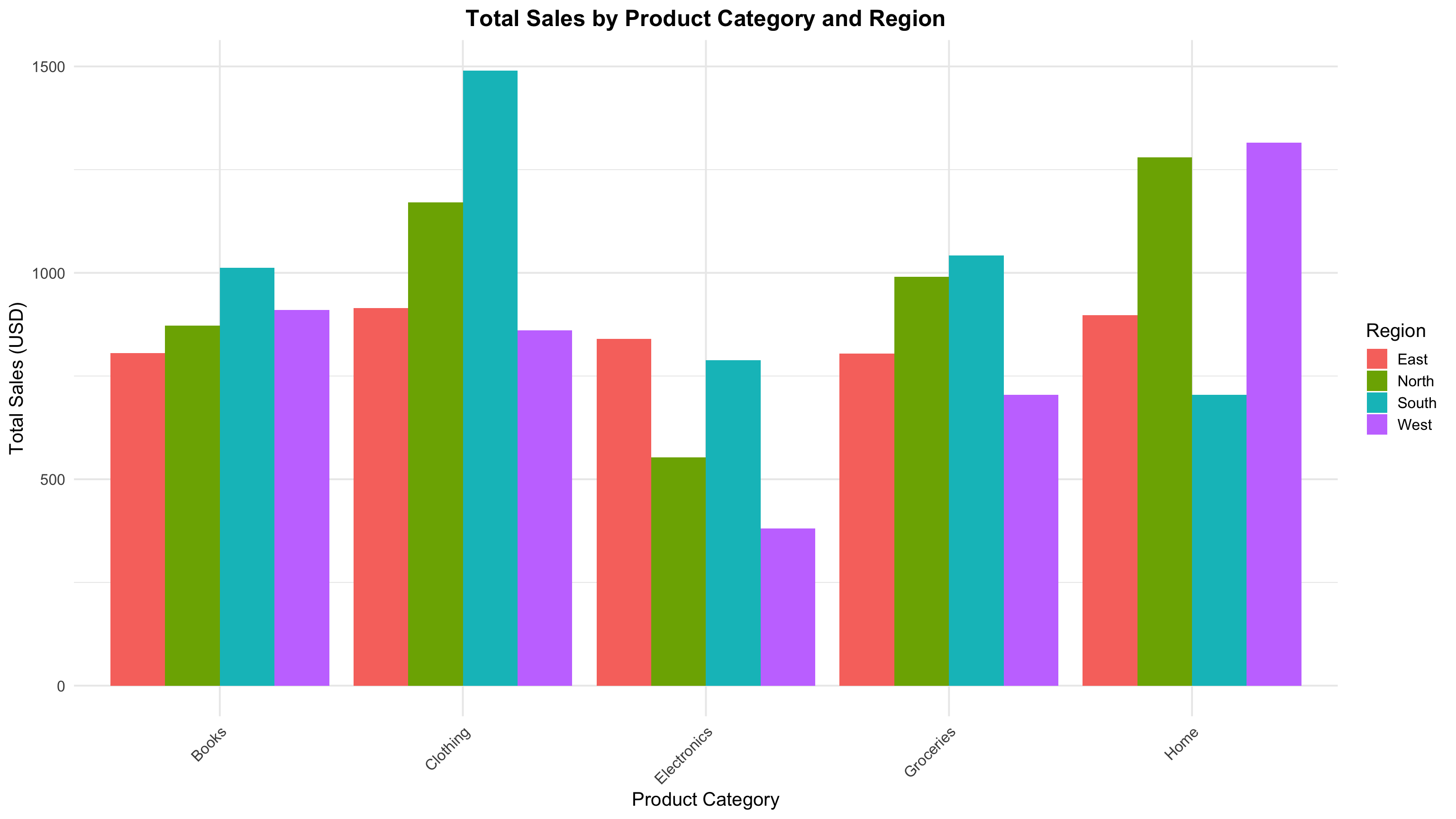
8.3.1 Grouped Bar Chart
A Grouped Bar Chart (sometimes called a clustered bar chart) is a type of bar chart that displays multiple bars grouped by categories, allowing comparison of subgroups within each main category. It is an effective way to visualize and compare values across two categorical variables simultaneously.
Key Characteristics of Grouped Bar Charts:
- Multiple bars per category: Each group (main category) contains two or more bars representing subcategories or levels of another categorical variable.
- Side-by-side comparison: Bars within a group are placed next to each other (not stacked), facilitating direct visual comparison of subgroups.
- Categorical vs categorical + numerical: Typically used when one variable is categorical (groups) and the other variable provides numerical values to be compared.
- Easy to interpret: Heights or lengths of bars represent quantitative values, making differences among subgroups easy to detect.
- Color or pattern coding: Different colors or patterns are used to distinguish the subgroups within each category.
- Useful for trend and proportion analysis: Helps to identify trends, differences, or similarities among subgroups across categories.
- Common applications: Market research (comparing sales by product type across regions), survey results (response rates by age groups and gender), and many others.
R Code (Grouped Bar-chart)
# ==============================
# 1. Load Libraries
# ==============================
library(ggplot2)
library(dplyr)

# ==============================
# 2. Load Data
# ==============================
data_bisnis <- read.csv("data/bab8/data_bisnis.csv", stringsAsFactors = FALSE)

# ==============================
# 3. Data Summarization
# ==============================
sales_summary <- data_bisnis %>%
  group_by(Product_Category, Region) %>%
  summarise(Total_Sales = sum(Total_Price, na.rm = TRUE), .groups = "drop")

# ==============================
# 4. Plot Grouped Bar Chart
# ==============================
ggplot(sales_summary, aes(x = Product_Category, y = Total_Sales, fill = Region)) +
  geom_bar(stat = "identity", position = position_dodge()) +
  labs(
    title = "Total Sales by Product Category and Region",
    x = "Product Category",
    y = "Total Sales (USD)",
    fill = "Region"
  ) +
  theme_minimal(base_size = 15) +
  theme(
    axis.text.x = element_text(angle = 45, hjust = 1),
    plot.title = element_text(face = "bold", hjust = 0.5)
  )
Pyton Code (Grouped Bar-chart)
# Your task8.3.2 Ridgeline Plot
A Ridgeline Plot is a compelling data visualization technique used to display the distribution of a numerical variable across multiple groups. It is particularly useful when comparing the density distributions of different categories in a visually efficient and aesthetically pleasing manner.
Key Characteristics of a Ridgeline Plot:
- Overlapping KDEs across categories: It shows multiple kernel density estimates 8 (KDEs), each representing a subgroup, stacked vertically with partial overlap for easy comparison.
- Efficient space usage: By partially overlapping each plot, ridgeline plots allow for the comparison of many distributions without cluttering the view.
- Reveals distribution shapes: Similar to violin plots, ridgeline plots expose skewness, modality (number of peaks), and spread of data in each group.
- Customizable aesthetics: The amount of overlap, color gradient, and smoothing bandwidth can be adjusted to enhance readability or highlight differences.
- Ideal for temporal or categorical trends: Often used in time series analysis or grouped data to examine how a distribution changes across levels of a factor (e.g., years, regions, categories).
- Not focused on exact values: Unlike boxplots, it doesn’t emphasize specific statistics (like median or quartiles) but rather the overall shape and relative density of the data.
- Visually engaging: Its layered, flowing style makes it popular in publications and dashboards for its ability to convey complex patterns in an intuitive and attractive format.
- Good for medium to large datasets: The KDE estimates are smoother with more data and can become cluttered or misleading with very small sample sizes.
R Code (Ridgeline-plot)
# ==============================
# 1. Load Libraries
# ==============================
library(ggridges)
library(ggplot2)
library(dplyr)
library(scales)

# ==============================
# 2. Filter Valid Data
# ==============================
# Filter out rows where Price_per_Unit is NA, Inf, or NaN
data_bisnis <- read.csv("data/bab8/data_bisnis.csv", stringsAsFactors = FALSE)

data_bisnis_filtered <- data_bisnis %>%
  filter(is.finite(Price_per_Unit))

# ==============================
# 3. Create Ridgeline Plot
# ==============================
ggplot(data_bisnis_filtered, aes(x = Price_per_Unit, y = Region, fill = Region)) +
  geom_density_ridges(alpha = 0.7, scale = 1.2) +
  scale_x_continuous(labels = dollar_format(prefix = "Rp", big.mark = ".", decimal.mark = ",")) +
  labs(
    title = "Distribution of Price per Unit by Region",
    x = "Price per Unit",
    y = "Region"
  ) +
  theme_minimal() +
  theme_minimal(base_size = 30) +
  theme(legend.position = "none")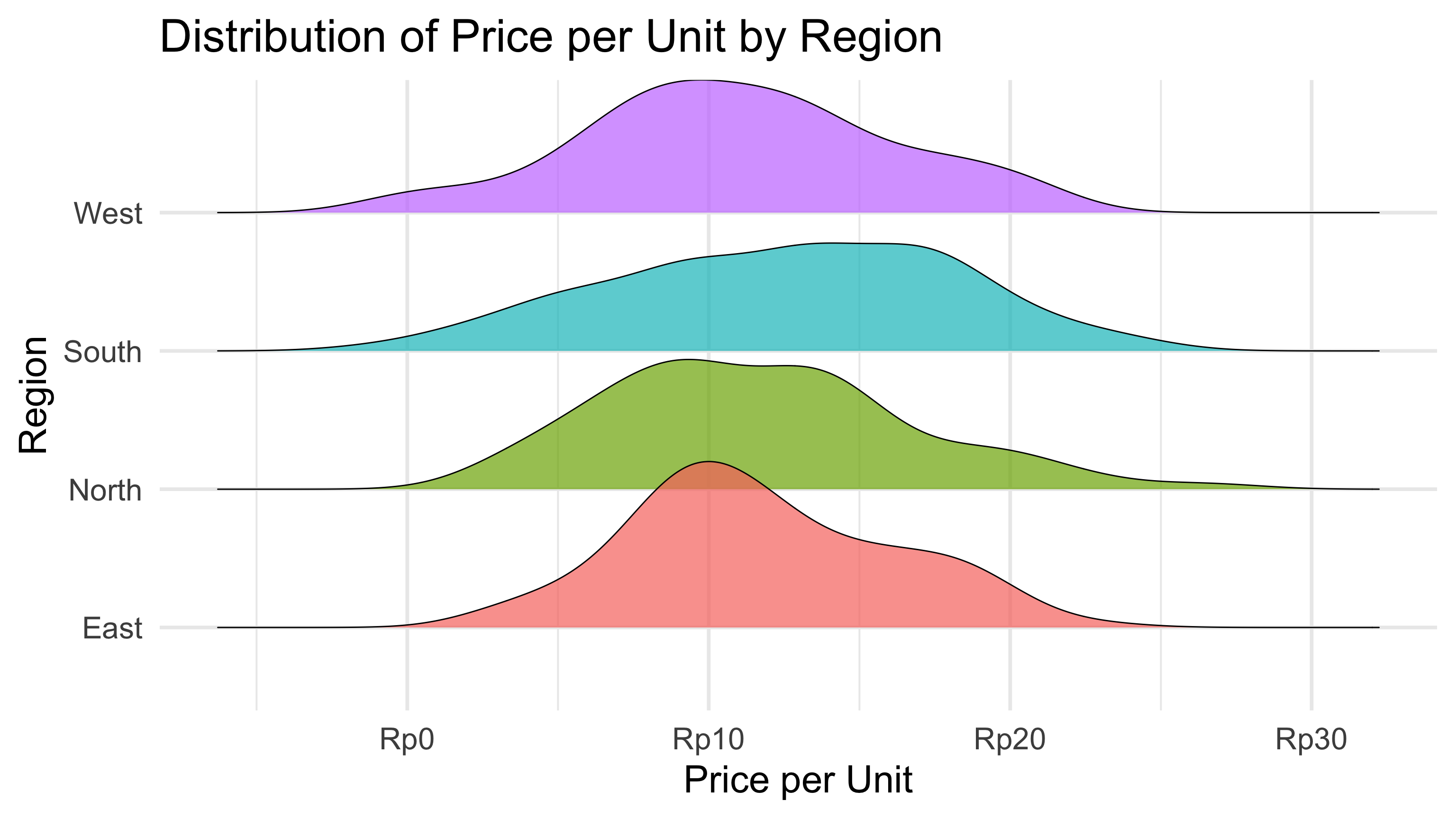
Python Code (Ridgeline-plot)
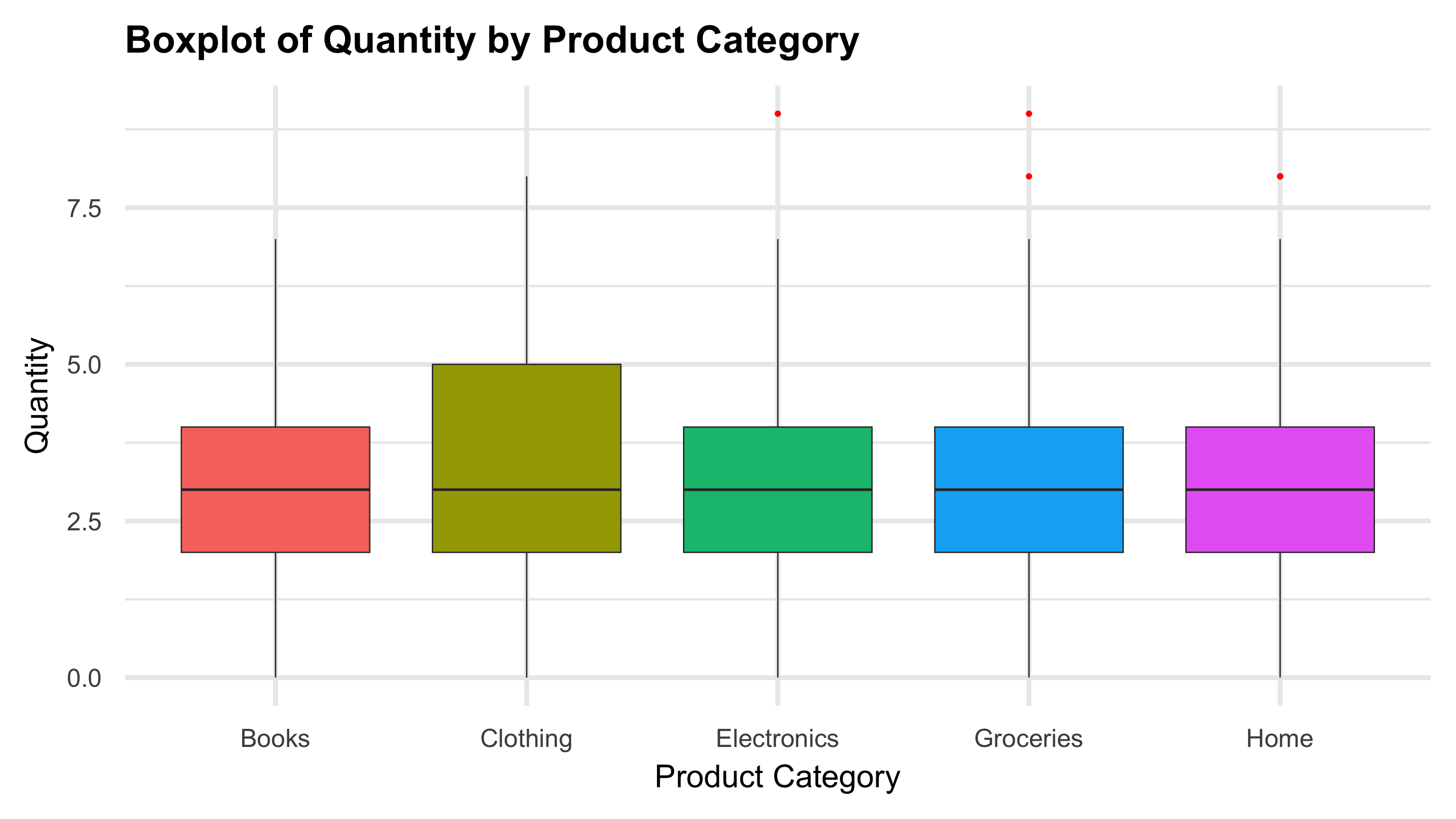
# Your task8.3.3 Boxplot by Category
A Boxplot by Category is a fundamental data visualization technique used to summarize the distribution of a numerical variable across different categorical groups. It is especially useful for comparing statistical properties like median, spread, and outliers between multiple categories in a clear and concise way.
Key Characteristics of a Boxplot by Category:
- Summarizes key statistics: Boxplots display the median, quartiles (25th and 75th percentiles), interquartile range (IQR), and potential outliers for each category, giving a quick summary of the distribution.
- Visualizes spread and skewness: The length of the box and whiskers reveals variability and potential skewness within each category.
- Detects outliers: Points outside 1.5 times the IQR are flagged as outliers, helping to identify unusual or extreme values in the data.
- Categorical comparison: By plotting multiple boxplots side-by-side, it allows direct visual comparison of distributions across categories.
- Robust to sample size: Boxplots can represent data distributions reliably even with moderately sized samples.
- Non-parametric and distribution-agnostic: Boxplots do not assume any specific data distribution, making them versatile for various types of numeric data.
- Widely used in exploratory data analysis: They provide immediate insight into group differences, data symmetry, and range.
- Customizable: Boxplots can be colored or grouped further by additional categorical variables to reveal interaction effects.
- Ideal for detecting data quality issues: Outliers and inconsistencies can be easily spotted, prompting further investigation.
R Code (Boxplot by Category)
# ==============================
# 1. Load Required Libraries
# ==============================
library(ggplot2)
library(dplyr)

# ==============================
# 2. Prepare Data
# ==============================
# Convert Quantity to numeric and remove NA
data_bisnis <- read.csv("data/bab8/data_bisnis.csv", stringsAsFactors = FALSE)
data_bisnis <- data_bisnis %>%
  mutate(Quantity = as.numeric(Quantity)) %>%
  filter(!is.na(Quantity))

# ==============================
# 3. Create Boxplot
# ==============================
ggplot(data_bisnis, aes(x = Product_Category, y = Quantity, fill = Product_Category)) +
  geom_boxplot(outlier.colour = "red", outlier.shape = 16, outlier.size = 2) +  # Boxplot with red outliers
  labs(
    title = "Boxplot of Quantity by Product Category",
    x = "Product Category",
    y = "Quantity"
  ) +
  theme_minimal() +
  theme_minimal(base_size = 40) +
  theme(
    plot.title = element_text(size = 30, face = "bold"),
    axis.title = element_text(size = 25),
    axis.text = element_text(size = 20),
    legend.position = "none"
  )
Python Code (Boxplot by Category)
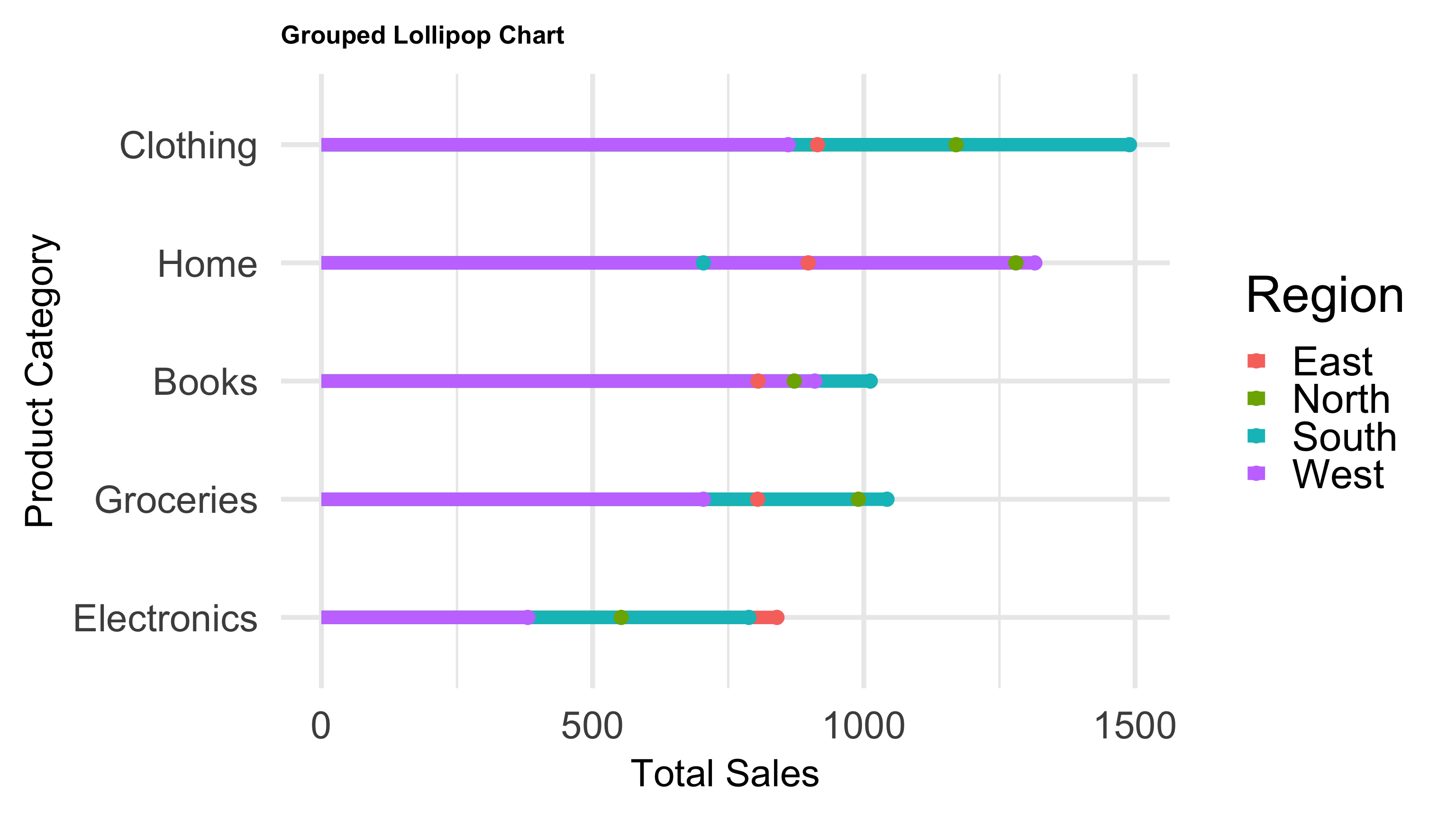
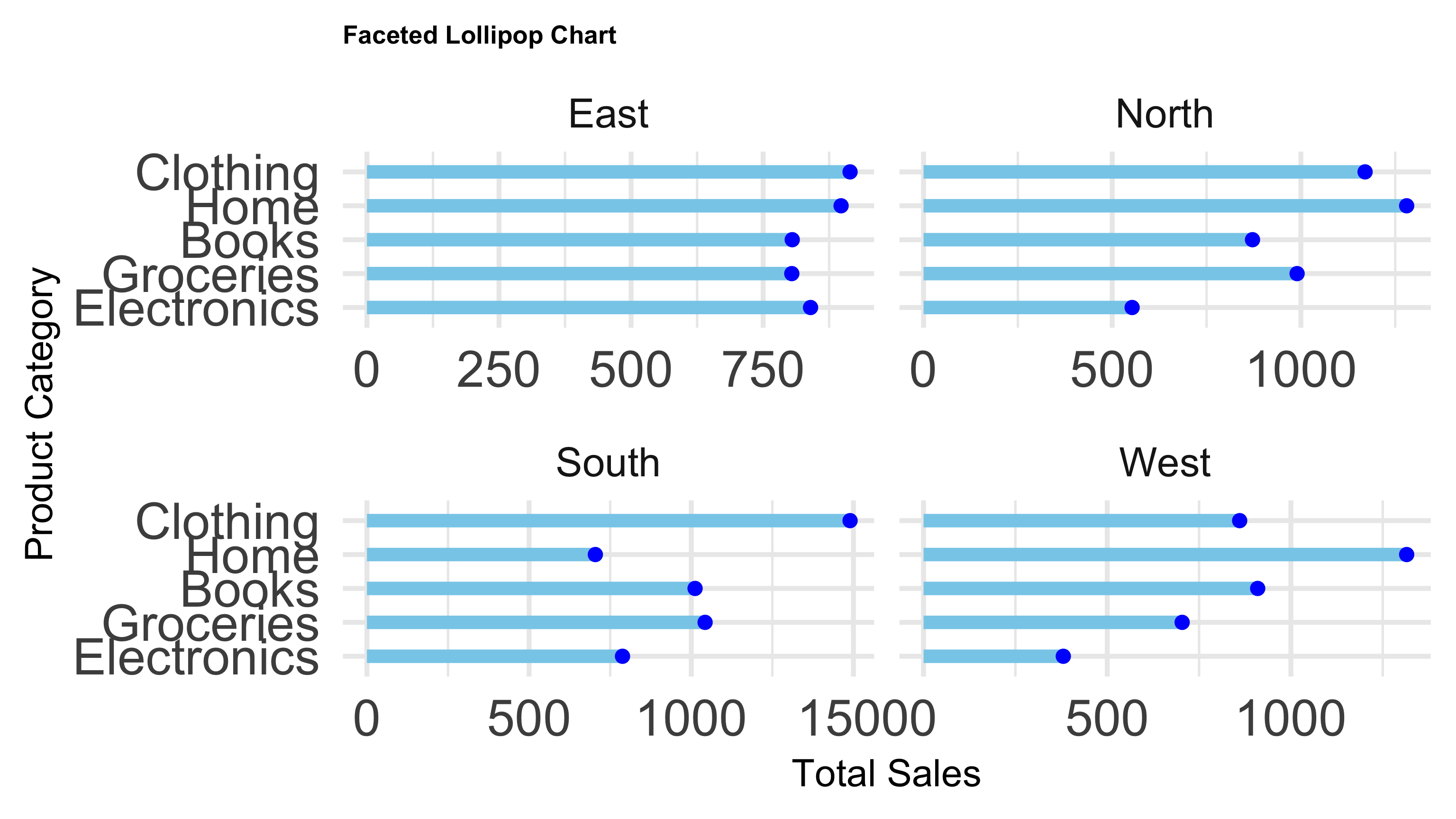
# Your task8.3.4 Lollipop Chart
A Lollipop Chart is a clean and visually appealing alternative to bar charts, used to display and compare values across categories. It combines the simplicity of a dot plot with a line that connects each dot to the baseline, making it easier to perceive the magnitude of each value.
Key Characteristics of a Lollipop Chart:
- Minimalist and clear: It emphasizes individual data points with dots, connected by thin lines to a baseline, reducing visual clutter compared to traditional bar charts.
- Easy value comparison: The length of the “stick” and the position of the dot allow quick comparison of category values.
- Highlights exact data points: Unlike bar charts, the dot makes it easier to focus on the precise value rather than the area of a bar.
- Useful for ranked or ordered data: Lollipop charts work well when categories are ordered by magnitude or rank, enhancing the visual storytelling.
- Customizable aesthetics: Colors, dot sizes, and line thickness can be adjusted to improve readability or highlight specific categories.
- Good for datasets with moderate number of categories: It maintains clarity without overcrowding, suitable for datasets where bar charts might become visually heavy.
- Visually engaging: Its sleek design is popular in dashboards and reports for conveying data in an elegant, intuitive way.
- Supports grouping or faceting: Can be combined with grouping variables or facets to compare subcategories within each category.
R Code (Lollipop Chart)
# ==============================
# 1. Load Required Libraries
# ==============================
library(ggplot2)
library(dplyr)

# ==============================
# 2. Prepare Data
# ==============================
data_bisnis <- read.csv("data/bab8/data_bisnis.csv", stringsAsFactors = FALSE)

# Summarize total sales by Product_Category and Region
sales_grouped <- data_bisnis %>%
  group_by(Product_Category, Region) %>%
  summarise(Total_Sales = sum(Total_Price, na.rm = TRUE), .groups = "drop")

# ==============================
# 3. Grouped Lollipop Chart
# ==============================
ggplot(sales_grouped, aes(x = Total_Sales, y = reorder(Product_Category, Total_Sales), color = Region)) +
  geom_segment(aes(x = 0, xend = Total_Sales, y = Product_Category, yend = Product_Category), size = 5) +
  geom_point(size = 5) +
  labs(
    title = "Grouped Lollipop Chart",
    x = "Total Sales",
    y = "Product Category"
  ) +
  theme_minimal() +
  theme_minimal(base_size = 40) +
  theme(
    axis.text = element_text(size = 30),
    axis.title = element_text(size = 30),
    plot.title = element_text(size = 20, face = "bold")
  )
# ==============================
# 4. Faceted Lollipop Chart
# ==============================
ggplot(sales_grouped, aes(x = Total_Sales, y = reorder(Product_Category, Total_Sales))) +
  geom_segment(aes(x = 0, xend = Total_Sales, y = Product_Category, yend = Product_Category), color = "skyblue", size = 5) +
  geom_point(color = "blue", size = 5) +
  facet_wrap(~ Region, scales = "free_x") +
  labs(
    title = "Faceted Lollipop Chart",
    x = "Total Sales",
    y = "Product Category"
  ) +
  theme_minimal() +
  theme_minimal(base_size = 40) +
  theme(
    axis.text = element_text(size = 40),
    axis.title = element_text(size = 30),
    plot.title = element_text(size = 20, face = "bold")
  )
Python Code (Lollipop Chart)
# Your task8.3.5 Heatmap
A Heatmap is a graphical representation of data where individual values contained in a matrix are represented as colors. It is widely used to visualize complex data by encoding data values as varying colors, making patterns, correlations, and outliers easier to detect.
Key Characteristics of a Heatmap:
- Color-Coded Values: Each cell’s color intensity corresponds to the magnitude of the value it represents, often using a gradient from low to high.
- Matrix Format: Typically displayed as a grid where rows and columns correspond to categorical variables or dimensions.
- Pattern Recognition: Helps identify clusters, trends, and anomalies in large datasets quickly.
- Flexible Applications: Commonly used in fields like genomics, finance, marketing, and business analytics to visualize correlations, sales performance, or activity levels.
- Interactive Variants: Often paired with interactivity (zoom, hover details) in dashboards for deeper exploration.
- Customization: Color palettes, scales, and clustering methods can be adjusted for clarity and emphasis.
- Relationship Focused: Unlike simple bar charts, heatmaps show relationships between two categorical variables by their aggregated values.
R Code (Heatmap)
# Your taskPython Code (Heatmap)
# Your task8.4 Relationship
Relationship data visualization refers to graphical methods designed to explore and present the connections, associations, or interactions between two or more variables or entities. These visualizations help reveal patterns, trends, correlations, or networks that may not be obvious from raw data alone.
8.4.1 Scatter Plot
A scatter plot is a fundamental data visualization tool used to display the relationship between two continuous variables. Each point on the plot represents an observation with its position determined by the values of the two variables.
Key Characteristics of a Scatter Plot:
- Bivariate relationship: Shows how one variable changes with respect to another.
- Detects correlation: Helps identify positive, negative, or no correlation.
- Outlier detection: Reveals unusual data points.
- Supports additional aesthetics: Color, size, and shape can represent more variables for multidimensional insights.
- Common in exploratory data analysis (EDA): Provides a quick visual summary of data relationships.
R Code (Scatter)
# Your taskPython Code (Scatter)
# Your task8.4.2 Bubble Chart
A Bubble Chart is an extension of the scatter plot that visualizes three dimensions of data. It plots points like a scatter plot but uses the size of each bubble to represent a third variable, allowing richer insight into relationships between variables.
R Code (Scatter)
# Your taskPython Code (Scatter)
# Your task8.4.3 Correlation Matrix
A Correlation Matrix is a table showing correlation coefficients between many variables. Each cell in the matrix represents the correlation between two variables, typically measured by Pearson’s correlation coefficient. It helps you quickly understand relationships, patterns, and dependencies in multivariate data.
Key Characteristics:
- Values range from -1 to +1:
- +1 means perfect positive correlation,
- -1 means perfect negative correlation,
- 0 means no linear correlation.
- Useful for detecting multicollinearity and feature relationships in data analysis.
- Often visualized with a heatmap or colored matrix, where colors indicate strength and direction of correlations.
- Important in fields like finance, health sciences, and machine learning feature selection.
R Code (Correlation)
# Your taskPython Code (Correlation)
# Your task8.5 Time Series
Time Series Visualization is the graphical representation of data points collected or recorded at successive time intervals. It is essential for identifying trends, seasonal patterns, cycles, and anomalies over time.
Key Characteristics:
- Temporal Ordering: Data points are ordered by time (seconds, minutes, days, months, years).
- Trend Detection: Helps identify long-term increase or decrease in data.
- Seasonality: Reveals repeating patterns or cycles within fixed periods.
- Anomalies: Detects outliers or unusual changes.
- Common Plots: Line charts, area charts, and stacked graphs.
- Multivariate Time Series: Multiple related time series can be plotted using facets or colors to compare.
8.5.1 Line Chart
A Line Chart is one of the most common and intuitive ways to visualize data points connected by straight lines, especially effective for showing trends over time.
R Code (Line Chart)
# Your taskPython Code (Line Chart)
# Your task8.5.2 Area Chart
An Area Chart is a variation of the line chart where the area between the line and the axis is filled with color. It emphasizes the magnitude of values over time and is useful to visualize cumulative quantities or proportions
R Code (Line Chart)
# Your taskPython Code (Line Chart)
# Your task