9 Interactive Visualizations
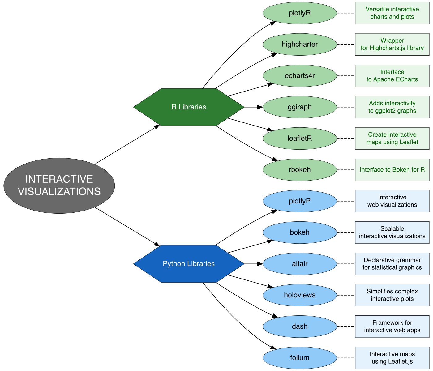
In the world of data visualization, interactivity has become essential for deeper insight and user engagement. While plotly is one of the most popular libraries for interactive graphics in R or Python, there are several powerful alternatives that offer similar—and in some cases, more specialized—capabilities.
These libraries provide web-based, dynamic, and responsive visualizations ideal for dashboards, exploratory data analysis, and communication of complex insights. Depending on the context (e.g., time series, maps, statistical charts), different tools may offer better performance, flexibility, or aesthetics.
Let say you have dataset like this:
9.1 R Libraries
R offers a rich ecosystem of libraries for creating interactive and dynamic visualizations, enabling deeper data exploration and engagement. Here are some popular options beyond the widely-used plotly:
9.1.1 plotly
A versatile library for creating interactive, web-based graphs that support zooming, panning, and hover tooltips.
9.1.2 highcharter
A wrapper around the popular Highcharts.js library, known for highly customizable and polished visualizations suitable for dashboards.
## Required libraries
library(dplyr)        # Used for data wrangling: grouping, summarizing, etc.
library(highcharter)  # Used for creating interactive charts
library(viridis)      # Provides color palettes with good perceptual properties

# Create a color palette based on the number of product categories
custom_colors <- viridis::turbo(n=length(unique(data_bisnis$Product_Category)))

# Begin visualization pipeline
data_bisnis %>%

# Step 1: Group the dataset by Product Category
group_by(Product_Category) %>%

# Step 2: Calculate total sales (sum of Total_Price) for each category
summarise(Total_Sales = sum(Total_Price, na.rm = TRUE)) %>%

# Step 3: Sort the result in descending order of total sales
arrange(desc(Total_Sales)) %>%

# Step 4: Create a column chart using highcharter
hchart('column',                   # Specify chart type
    hcaes(
      x = Product_Category,        # X-axis = product category
      y = Total_Sales,             # Y-axis = total sales value
      color = custom_colors        # Apply custom colors to each bar
    )
  ) %>%

# Step 5: Apply a Google-themed style
hc_add_theme(hc_theme_google()) %>%

# Step 6: Add a tooltip showing the total sales when hovering over a bar
hc_tooltip(pointFormat = '<b>Total Sales: </b> Rp {point.y:,.0f}<br>') %>%

# Step 7: Add a main title to the chart
hc_title(
  text = 'Total Sales by Product Category (2020–2024)',
    style = list(fontSize = '25px', fontWeight = 'bold')
) %>%

# Step 8: Add a subtitle below the main title
hc_subtitle(
    text = 'Based on Transaction Value',
    style = list(fontSize = '16px')
  ) %>%

# Step 9: Add credits to the bottom-right corner of the chart
hc_credits(
  enabled = TRUE,
  text = '<a href="https://www.linkedin.com/in/dsciencelabs/" target="_blank">@siregarbakti</a>',
  style = list(fontSize = '10px', fontWeight = 'bold')
)
9.1.3 echarts4r
Based on Apache ECharts, it excels at rendering large datasets with beautiful, flexible, and responsive charts.
9.1.4 ggiraph
Enhances ggplot2 plots by adding interactivity such as tooltips and hover effects, integrating seamlessly with familiar syntax.
9.1.5 leaflet
Specializes in interactive geospatial visualizations and mapping, perfect for spatial data applications.
9.1.6 rbokeh
An R interface to the Python Bokeh library, designed for elegant and interactive browser-based plots.
9.2 Python Libraries
9.2.1 plotly
Python offers the same interactive charting capabilities as in R. Built on plotly.js, it allows users to create dynamic, web-based visualizations with ease.
9.2.2 Bokeh
Designed for creating interactive and scalable visualizations for the web. Excellent for streaming data and linked plots.
9.2.3 Altair
A declarative statistical visualization library based on the Vega and Vega-Lite grammars, focused on simplicity and concise syntax.
9.2.4 HoloViews
Built on top of Bokeh and Matplotlib, it simplifies building complex interactive plots with minimal code.
9.2.5 Dash
Developed by the Plotly team, Dash is a framework for building interactive web applications with Python, ideal for creating full-featured dashboards.
9.2.6 Folium
For interactive maps and geospatial visualization, built on Leaflet.js.
Choosing the right tool depends on your familiarity with the syntax, the type of data, and the intended audience or platform (e.g., static report vs. dynamic dashboard).