2.5 Descriptive statistics
The next step that you must always do after checking you understand what is in your dataset is to calculate the descriptive statistics of the variables of interest. In descriptive statistics, we are just looking to characterize the values in our particular dataset. We are not yet interested in trying to work out what the data say about our whether our hypotheses are supported or not; that is the domain of inferential statistics, which we will turn to in chapters 3 and 4. The descriptive statistics for a continuous variable are some measure of the average or central tendency, usually the mean (though other things like the median are also possible and preferable under some circumstances), and some measure of the amount of dispersion around this central tendency, usually the standard deviation (though other things like the inter-quartile range or range are also possible). For a qualitative variable, the descriptive statistics are the frequencies, i.e. how often each possible value occurred.
I will to show you how to get descriptive statistics using tidyverse, and then also using a neat contributed package called table1 that will get you a lot of information in a single line.
The main variables we care about here are the IV (Condition), the DV (SSRT), and three covariates (Age; Deprivation_Score, GRT). Age speaks for itself. Deprivation_Score is a score representing the socioeconomic deprivation of the postcode where the participant grew up (higher mean more deprived). GRT is the general reaction time of the participant, taken from trials where there was no stop signal. This is a potentially important covariate. If a person has a longer SSRT, it could be because they are slower at everything, in which case they would have a longer GRT as well. Thus, we might wish to adjust for GRT when we come to the inferential statistics (see chapter 3).
To get our descriptive stats, we use the summarise() function that we met before. For example, to get the mean and standard deviation of SSRT:
# A tibble: 1 × 2
  M.SSRT SD.SSRT
   <dbl>   <dbl>
1  238.4   43.92
Let’s do the same for Age (you can get descriptives on multiple variables in one call to summarise(), by the way, I am just proceeding one variable at a time):
# A tibble: 1 × 2
  M.Age SD.Age
  <dbl>  <dbl>
1    NA     NA
What? The mean and standard deviation of Age are NA. What does this mean? NA in R means missing or uncalculable. We are getting this answer because some participants did not give their age; specifically, participant 2. Have a look:
 [1] 65 NA 21 60 42 20 64 31 20 20 20 60 30 44 38 47 56 53 56 25 57 53 27 40 59
[26] 26 22 20 20 24 55 20 20 23 22 21 34 22 23 30 31 23 25 23 28 26 23 22 61 20
[51] 23 22 22 23 28 19 37 22
In R the average of a vector that contains an NA is also an NA, unless we tell it specifically to strip out the NA values before the calculation. We ask R to do this by specifying na.rm = TRUE in the function call.
# A tibble: 1 × 2
  M.Age SD.Age
  <dbl>  <dbl>
1 32.77  14.81
In an experimental study, you often want your descriptive statistics to be grouped be experimental condition. For example, we want to get a sense of whether the average SSRT is about the same in the negative and neutral conditions. The grouped descriptive statistics are obtained with a simple modification of the code chunk we used above, inserting a group_by() function and then finishing with ungroup().
# A tibble: 2 × 3
  Condition M.SSRT SD.SSRT
  <chr>      <dbl>   <dbl>
1 Negative   242.1   50.05
2 Neutral    234.5   36.77
Finally for this section I am going to show you a neat contributed package that gets all your descriptive statistics for you and makes a table. The package is called table1. First, install the table1 package with install.packages('table1'), and then load it into the current session.
The table1 package is so named because table 1 of many papers shows the descriptive statistics of the main variables, often by group. This package makes that table for you (you can even write your Results section directly from R and spit out this table automatically into your final document). Let’s make our table 1.
| Negative (N=30) |
Neutral (N=28) |
Overall (N=58) |
|
|---|---|---|---|
| SSRT | |||
| Mean (SD) | 242 (50.0) | 235 (36.8) | 238 (43.9) |
| Median [Min, Max] | 239 [130, 392] | 234 [164, 329] | 235 [130, 392] |
| Deprivation_Score | |||
| Mean (SD) | 0.458 (0.293) | 0.451 (0.251) | 0.455 (0.271) |
| Median [Min, Max] | 0.375 [0.0108, 0.977] | 0.403 [0.0718, 0.979] | 0.380 [0.0108, 0.979] |
| Age | |||
| Mean (SD) | 34.8 (16.0) | 30.5 (13.3) | 32.8 (14.8) |
| Median [Min, Max] | 27.5 [19.0, 65.0] | 25.0 [20.0, 64.0] | 25.0 [19.0, 65.0] |
| Missing | 0 (0%) | 1 (3.6%) | 1 (1.7%) |
| GRT | |||
| Mean (SD) | 700 (168) | 627 (146) | 665 (161) |
| Median [Min, Max] | 667 [430, 994] | 585 [440, 941] | 631 [430, 994] |
Read the code as ‘give me table 1 containing variables SSRT, Deprivation_Score, Age, and GRT, by Condition’ (note the | symbol for ‘by’). The table is really informative, giving us descriptives by group and overall, not just the mean and standard deviation, but also the median, the miniumum, the maximum, the number of cases, and the number of missing values if applicable.
2.5.1 Making some quick plots
There is one final step in an initial session with a dataset: to make some basic plots so you can see what the data look like. These do not have to be the final, pretty, publishable plots: we will learn how to make those in chapter 5. It is just some quick eyeball plots so you can understand what your data look like.
The first useful function is hist(), which returns a histogram of a continuous variable so you can see what the distribution is like:
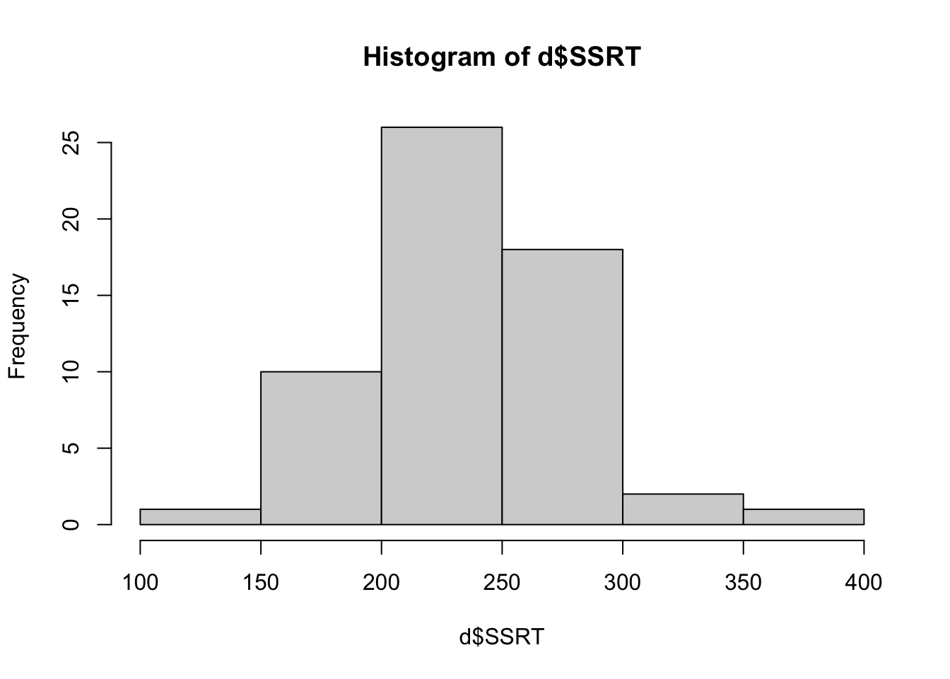
The bars show the number of cases in each of the bins shown on the horizontal axis. From this we can see that most of the SSRT values are around 200 to 300 msec, with a smaller number of more extreme values in either direction. Importantly, the distribution is roughly symmetrical: there are about as many values 100 msec above the mean as there are 100 msec below the mean. This is good to know as if the shape were very different (for example most people had values below 100 msec and a few had values about 1000 msec), this could affect how we will analyse the data.
If you want finer bins on the horizontal axis you can set this.
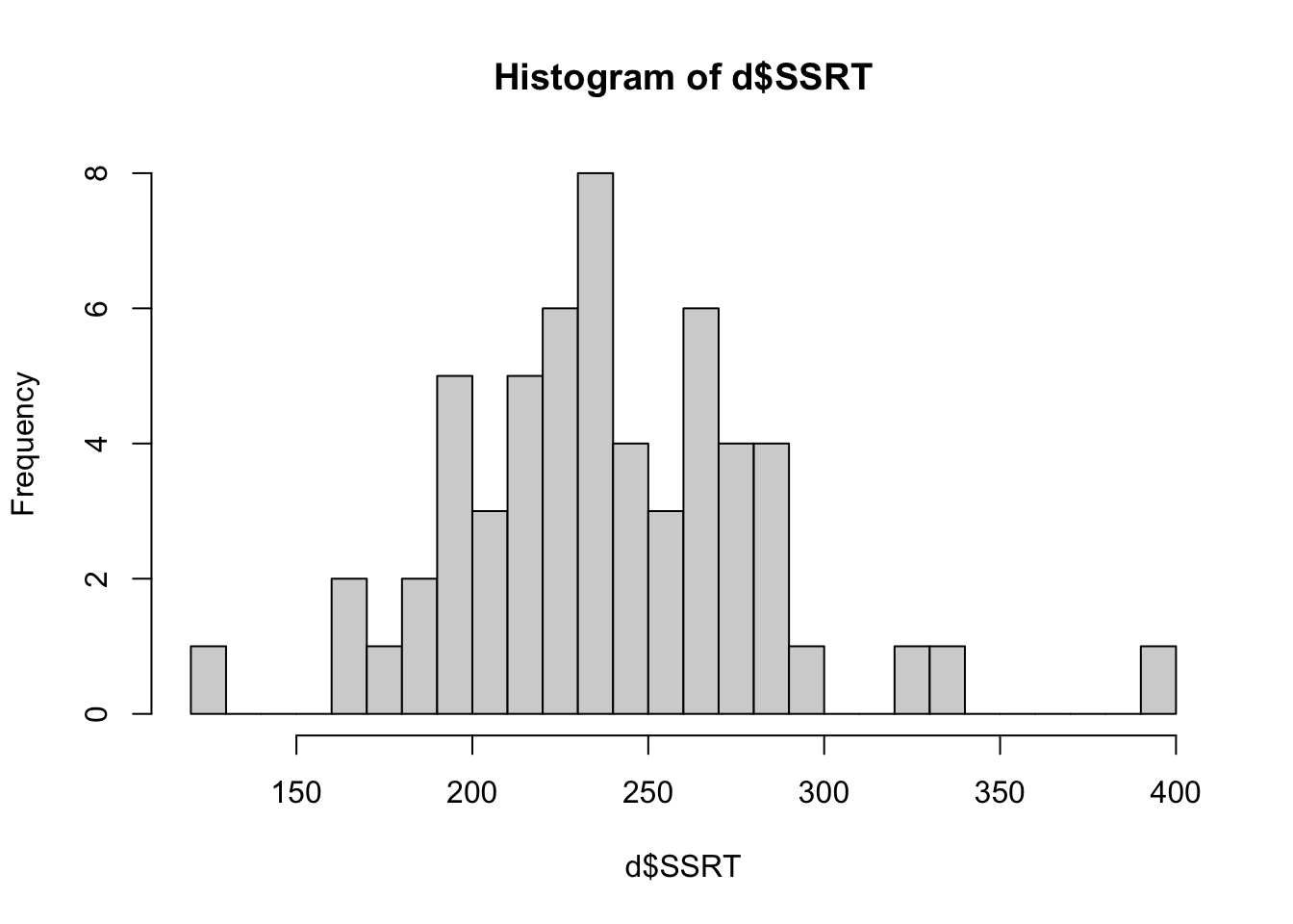
You can also specify all kinds of other features like axis names and colours, but as we are just eyeballing the data, this does not matter too much. Now try making histograms for Age and Deprivation_Score.
The second type of quick plot that it is worth doing is called a boxplot. This is useful for understanding how the distribution of a continuous variable (like SSRT in the present case) changes across levels of a qualitative variable (like Condition). Let’s make one:
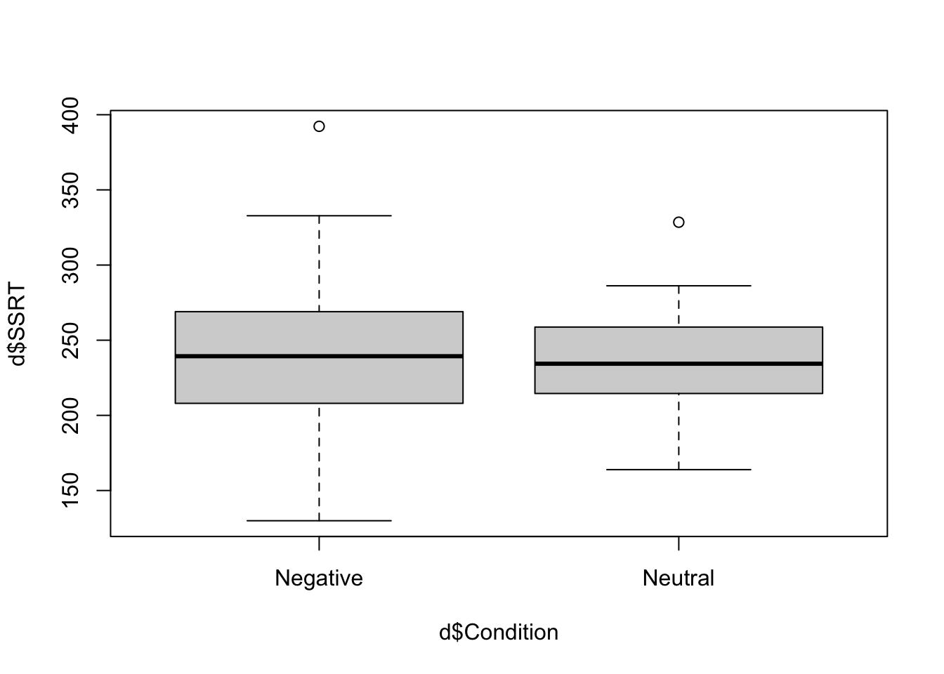
Note the tilde symbol again. We can often paraphrase what tilde does in R ‘by’, as in ‘make a boxplot of SSRT by Condition’.
In your boxplot, the thick horizontal lines represent the median SSRTs in the two conditions. You can just about see (as we already know from table) that the median is very slightly higher in the Negative than the Neutral condition. The filled boxes are the areas containing half of the data points in each condition (i.e. the region from the datapoint at the 25th percentile to the one at the 75 percentile). The whiskers that point out from the boxes aim to capture the variability of the remaining data in both directions. The rule establishing the length of the whiskers is a bit complex, but basically they go to the largest (smallest) data point that is within 1.5 times the height of the box in either direction. Any remaining values outside the whiskers are shown as isolated points or outliers (there is one positive outlier in both conditions here).
What leaps out from the boxplot is that the distribution of SSRTs is not very different in the two conditions: the central tendency is very slightly higher in the Negative condition, and there is also more dispersion in the Negative condition, as indicated by the wider box and wider whiskers.
The final kind of quick plot we might want to make is the scatterplot, which we make with the function plot(). A scatterplot is useful when you want to quickly understand if there is any obvious relationship between two quantitative variables. We know that behavioural inhibition, at least as measured by the SSRT, tends to get a bit worse as you get older. Make a quick scatterplot of SSRT against Age (note the ~ meaning ‘by’ again):
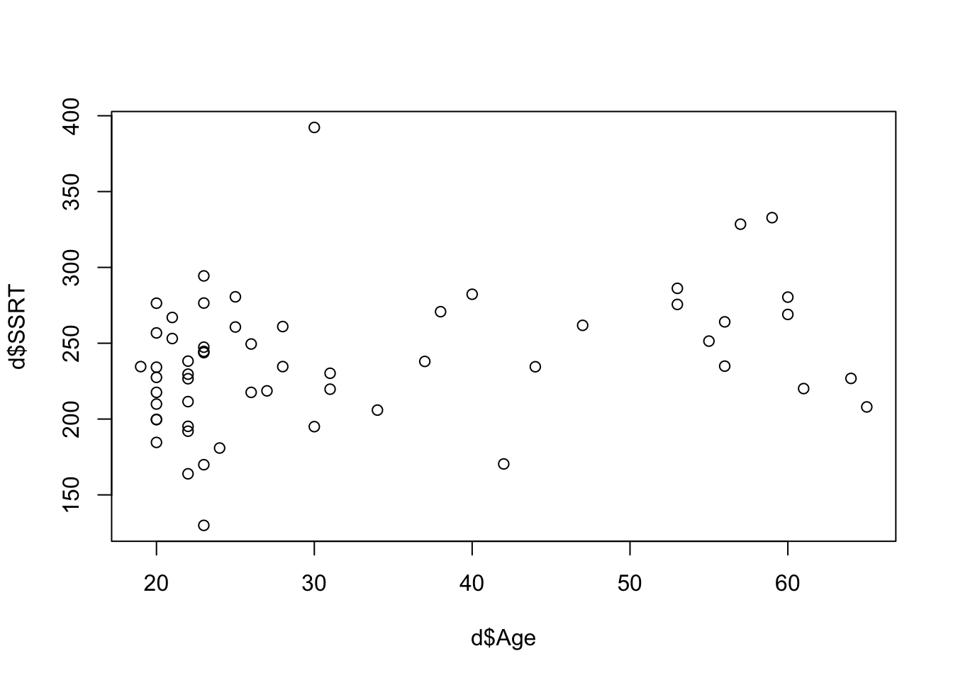
It looks like some of the higher SSRTs are in the older participants. At least, there aren’t any older participants with very low SSRTs.
In chapters 3 and 4, we will move on to the substantive analysis of this dataset: the one where we try to figure out if the results support the study’s hypotheses or not.