11.2 Basics of simulating datasets
It’s often a really good idea to simulate what your dataset might look like in advance of actually running the study. This can help you devise the analysis strategy, set a target sample size, and refine the study.
Let’s imagine that we want to simulate a dataset for an experiment with a simple two-group, between-subjects design, and one continuous DV. We are considering running 50 participants per group, and we want to know what it might look like if the IV increased the DV by 0.2 standard deviations. Let’s assume our DV will be scaled, so it will have a standard deviation of 1. We can thus represent the case we are interested in as the DV having a mean of 0 in the control condition, and a mean of +0.2 in the experimental condition, with a standard deviation of 1 in both cases.
We can generate random numbers drawn from a Normal distribution with a specified mean and standard deviation with the function rnorm(). The three arguments you need to give this function are n , the number of values required, mean, the mean of the distribution, and sd, the standard deviation of the distribution. So, rnorm(n=50, mean=0, sd=1) gives you 50 values drawn from \(N(0, 1)\).
So, the following code is going to produce the data frame we need. I have commented it so that you can see what each line is doing.
# Set up a variable for Condition
# rep() repeats the given element the specified number of times:
Condition <- c(rep("Control", times =50), rep("Experimental", times=50))

# Make the variable with the values of the DV
Outcome <- c(rnorm(n=50, mean=0, sd=1), rnorm(n=50, mean=0.2, sd=1))

# Bind the two variables in a data frame
simulated.data <- data.frame(Condition, Outcome)
We have our first simulated data set, simulated.data. We can do things like make plots of what we might see. Note that this plot will look different every time you run the code (and yours will look different from mine), because we are sampling different data points from the underlying distribution each time.
library(tidyverse)
ggplot(simulated.data, aes(x=Condition, y=Outcome)) +
  geom_boxplot() +
  theme_classic()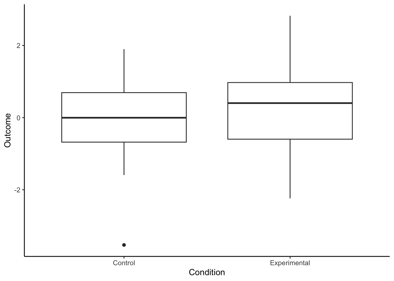
You may or may not see some indication of a group difference, depending on the vagaries of sampling. What about a statistical model? Here, you can try out the statistical model and test that you are planning for your real dataset when it comes.
                      Estimate Std. Error t value Pr(>|t|)
(Intercept)           -0.00872      0.152 -0.0575    0.954
ConditionExperimental  0.24524      0.215  1.1428    0.256
If you are working along, try re-running the code chunk that simulates the data, and then refitting model m1. Sometimes you will see a significant effect and sometimes (more often, actually) you will not. Most often the parameter estimate will be somewhere in the expected range, a small positive value, even if the test is not significant. With simulated data you are in a very unusual situation: you actually know the true value of the parameter that your model is estimating (i.e. 0.2). So you can get a really good sense of how far ‘off’ your understanding of the world can be in an experiment where you only have 50 participants per group.