8.3 Using model selection to test between multiple non-null hypotheses
8.3.1 The Changing Cost of Living Study
For our examples, we will use the data from a study called The Changing Cost of Living Study (Nettle et al., 2025). This longitudinal study aimed to investigate the impact of financial circumstances on people’s psychological well-being over the course of a year. Every month, the participants (232 adults in France and 240 in the UK) filled in a financial report including how much income they had earned that month as well as their expenditures of various kinds. They also completed a number of psychological measures, notably measures of depression and anxiety symptoms.
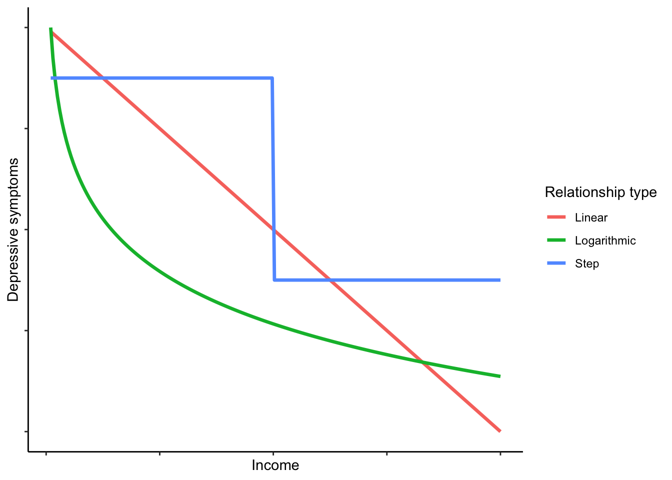
In this first example, we are going to examine the relationship between household income earned, and depressive symptoms. It will be no surprise that when people’s household earnings are smaller, their depressive symptoms are higher. This is one of the best known patterns in all of psychiatric epidemiology. The null hypothesis (no relationship) is therefore not plausible and rejecting it would not be interesting. But there are a number of interesting non-null hypotheses we can entertain about the association.
Linear negative association. Depressive symptoms reduce by a constant amount for each euro increase in income.
Logarithmic negative association. Depressive symptoms reduce by a constant amount for each unit increase in the logarithm of income. This would imply a benefit of earning more that flattens off, so the first 500 euros you earn would reduce your symptoms a lot, the second 500 a bit less, the next 500 less still, and so on.
Threshold function. Under this hypothesis, what matters about income, for depression, is having enough versus not. Without further discussion here, I am going to define ‘enough’ as 3000 euros per month (these were working age people, many with children, often with two salaries in the household). The hypothesis is that people in households with less than this threshold will have higher symptoms than people with more; but once above the threshold, there is no further association.
Here is a schematic visualization of what the prediction of each hypothesis might look like (though the exact shapes and positions would depend on the parameter values):
We will define a model corresponding to each hypothesis and select between them.
8.3.2 Getting the data and the MuMIn package
The OSF repository Changing Cost of Living Study is: https://osf.io/d9qb6/. You will see that there are two versions of the data available, .csv and .Rdata. Let’s use the .Rdata this time. The best way to do this is to save the file locally (making sure to put it in your working directory, or change your working directory to wherever it is), and then:
You should see data frame d appear in your environment. The codebook of what all the variables represent is available in the OSF repository with the data, under ‘Documents’.
For our analysis, we are going to aggregate the data to the participant level. Remember, every participant filled in their income that month, and their depressive symptoms that month, on up to 12 separate occasions over a year. We are going to average together all those 12, so that for each person we have one value for their average income, and one value for their average depressive symptoms. This means that each person’s income and depressive symptoms are better measured, because monthly fluctuations are averaged out. However, it turns a longitudinal dataset into a cross-sectional one, throwing away information about change over time. There are many purposes for which you should not aggregate in this way - indeed, it eliminates what is most interesting about this dataset - but we will do it here because it makes the demonstration simpler and clearer.
Below is the code to perform the aggregation. It will make a data frame a with one row per participant (there are 485 participants). To orient you, the person ID in data frame d is called pid. The income variable is called incomec, and the variable for depressive symptoms is called PHQ, after the Patient Health Questionnaire which it uses. We are also including gender (called mgender in data frame d) as a covariate. As gender is a categorical variable, we can’t very well take the mean when we aggregate. Instead, we will use the first value (i.e. whatever the participant said their gender was in the first month of the study). Run the code and then check what data frame a looks like using head(a) or View(a).
a <- d %>% group_by(pid) %>%
  summarise(income = mean(incomec, na.rm=TRUE),
            depressive.symptoms=mean(PHQ, na.rm=TRUE),
            gender = first(mgender))
Now you need to install the contributed package MuMIn (install.packages('MuMIn'); MuMIn stands for Multi_Model Inference).
We need to do two things before we can work with MuMIn. As mentioned, model selection only works if all the models are fitted to exactly the same dataset; otherwise the AICs of the different models are not comparable. MuMIn therefore requires us to set the options such that models will not get fitted if there are any missing values in any variable. We do this as follows:
Now, we have to make sure that we only have the set of cases where none of the variables of interest has a missing value. Here is one quick way to do this:
You will see that the number of cases went down from 485 to 483: a couple of people had missing values for gender.
8.3.3 Setting up your models and doing the selection
Now we come to setting up the three models corresponding to the three hypotheses. Two things to note. For the step function, we first have to set up a binary variable which identifies whether income was more than 3000 or not.
If you run table(a$threshold.met), you should see that 220 of the participants were below the threshold and 263 above. And as for the outcome, we are going to square-root transform the depressive.symptoms variable. If you look at the distribution, you will see why; many people have scores close to zero, and a few have very high scores, making for a right-skewed distribution. The square-root transformation reduces this skew considerably. (The par(mfrow) = c(1, 2) below outputs the two histograms next to one another; the par(mfrow)=c(1, 1) afterwards is to reset the settings to have figures appear one at a time in future.)
par(mfrow = c(1, 2))
hist(a$depressive.symptoms, main='Untransformed')
hist(sqrt(a$depressive.symptoms), main = 'Square-rooted')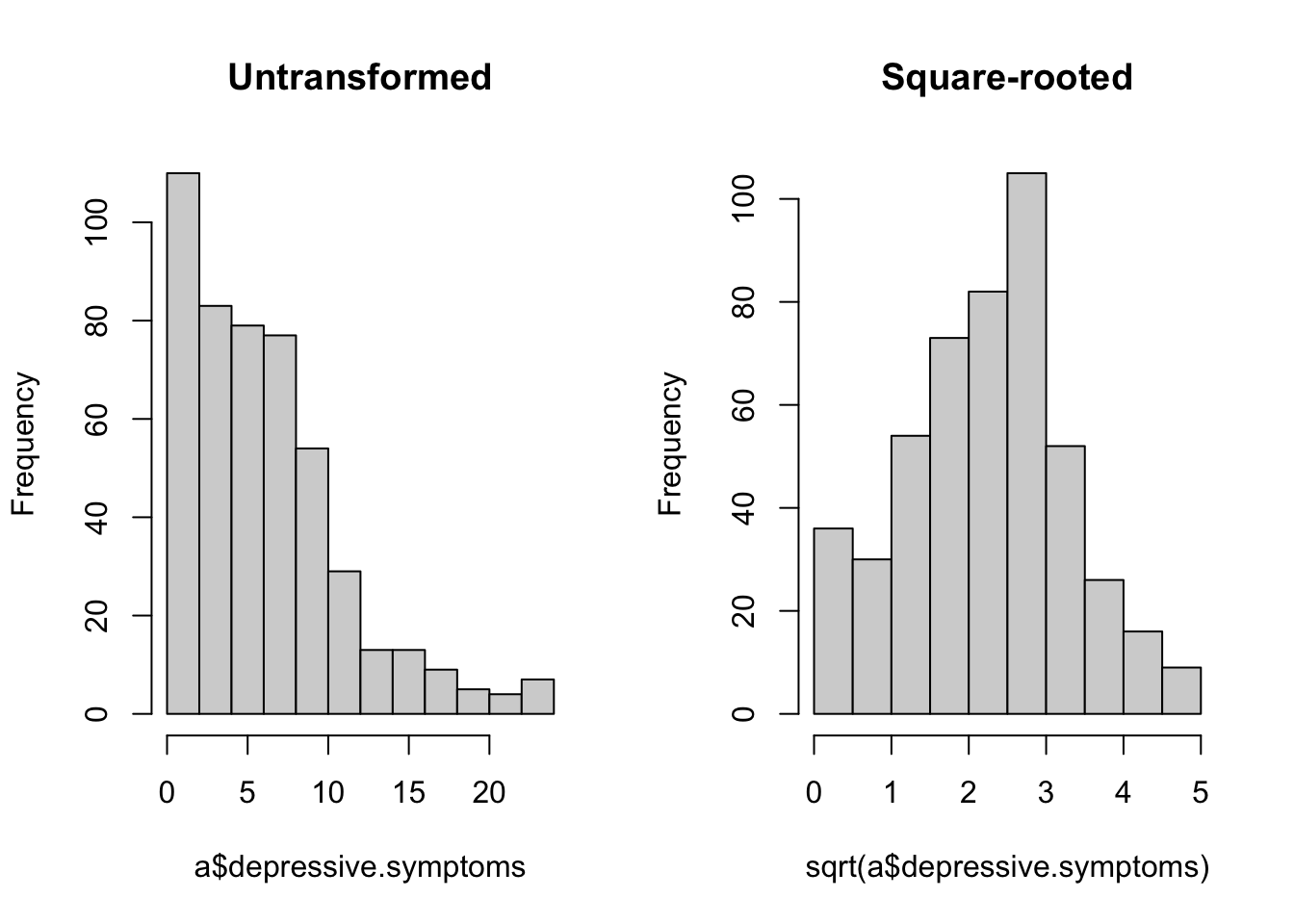
Now it’s time to set up the models. Gender appears in all the models as a covariate, since we know that women tend to have more depressive symptoms than men, independently of income.
linear <- lm(sqrt(depressive.symptoms) ~ income + gender, data=a)
log <- lm(sqrt(depressive.symptoms) ~ log(income) + gender, data=a)
threshold <- lm(sqrt(depressive.symptoms) ~ threshold.met + gender, data=a)
If you run the summary() on these models, you will see that all contain significant coefficients for the income-related variable(s), so null hypothesis significance testing is not going to help us here. Let’s do the model selection:
 For each model, you can see which variables are included. For the continuous variables, you can see their parameter estimates where they are included; for the categorical ones, there is just a cross. You can see the AIC (column
 AICc) for each model, and then the AIC weight. The winner is threshold. Not by much, though: an AIC advantage of about 0.4. To put this in context, any models with AICs within 2 units of one another are considered nearly equally well supported. (The absolute value of AIC should not be interpreted - it depends on the values in your dataset - but the difference in AIC between two models of the same outcome, shown in the table as delta, can always be interpreted.) log comes second, and then lin. There is not much difference in AIC to separate them, and the AIC weights reflect this: 0.43 for threshold; 0.36 for log; 0.21 for linear.
Let’s have a look at the data to see why threshold did well. One way we can do this visually is to use a GAM (Generalized Additive Model) to put a fit line through the data. A GAM is a very flexible form of data-driven fitting. It does not assume that the relationship between the \(X\) and \(Y\) variables takes any particular functional form, only that there is some smooth relationship. It fits the line in a way that responds to the local values of the points. Here is the GAM-based smoother; we need to remember to square-root transform the y-axis to reflect the transformation we used in the models.
ggplot(a, aes(x=income, y=depressive.symptoms)) +
  geom_point(colour="grey") +
  geom_smooth(method='gam') +
  labs(x='Income', y='Depressive symptoms') +
  scale_y_sqrt() +
  theme_classic()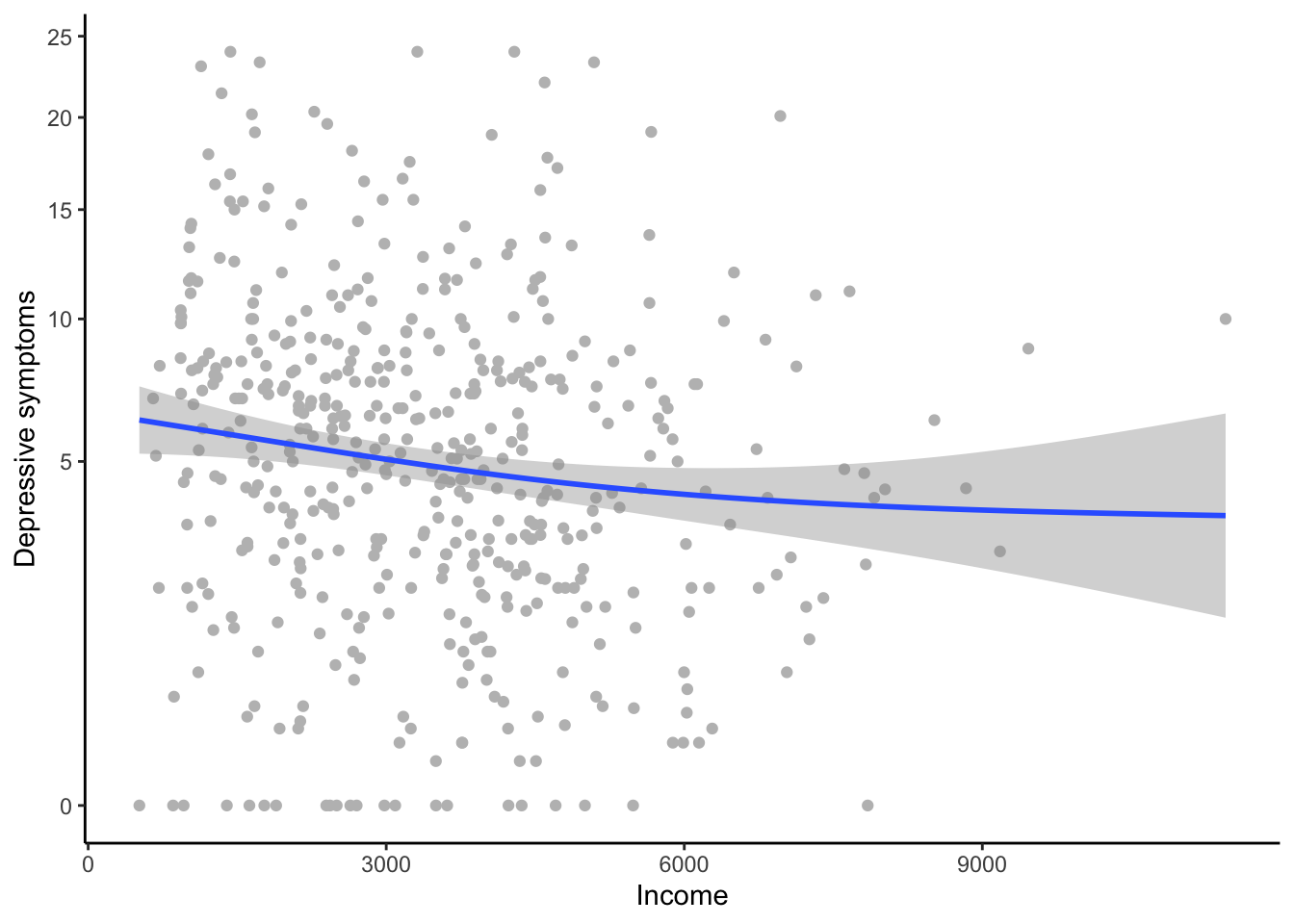
You can clearly see a (weak) negative relationship overall. You can also see that is getting flatter towards the higher income; this is the reason that lin came last. On the other hand, the flattening off is not as marked as you would expect under a logarithmic model (look back to what a logarithmic function looks like in the schematic graph earlier in the section). The reason that threshold has done quite well is that it roughly captures the fact that symptoms are higher for people in househlds with low incomes, and that after that the relationship is rather flat. You also see that towards the higher income, the confidence interval for the fit becomes very large. This is quite a modest-sized dataset, and there are few cases of people with household incomes over about 4000 euros. This is a reason why it’s hard to decisively discriminate between the three models.
Model selection teaches you to have a more graded approach to inference than the simple, binary significance thresholds you might be used to. Sometimes the result is clear-cut, but often, as here, not. The best-supported hypothesis in this dataset is that what matters for depression is being in a household with an income of 3000 euros or not. But there is some chance the relationship in the population is logarithmic, or linear. I would report the AIC weights for all three models (in text or in a table), and let the reader understand the uncertainty for themselves.
By the way, though I stressed that model selection is different from null hypothesis significance testing, you can include a null hypothesis as one of your candidates if you want. Let’s set up a model that does not include income at all.
And now:
 The model
 null is well adrift of all the others, getting a weight of less than 0.01. We can definitely say from these data that income matters for depressive symptoms; the only uncertainty is around exactly how.
8.3.4 Model averaging
In your paper, you might want to report the parameter estimates for gender. Though gender was not of primary interest, readers will still be interested to know whether depressive symptoms were higher in women in this dataset. If you run the summary(thresh), you will see a parameter estimate for genderWoman (compared the reference category of Man) of 0.24. On the other hand, if you run summary(log) you will see a parameter estimate of 0.23. So which is the ‘right’ parameter estimate for genderWoman?
Model averaging allows you to get a parameter estimate for a variable on average across the whole set of models. Specifically, it is the weighted average, weighted by AIC weight; so here, the parameter estimate from thresh will be weighted a bit more than those from the other models. Model averaging gives you a handy and fair way of reporting a single parameter estimate for a variable in the frequent case where model selection gives some AIC weight to several models. Here is how we make the average model:
Now, the parameter estimates:
                (Intercept)           threshold.metTRUE
                   3.03e+00                   -3.08e-01
genderPNTS or self-describe                 genderWoman
                   6.80e-01                    2.36e-01
                log(income)                      income
                  -2.74e-01                   -8.23e-05
Because we specified full=FALSE, we get estimates based only on models in which that term is actually present (which is all of them for the case of gender). We see that the averaged parameter estimate for genderWoman is 0.236, somewhere between the one from thresh and the one from the other models. We can also get the confidence intervals:
                                2.5 %    97.5 %
(Intercept)                  0.962665  5.09e+00
threshold.metTRUE           -0.496894 -1.19e-01
genderPNTS or self-describe -0.256192  1.62e+00
genderWoman                  0.046393  4.26e-01
log(income)                 -0.446257 -1.03e-01
income                      -0.000137 -2.75e-05
The confidence interval for genderWoman does not include zero. Regardless of how we model the relationship between income and depressive symptoms, we conclude that women have more depressive symptoms than men, with an overall parameter estimate of 0.236, and a 95% confidence interval of 0.046 to 0.426.