5.3 Figure 1: two experimental conditions
Let us say that we want our figure 1 to be a graph of how the DV coop_score is distributed according to the IV Condition. This means that the mapping between our canvas and the data frame is as follows:
| Data frame | Figure canvas |
|---|---|
| Condition | Horizontal (x) axis |
| coop_score | Vertical (y) axis |
This is how we set this up. The code says, ’take df7 and then make a ggplot, with the aesthetic (i.e. mapping) such that Condition corresponds to the x-axis and coop_score to the y-axis; then assign this to the object figure1. Then we call figure1 to cause it to be printed to the screen.
Not very exciting, is it? That is because we have defined the canvas but not put anything on it. Let’s start to add some geoms. The most obvious one is the raw data points, which is called geom_point(). We add that as follows (note that the plus has to come at the end of the second line, not the beginning of the third).
 It is still not a great representation of the data. The problem is that
 coop_score can only take a limited number of values, and all the data points with the same value are printed on top of one another, so you can’t really see the data. You can improve this by adding a specification to geom_point() to jitter the points a bit (randomly perturb them slightly to the left or right. Here is how you do this (the width and height arguments just specify how far you want the jittering to go in each dimension; here I don’t want to jitter at all vertically, I want to see where the scores really are on the y-axis, and I want to jitter a bit horizontally so the points are not on top of one another:
figure1 <- df7 %>%
  ggplot(aes(x=Condition, y=coop_score)) +
  geom_point(position=position_jitter(width=0.2, height=0))
figure1
Now we really see the raw data, in the form of two clouds. It looks like the
 coop_score values tend to be a lot higher in the restraint than the indulgence condition. What I would want to do next is to represent the central tendency of the variable in each condition in a visually clear way. We can do this by adding a geom_boxplot(), which will show the median and inter-quartile range for each condition. I don’t want the boxplots to take up the full width of each column, so I will specify that their width=0.2. The other thing I want to do is change that ugly grey background. This the ggplot() default, but it has much nicer options. You apply them by adding information in a theme() layer. theme_classic() gives you a set of options suitable for most journals; you could also try theme_bw() or theme_minimal() for talks. Here is the full code:
figure1 <- df7 %>%
  ggplot(aes(x=Condition, y=coop_score)) +
  geom_point(position=position_jitter(width=0.2, height=0)) +
  geom_boxplot(width=0.2) +
  theme_classic()
figure1
Note that the order of addition of
 geoms matters; if we reversed the order of + geom_point() and + geom_boxplot(), we would have the points on top of the boxplots. Now you can see the data points, and you can see that the central tendency is higher in the restraint condition. You can verify that this is the right conclusion if you like by fitting a General Linear Model:
                   Estimate Std. Error t value Pr(>|t|)
(Intercept)          -0.806     0.0601   -13.4 7.91e-34
Conditionrestraint    1.776     0.0865    20.5 1.84e-63
5.3.1 Refining your figure
It is important to be fussy about your figures. These are the main way that most people will understand what you have found. If you make plots that are uninformative, or messy or hasty, it has a really negative effect on the reception of your work. A good figure will make people see (and, perhaps, believe and remember) what you found. If I had figure1, there are still many things I would fuss about. The boxplots don’t stand out enough from the points; it would be better if the points were grey rather than black. The labels ‘indulgence’ and ‘restraint’ do not have capital letters, whereas ‘Condition’ does. The y-axis label is not informative and does not have capitals. In the next chunk of code, I introduce extra lines to fix all these little things. There is usually a lot of such adjustment as you refine your figure. I also add some colours for the boxplots. Why not? Many journals allow you to have colour these days, and it makes your figure more striking. (Sorry, if you are using the printed book, you won’t see the colours, but you can create them for yourself by running the code on your computer.)
figure1 <- df7 %>% ggplot(aes(x=Condition, y=coop_score)) +
  geom_point(position=position_jitter(width=0.2, height=0), colour="darkgrey") +
  geom_boxplot(width=0.2, colour = c("red", "darkblue")) +
  theme_classic() +
  scale_x_discrete(labels=c("Indulgence", "Restraint")) +
  ylab("Change in cooperativeness")
figure1
One more tiny thing. If you look carefully at your output, you will see that a few of the points appear in the colours of the boxplots, not the grey of the rest of the points. Why is this? When a boxplot is created, points that lie beyond the ends of the whiskers (outliers) are shown as individual points. So here, outlier points are shown twice, once in grey when
 geom_point() plots all the points, and then again in the colours of the boxplot when geom_boxplot() adds the boxplot. Plotting the outliers with the boxplots is redundant in this case as all the points are already shown anyway. So, we suppress the boxplot outliers by the cheap trick of setting their shape attribute to NA (to save space, I won’t reproduce the output, but it solves the problem).
figure1 <- df7 %>% ggplot(aes(x=Condition, y=coop_score)) +
  geom_point(position=position_jitter(width=0.2, height=0), colour="darkgrey") +
  geom_boxplot(width=0.2, colour = c("red", "darkblue"), outlier.shape=NA) +
  theme_classic() +
  scale_x_discrete(labels=c("Indulgence", "Restraint")) +
  ylab("Change in cooperativeness")
figure1
There are many, many other things you can control in ggplot(), from the scales to the layers to legends, text fonts and more. All of these are done by either adding extra features to the basic call, as we did with the theme() and ylab() statments, or including extra arguments to existing features, like we did when we specified width and colour. There are many other kinds of geom too. I won’t go through them all here. The web is an excellent source of ggplot2 ideas and cheat sheets. You can do almost anything.
5.3.2 Showing means and confidence intervals
Our figure1 uses boxplots. Statisticians have traditionally preferred these to plotting means and confidence intervals, because they show more about the distribution of the data. However, assuming we are going to analyse the data using a General Linear Model, there is a mismatch between the estimands of the inferential model (mean and confidence intervals in each condition), and the figure (which, in the boxplots, shows medians and inter-quartile range). And, the concern about not showing the distribution of the data is mitigated by the fact we are plotting all of the raw points. So we might decide we want to show means and confidence intervals, to bring the figure into closer alignment with the statistical model.
You do this using ggplot2’s function stat_summary(). It involves two lines of code, one to put the mean on, the other to put an error bar on, and has slightly awkward syntax. The code and resulting figure are below. The error bars show 95% confidence intervals for the mean. Note the fiddly distinction between fun in the first case and fun.data. This is because the mean only requires one number to be summarised from the data, whereas the error bars require several. I also put the points into light grey to see the error bars better; and a horizontal dotted line at \(y=0\), so we can see clearly that the means in the two conditions are not just different from one another, but both different from zero, in different directions.
figure1 <- df7 %>% ggplot(aes(x=Condition, y=coop_score)) +
  geom_point(position=position_jitter(width=0.2, height=0), colour="lightgrey") +
  stat_summary(fun=mean, geom='point', size=3, colour=c('red', 'darkblue')) +
  stat_summary(fun.data=mean_cl_normal, geom='errorbar', width=0.2, colour=c('red', 'darkblue')) +
  theme_classic() +
  scale_x_discrete(labels=c("Indulgence", "Restraint")) +
  ylab("Change in cooperativeness") +
  geom_hline(yintercept = 0, linetype='dotted', colour='black')
# Now print it to the screen
figure1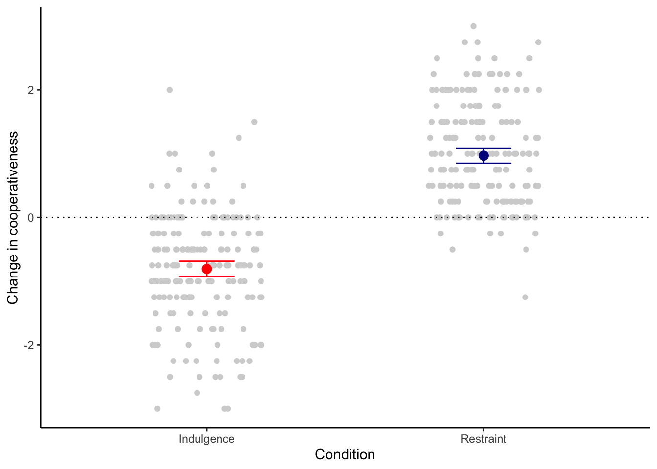
5.3.3 Outputting your figure
So far, we have printed figure1 to the screen. This is just a draft version. The version you will want to include in your paper will need to be a PDF or image file (such as ‘.png’ format). You make these by files calling an output device and printing figure1 to it, then turning it off to complete the file. Here is how to make a .png version at a resolution of 600dpi, 8cm wide and 10cm high.
You should now find a file called ‘figure1.png’ in your working directory. As you can see it looks a lot better than the draft on the screen. You will want to play around with image size and font sizes to make the figure fit into your paper in the right way.
For a PDF, the code is as follows. The PDF device only works in inches, not cm, so we will make it 3in wide and 4in high (an inch is about 2.5 cms). Note that there is no resolution parameter for pdf(), since PDF graphics are vector based, and hence infinitely magnifiable without loss of resolution.